Showing posts with label SU. Show all posts

Sunday, September 21, 2014

Falling for Inspiration

I think fall is my favorite time of year.  Day time temperatures are warm but not melting.  Evening brings open windows and thoughts of light sweat shirts to ward off the chill in the air.  Colors that are rich, warm and golden.

For the past two weeks, fall has been but a dream. Triple digits temperatures that only fell to the upper 90's at night.  Humidity that is rare for this part of California.  

Basically, weather that zaps all energy, smiles and creativity.  So, once again, I turned to my Pinterest inspiration board when the need arose for a birthday card for the Toad's grandfather (aka "Big Papa").  This card caught my eye due to the fall theme I was craving.  

My version:


Supplies: 
Paper: Gina K's Pure Luxury in Ivory
Stamps:  CHF 6x6 Vintage Text, Tim Holtz: Falling Leaves, SU Warmest Regards
Inks:  Distress inks, Memento Rich Cocoa

As I finish up this post it would seem that possible the first signs of fall are here!! Cooler temperatures and open windows today! 

'Till next time....................enjoy what makes you happy

Saturday, August 9, 2014

LOOK!! More Butterflies!!

Hello there!!  It's been a bit longer than I had planned between posts, despite the fact that I actually have a couple of cards that I have made and need to share.  Ahhhh!! The joys of being busy!! 

After my last card, it would appear that I had a rough time branching out from the butterfly genre.  I needed another teen card for a young lady mere days following the panic creating for the last birthday celebrations. Those creations can be found here and here, for those of you who may wish to refresh your memories or get a gander for the first time.  

I usually try to create cards that are not overly "girly" for the fairer peeps of my boys, as I would rather they not be embarrassed to give the cards.  

Not to mention that if one is going to embarrass their children, one should be able to see them squirm, am I right?!!

Despite my best efforts this card turned out to be a bit more "girly" than I was aiming for. BUT!! I used the last of my scraps from the papers made for the previous two cards and I got the card done fairly quickly, which in itself, is rather a miracle.


I apologize for the poor lighting of this card.  I took the pictures just before leaving to take the youngest kiddo to the party and didn't have time to download to make sure I had something presentable. You will just have to use some of your creativity to "lighten" the card to a brighter shade!!

As I said, the making of this was fairly simple.  I dug through my hoard and found a box of Glimmer Mist Masks and spritzed with a combination of light pink shades of Glimmer Mists. 

Would someone PLEASE let me know why I even own PINK Glimmer Mists?!!! It is driving me crazy as to why I would have purchased these colors!! But, apparently, I'm using them, so maybe I'm more of a "pink" type of gal than I want to acknowledge! 

The butterflies were die cut using a Tim Holtz die and a Martha Steward punch.  A bit of bling for the bodies.  Stamped the sentiment, adhered the butterflies with rolled glue dots down the center of their bodies so that the wings could be bent and popped up for "flight".  The front panel was cut slightly smaller than the card base and popped up with some dimensionals.

Easy peasy.  

I promise that my next couple of cards will NOT have butterflies, LOL!! In fact, I'd say they are at the opposite end of that spectrum!  

'Till next time................................

Monday, July 28, 2014

Winged Birthday Wishes

Hey there!! Today I thought I would share the second card I made using the same background technique I shared in my last post  but in a different way.  If you followed the link to the video of the technique  you will recall that it was recommended to use water color paper for the background. Call me a rebel a curious soul, but I wanted to see how the technique looked on different papers.  I used a heavier paper, (sorry, I think it was from Walmart.  I no longer have the info on it as it was a NEED STURDY PAPER NOW purchase and I was willy nilly in throwing away the information), along with the water color paper to compare the outcomes.

Recommendations are a good thing.  I liked the outcome of the technique better on the water color paper.  Much crisper image, but if you are looking for a more "water colored" or slightly more imperfect image, try it on card stock.  I'd be interested to see how the images compare from heavier weight to lighter weight card stock too.

Anyhoos!! I decided to use the results from the card stock paper with some punches.


I wanted a very light background paper as the butterflies added quite a bit of pattern on their own.  Again, the card size is a bit larger, 5x5.5" (?).  And I have NO IDEA what retired paper pack I used from my stash on this card as I had pulled out just about every pad I own trying to find a subtle background that wouldn't  distract from the butterflies.  Geesh.  I'm really slipping.  Obviously I'm not pushing any specific products, LOL!! I'm quickly becoming the antithesis of a design team member!!  I DO know that the punches are a combination of Tim Holtz, Martha Stewart and retired Spellbinders.  And the sentiment is retired SU.  Inks are the same as the last card: 
Distress Paints in Fired Brick, Spiced Marmalade and Wild Honey.  A mixture of Glimmer Mist Pearl and Luminarte Radiant Rain Pearl Blue. Embossing folder Sizzix Tropical Paisley.

I tried to get a photo of the shimmer on these winged wishes, but I couldn't capture the subtle shimmer. 

More shimmer to come!!

'Till next time.........................I hope you have a fabulous and creative week!! 


Thursday, April 17, 2014

Another Throwback Thursday

I pulled out all the throwback stops on this card.

Two, not one, but TWO old SU stamp sets.

Using inks and masking to create a scenic background. Remember when that technique was all the rage?!

And to complete the throwback?  I used old SU colored card stock in ?Summer Sun?  Does this color even exist in SU's color family anymore? Anyone?  Anyone? Bueller?

I did fail in making this card totally flashback by using Distress Inks vs SU retired inks.  Sorry. Distress Inks just blend soooo much nicer, in my humble opinion.


This card is for a young man who just turned 16.  He loves the mountains and hunting.  I thought that creating this scene was appropriate for the occasion. I must have been on target as he proclaimed "this card is so cool".

Card details:  Size 5.5" square.  
Papers:  Gina K pure luxury black and ivory (for the scene panel).  SU ?Summer Sun?
Inks:  Distress Inks in Ripe Persimmon, Black Soot, Mustard Seed, Spiced Marmalade, Fired Brick, Gathered Twig, Walnut Stain. Memento Tuxedo Black
Stamps: SU's Lovely as a Tree, Nature's Silhouette 


'Till next time..........


Thursday, April 3, 2014

Flashback Thursday

Notice how the newest craze on FB is to post flashback photos on Thursday?  Today, I'm posting a birthday card that flashes back in using an oooold SU stamp set, Time Well Spent.

Actually, this card uses some old SU card stock colors also.

And the combination gives a retro, bright, 60's-early 70's look.

I'm just rocking the flashbacks today!!


The pink paper is either SU's Pink Passion or Pixie Pink. Who knows? I never labeled my paper colors and I actually had to look at my SU inks to get the possibilities.  The orange is Only Orange.  

I needed a card for a classmate of  Youngest Kiddo.  This particular girl is new to the class this year and I really don't know much about her personality to give me a clue as to what style of card I should go with. 

 This card took life with the determination to figure out how to use ink sprays (in this case, Tattered Angel's Glimmer Mist in Tuscan Sun and S.W.A.K.) besides just spritzing for general overall glimmer.  I taped down the honeycomb stencil from Heidi Swapp and tried to keep from being too heavy handed or too close with the spraying.  Then I dug through my paper stash and tried to find papers that matched the Glimmer Mists.  

Just a side note.  I am beyond curious as to why I even own a pink colored Glimmer Mist.  It is a well known fact that I am not a "pink" type of gal.  I cannot recall why I would have purchased such a color.  I must have needed it for a specific project. Who knows?!!

I then stamped the flower image from Time Well Spent three times using Memento Tuxedo Black ink.  I colored with Copics and cut each layer out and adhered with dimensional tape.  A epoxy dome was place over the center and bling added for extra pop.  The sentiment is also from an old retired SU set; It's Your Birthday.  I used the same Glimmer Mists on the sentiment flags to tone down the intensity of the colors just a bit.  A bit of a clear mist was then spritzed over the flower to tie it all together.


A bit brighter and much more "girly" than I usually make for my boys to give to their female friends, but, in this case, the Youngest Kiddo didn't flinch (much) when he saw it.  

Now to see what I can come up with for yet another female classmate's birthday this weekend!!


Friday, November 29, 2013

Birthday Vine

Hello there Peoples!!  I hope you had a wonderful Day of Thanksgiving yesterday!! I actually spread out Thanksgiving over the past week.  Youngest Kiddo and I went back to Colorado and spent 4 days with family.  Got home late Monday night, and have been trying to play catch up since!!

I missed my chance to say "Thanks" to those of you who stop in, browse and comment. But, I believe it is never too late to say "Thanks" so please know that I appreciate each and every one of you who do take the time from your busy schedules to visit this little ol' blog!!

Today's card is the last of the cards I made a few weekends back.  I'd like to say that I got out of my stuck in a rut, stuck in a rut layout, but alas!  I'm afraid that this layout is just a CAS (clean and simple) version of cards One and Two!!


Details:  card base is Gina K's Pure Luxury Ivory, 5.5" square.  Design Paper is My Mind's Eye Madison Avenue that was sponged along the edges with Distress Ink in Vintage Photo.  The flourish is Sizzix Flourish 2, that was die cut from SU Chocolate Chip and spritzed with various Glimmer Mists (sorry, it was a grab and spray type of thing and I forgot to note which ones I grabbed and sprayed!!).  The little flower petals were punched from an old SU punch (has 3 little flowers on in).  I sponged slightly in the middle with a Q-tip with Distress Ink Warm Lipstick and shaped with a stylus and mouse pad.  The little 1/2 self adhesive pearls are from my stash. The sentiment is from SU's retired stamp set It's Your Birthday and was stamped in Memento Rich Cocoa. 

That's about it for me today!! I have the goal of starting to put out my Christmas decorations this weekend and need to do some preparation cleaning first!!

'Till next time.............................


Sunday, July 14, 2013

The Process of Creating

The Oldest Kiddo has been invited to a classmate's 16th birthday bash this weekend, which resulted in a swift kick in the rear to clear off enough space on my desk to make a card.  To make it more of a challenge, the party is in honor of a lovely young lady.  

Eeeaaak.  A sweet 16 card that can't be so girly that my son is uncomfortable in giving her the card.  

During the process of creating this card, I made an enlightening discovery.

It is now understandable as to how I can take HOURS creating a simple card and have a huge mess made in the process.

I thought I share just a teeny tiny behind the scene look as to how my brain functions when I create. I will spare you the complete process, as I'd hate to put anyone's creative mojo into shock.

The Sweet 16 celebration is to take place at the beach and the invitation had a wonderful color combination of soft sea green and a blue/teal, which I used as my starting point.  Went through all my "beach" stamps and decided that they were either too cutesy or not what I envisioned for a 16 year old.  Pulled out a couple of old SU retired stamps and had the idea to go a bit more trendy with a more geometric type look.

I then pulled out some distress inks and smooshed (technical term) them randomly on my craft sheet and spritzed with some glimmer mist.

Nope. Didn't like the look today.

Then I took Glimmer Mists in Honey Dew and Patina and spritzed on my craft sheet.  Smooshed (that technical term again) my paper in the mist and came up with a background that I liked.


PERFECT soft, sea foam look I was going for!! 

Then I stamped the sketchy circles from SU's retired So Much set using Memento Rich Cocoa ink.  Added the circle dot stamp with Distressed Tumbled Glass.


And here is the final project


Did your head spin 360 degrees?!!

Yeah.  This is how my brain works.  I start out with one idea, then I go off on a completely different path!  

After I got the first basic background done, I die cut the numbers and wasn't feeling the groove. Dragged out several different paper packs and nothing was bringing that background to life. Mind you, this is after cutting SEVERAL different colors of card stock for the base and matting layer thinking that would help the creative flow.  Nothing was flipping that "OH YEAH" trigger.  I think the background had turned out too grungy or masculine for this particular young lady.  So, I started messing with different ideas on scratch paper (I'm a slow learner). I liked the sketchy circle, I just had to find a way to use it in a more feminine way.  Finally, the idea to use SU markers in Rose Red and Old Olive randomly on the stamp clicked with the die cut numbers. First tried making the flower in a solid red, but didn't like that.  Went with the basic white with a bit of Rose Red sponging on the edges.  Stamped the sentiment in Old Olive, cut the flag banner by hand and sponged the edges and curled it.  Got everything all layered for Oldest Kiddo's approval before final taping was done.

Oldest Kiddo;"Oh. That's cool. Thanks Mom."

Showed him the original background.

Oldest Kiddo; makes weird face. "Nah. I don't like that one as much. It doesn't fit *L and I think it is too busy.  I like the white better."

Smacking my head.

Details:  Card base and white layers:  Gina K pure luxury card stock. DP:  Basic Grey Sweet Threads. Stamps:  SU (retired) So Much and Celebrate Everything. Inks:  SU Rose Red, Old Olive.  Dies:  Spellbinder's/Donna Salazar Rose Creations.  Tim Holtz/Sizzix Word Play.  

'Till next time.........let the creative path lead where it may!

Friday, November 9, 2012

Vintage Rose

October 30.  Uhhh.  It would seem that I feel off the edge of the earth for a little bit!

In reality, while I haven't been crafting, I have been creating.

For the Annual Fall Fair:
250oz of homemade caramel.
150oz of Apple Pumpkin Spice dip.
Two pans of brownies, and 100 dipped S'mores marshmallows.

Before I even recovered from that tornado that hit my kitchen, I became "General Mom" and went into over drive, barking orders to the troops, aka The Toad and Kiddo's, to get a layer off the house to host a part for  the Oldest Kiddo's class that got changed to our house at the last minute.

This week, I TOTALLY went the opposite direction of being productive.

Unless you count the four books that I have finished since Sunday afternoon.  Which, for me personally, was a wonderful escape.

But I have warned myself that the mini book vacation is now over.  Time to snap myself back to reality.

My first reality check came in the form of a needed birthday card for my mother in law.  Whose birthday was actually on Tuesday, but will be celebrated tonight.

So, being the Queen of Procrastination, I waited until today to start thinking about it.

While the card took a bit of a different turn than I had originally started out with, I'm happy with the end results.  The card is kicked up a notch from CAS (clean and simple) but not too BAM! Does anyone besides me remember Emeril's cooking show?!


One of my goals this past year has been to use the vast amount of supplies that I already have, versus buying anything new.  I did break down a couple of months ago and bought Donna Salazar's Rose Creations, but justified the purchase with the knowledge that it was TWO YEARS ago released and has been on my wish list since!! 

Basic Details:  Card base is Pure Luxury Ivory (Gina K).  Designer paper is K&Company (oooold, from my stash), Spellbinder dies used for all the die cutting.  Stamp is from SU's retired It's Your Birthday. Tattered Angel's Glimmer mist in Vanilla Bean gives a slight shimmer to the rose.  Rose edges were sponged in Distress ink Victorian Velvet.  Leaves were sponged with Distress Peeled Paint while still in the die.  Bottom corners rounded with 1/2" corner rounder. 


'Till next time................remember to take time to explore some type of creativity, whether it be something that you create or the creative works of others!


Monday, May 28, 2012

Rockin' the Blues

Hey there People! Are you sitting down?  Yes, it's true!  I'm back with another post today!  Geesh! Is this the third post in 6 days?!  I highly recommend grabbing your cameras and heading outside.  Pigs are very likely flying right now!!
*****

Before I get to my card for today, I'd like to take this moment to thank all the men, women and families that have sacrificed so much for this country.  They are the ONLY reason we have the all these freedoms that we tend to take for granted. There are not enough words so I will stick to a simple THANKS for all that you have given to the rest of us. 

*****

This has been a crazy busy weekend for us!  In addition to the 90th birthday celebration, we also have the family celebration for the Oldest Kiddo, for which I am pretty much expected to make a card for!  His actual birthday is later this week, but bummer for him, it falls right smack dab in the middle of finals and then he has to help with graduation duties as an underclassman next weekend.  This just seemed like the better weekend to try and pull off the family party and we'll figure out a better time to plan a get together with his friends later.

This was actually a fairly quick card to put together once I came up with the idea. That was the kicker.  Coming up with the idea.  Making cards for teenage boys is very hard when their interests don't change much over the last couple of years!  I want the card to be relevant  , but not the same o, same o!!  I found my inspiration from this card of Susan's.  I liked the simplicity of only two colors and the grungy genre.   I think it took me maybe 10 minutes total, and that would include having to re stamp the entire card.  It would seem that somebody pulled a lazy stamper moment and did not stamp off or even pretend to clean the sentiment stamp the last time she used it.  This resulted in a completely different shade of color on the almost completed card.  


Basic details:  One layer card, top fold from Pure Luxury White.  Lightly inked the splatter stamp from SU's Extreme Elements with Distress Tumbled glass.  Stamped SU's Extreme Guitar with Distress Broken China and added a bit of shading with Copics.  The stars are from Extreme Elements stamped with Distress Peeled Paint.  The sentiment and the other grunge element is from Tami Mayberry's Live Life Loud set and were also stamped with Distress Peeled Paint. 

It would seem that I REALLY need to address the after effects of the creative tornado that has gone through this room over the last few weeks!  Mojo is finding it very hard to even think in this mess!  

'Till then, enjoy the simplicity of creating!!


Tuesday, July 12, 2011

Teenage Angst

Hey Peoples!!

Have you all totally given up on me ever posting again?  Between my psychotic computer (yes, yes, I know I need to do something about the stupid thing....but I'd so much rather spend money on other things!) work and life in general, things have been rather slow in the crafting department.  I'm thinking that with some recent changes that have been made in our household, that I may find myself with some more time to get back to my creative side.

Over this past weekend I made a couple of interesting discoveries.
1) I have been immersed in a home, surrounded with testosterone for so long that I've found my tastes in movies now seem to run along the lines of Transformers (haven't seen the newest one yet...it's on the schedule) Ironman (I and II), and the likes.  Still not as thrilled with The Three Stooges, but hey!  Give me time, I'm sure I'll start rattling off lines from them too.

2) While I still have enough estrogen in me to appreciate a feminine card, it would seem I have NO STINKIN' IDEA how to make a card for a teenage girl.

3) When one gives her mojo an extended vacation and then tries to force her mojo back for a card that is needed NOW, it would seem that mojo will dig in her heels and scream and fight every last step of getting the needed card done in under 3 hours. 

The oldest Kiddo needed a birthday card this past weekend for one of his classmates.  Who just so happens to be a 14 year old girl.

Have I ever mentioned that I am surrounded by males in my household?  Even the dog is male.  I have NO IDEA what 14 y/o girls are into (besides 14+ y/o boys).  Originally I thought to myself "Self (or mojo), just make a You Rock" type birthday card in girly colors, since all teenagers seem to have some type of music device forever attached to their noggins.

The the oldest Kiddo drops the bomb that this particular girl likes country music.

Uhhhhhh.  While I can do western themes, I don't do rockin' country themes. 

After literally 6 attempts at creating SOMETHING, this is the CAS card I came up with.  Seriously people.  Only give your mojo a couple of days off.  Much longer than that and things start to get ugly.


Base is a 4 1/4" x 5 1/2" piece of Pure Luxury that is folded along the side.  The circle collage, from my new set Live Life Loud (Gina K) was randomly colored with SU markers in Chocolate Chip, Old Olive, Regal Rose and Melon Mambo. The sentiment is from SU's retired set It's Your Birthday.  I inked it up with the Melon Mambo marker, since I don't own that ink pad.  

6 attempts at this.  Sad, so sad!!

I'm hoping that after this creative struggle, Mojo will decide to come back to work and help me out with less of an attitude.  

Cross your fingers.  I don't know if I can battle both a psychotic computer and a temperamental mojo.  

Till then............................ 


Saturday, June 11, 2011

Grungy Thanks

How is the weekend starting out for you all?!  A couple of weeks ago I just kept telling myself that I just had to get through till the end of school and things would slow down.

Someone forgot to inform,what is my reality, of that fact.

Now I'm telling myself I just have to get through the month of June. 

19 more days.  But who's counting?!

I have been trying to finish up Thank You cards that the Oldest Kiddo needs to send for birthday and graduation gifts he got over the last couple of weeks.  Seeing as these cards are being sent from a teenage boy, and the fact that he needs at least 13 cards, I kept them CAS, with just the right amount of grunge to keep them edgy.


Card base is Gina K's Pure luxury at 4 1/4" x 5 1/4", folded along the side.  I randomly colored the various circles on Tim Holtz's Gunge Cirque with my SU markers in Old Olive, Not Quite Navy and Chocolate Chip, selectively repeating parts of the image to complete the circle strip to the edges of the card.  The sentiment (from Annette Allen Watkins.....beats me.  Have had it in my collection over 14 years!) was stamped with SU's Old Olive.  Round the corners and call 'er DONE!!

That's all from me today!  I have the daunting task of going shopping for an outfit that I can wear to a family wedding next week.  How long do you figure it will take me to find something that will make me look 15 lbs lighter? 

Yeah.  I figure that it is going to be a looooong day with that goal!

'Till then................


Sunday, June 5, 2011

Still Marching for Graduation

Hey Peoples!  How is your weekend going?  We are still in the graduation mode here as we have family friends celebrating High School graduations this weekend.  I came up with another CAS (clean and simple) card that I can see being used again and again as the kiddos the Toad coaches graduate. 

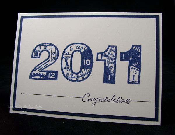
This is a very simple card to make in school colors and mass produce!  Base is 6 x 4 1/4" Pure Luxury.  SU's Real Red mat.  The numbers are from PaperArtsy (clocks 7 and clocks 8), that were stamped with VersaMark and embossed with red embossing tinsel.  In real viewing, the embossing tinsel adds a festive sparkle.  Pulled out the retired SU set of Warmest Regards for the sentiment and stamped using Archival Jet Black ink and then drew a line to weight down the main image. 

I made this also in the colors of another local high school for another family friend.  Got a little blip of ink mishap by the zero, but decided that the kiddo (being male) probably wouldn't notice or care.  I just wasn't up to redoing it, when in all likely, it will see the trash can!!


This still uses Pure Luxury for the base but substituted SU's Night of Navy for the mat.  I used Distress Chipped Sapphire ink and clear embossed. Sentiment is the same as above.

That's it for today!!  I'll be back in a day or so and share a very nontraditional graduation card! 

'Till then.......................enjoy the start of a new adventure today!

Monday, May 30, 2011

Rockin' 14

How was every one's Memorial Day?  In our house, it is also a celebration weekend as the Oldest Kiddo just happen to be born on this holiday 14 years ago.   The weekend was spent cooking, feeding, cleaning up, cooking, feeding, cleaning up after four teen age boys and one younger kiddo who so wishes he was a teenager!! haha!  It was all good!  There is nothing like the sound of kids cracking themselves up with a good time!

I finally managed to make the Kiddo's birthday card the morning of his birthday.  Hey!  I got it done BEFORE the family celebration, so that has to count for something! snort.  I'm telling you, the lack of creative time has definitely caused some serious rust in my stamping skills!  After FOUR attempts, I finally was able to get the main image panel to look somewhat as I envisioned. 


I started by clear embossing the large splatter of SU's Extreme Elements onto a 4 1/4" square base of Gina K' Pure luxury.  I then pulled out Distress Ink in Peeled Paint, Broken China and Vintage Photo, randomly swiped them across my craft mat and misted with Perfect Pearls Turquoise for a Wrinkle Free Distress look.  I then sandwiched the panel between copy paper and ironed off the clear embossing (Faux Bleach technique).  The main image was stamped with Azure Stazon using SU's Extreme Guitar.  The other stamps (flourish, grunge dots and stars) are also from the Extreme Elements set and were stamped randomly with Stazon Timber Brown (the flourish over the removed embossed areas), Peeled Paint and Broken China inks.  The sentiment was stamped with more of the Azure Stazon ink and hand cut.  Light sponging with Peeled Paint, Broken China and some Vintage Photo along the edges blends it in with the main image.  Pop dots raise the sentiment forward.

To finish off the card I used the Alpha Parts Ransom numbers to create the 14 in the corner.  The main image  was distressed.  I deliberately did not sponge the exposed white edge as I liked the look against the white base. The image was then matted on SU's Pacific Point and everything layered onto a 5" square piece of Pure Luxury. 

Life will continue to be crazy this next week as it is the last week of school and the birthday boy graduates from 8th grade on Thursday.  I've got 6 graduation cards that still need to be made, but posting might have to wait until after the weekend, LOL!  I'll be lucky to get them done between everything else that is on the schedule for this week!

'Till then....................................take time to Rock some Creativity!


Friday, May 27, 2011

QUICK!! Another Glimmer of Hope (and a card too)

Do you think that computers can be possessed?  I'm seriously thinking that mine is.  Refuses to connect for, what, a week?  Then, this afternoon, The Toad decides to try it and ABRACADABRA!  The dang thing works.  I REFUSE to think that the stupid thing was protesting at my demands for non stop blog hopping!! 

Of course, tomorrow will probably bring back the "refuse to connect" story.  BUT!  In the meantime, I thought I'd share a quick card that was made a couple of weeks ago for the gal that does marketing for work.


This gal is a rather creative and crafty gal herself, so it was decided to get her a gift certificate from our local scrapbook store.  The store puts the  certificates in a clear cellophane bag with pretty tissue paper and ribbon.  I was inspired by the tissue paper to make all these different punched flowers from various dies.

You are just going to have to trust me when I say that these resemble the flowers on the tissue paper.  It would seem that once again, SOMEBODY was so flustered trying to get a half way decent picture of the card before running out the door for the lunch party, that she forgot that important photo of the gift packaging along side the card!! 

This card uses so many different dies and punches!!  The base is Pure Luxury (but of course!) in a 5 1/2 square layout.  I believe the bright green is SU's Green Gable or Green Galore.  The largest flower was made using PaperArtsy's grunge flower #2 and 3.  Spellbinder's Peony dies and Snowflake were also used (EEEAAAKK!! My computer is starting to act up....no more links! Sorry!! Just going to try and get this posted QUICK!!).  The circles were made from various circle punches. 
Papers:  SU's Real Red, Tempting Turquoise, Green Galore or Gable Green (which ever one it was!) and Tangerine Tango. 

(How's that for short and to the point?!!)

I hope you all have a safe holiday weekend!  Remember to take a moment and remember those who have sacrificed so much in serving our country. whether in active duty or by being a family member of one serving!

A very sincere THANK YOU to all of you who are or have served!!

I'll be back (hopefully!) with a b-day card and graduation cards in the next day or so!! 

'Till then.................explore some creativity!!

Sunday, May 15, 2011

Get Whale Soon

So, it would appear that my computer is just psycho. 

Seriously.  I think it needs to be put on medication.

It would seem that said computer takes great pleasure in giving me false hope with little snippits of times where it will work, only to snatch it away when I'm in the middle of trying to get something accomplished online.

This is one of those snippits of time that it appears to be working.  So, I am going to QUICKLY try and post a project.

                                                                        *************

There are just some cards I wish I NEVER had to make.  Sympathy cards are one.  But this isn't a sympathy card. 

This is a Get Well Soon card.  For the 15 y/o daughter of good family friends.  On Tuesday, she will undergo brain surgery to try and remove a 1.5 cm tumor from the cerebellum vermis (a very important part of the brain that controls proprioception and movement). 

Scary.

But!  This young lady has a very positive attitude and a whole lotta spunk!  She posted on her Caring Bridge page that she thought that everyone should just "Save the Whales and Kill the Tumor". 

Her Motto and design have been made into a T-shirt., which will raise money to help bring awareness to brain tumors. 

I decided that I know NOTHING about what 15 y/o girls are into and wouldn't think as corney (as it would seem I'm surrounded by barrels of testostrone).  So I went with the Whale Theme.   The jury is still out on whether or not this is too cutsey or corney, but I will take refuge in the fact that I'm probably at the age where all 15 y/o kiddo's will just roll their eyes at me and think that I'm just another corney adult. 


The 5 1/2" square  base is Gina K's Pure Luxury.  The design paper is from My Mind's Eye and comes from my "I've had forever stash".  The Whale image, from Stampin' Up's Silly Sea Life, was stamped using Archival Jet Black ink onto a scrap piece of Pure Luxury.  I die cut around the image with my Classic Circle Nestabilities.  Leaving the image in the die, I made a mask of the whale and lightly sponged Distress Ink in Tumbled Glass for the sky and a combination of  Distress Broken China and SU's Pacific Point for the ocean.  I added some waves with Copic markers. 

The whale was also colored with Copics and then covered with Glossy Accents.  The waves were highlighted with Distress Rock Candy sticklesHint:  Do NOT try to speed up the drying of Glossy Accents (even from the back of your paper) with a heat gun.  This poor guy has a blister on his head that required an attempted fix by adding more Glossy Accents.  Just sayin'.

Finally, the image and design paper were matted with an unknown SU blue. It would seem that SOMEONE just bought all the blue paper's from her former upline when said upline decided to quit stamping.  But SOMEONE has no idea what blue this particular shade is, as she has not kept up with the latest from SU.  Robin's Nest Dew Drops finish off the bling on the card. 

*********

That's about it for me today.  I need to start tackling the mile long list of projects that need to be done over the next two weeks as school winds down!  Keep your fingers crossed that my computer will continue on the  "I like you phase". 

'Till then..............give your loved ones a Whale of a Hug. 

Monday, March 7, 2011

Making the Years Count

Happy Monday Peoples! Yes, I am aware that the day is half over, and for some of you, drawing towards evening. But being as I was fairly productive on the home front as well as the creative front, the timing is what it is!!

Last night I was going through some of my papers just to remind myself what I had.  I pulled out a little 6x6 pad from 7gypsie's Gypsie's Market  and was immediately struck with the idea to make a flower out of the striped  paper.

While the flower did get made, you will not see it on today's project! Haha!  It would seem that after planning the whole card around the flower, I did not like the flower as an embellishment!  Soooo, I swapped it for a butterfly made out of the same paper. 

The layout comes from Verve's MoJo Monday Sketch Blog.  I'm not sure why, but sadly, I do not own any of Verve's stamps.  I think that this is something that I may need to change in the near future!  But lucky for me, Verve invites everyone to play along regardless of stamps used! Whew!


The card is actually pretty simple in product. The card base is a 5 1/2  square piece of Vanilla Pure Luxury.  All the  design papers are from 7gypsies.  The two strips of paper along the left side are fauxed layered.  I used a black marker and my small T-square to draw the lines.  The diagonal border is a Martha Stewart punch.  The sentiment panels were cut using Spellbinders classic circles and scalloped circle Nestabilities.  The actual sentiment layer is another piece of the Vanilla Pure luxury that was stamped with Archival Jet Black ink using a retired SU stamp set It's Your Birthday and spritzed with Tattered Angel's Glimmer Mist in Old Lace (nice shimmer IRL).  The leaves are Sizzix Branch w/Leaves sizzlet die.  The butterfly, from SU's Beautiful Butterflies, was cut twice and attached only by the body with a rolled glue dot.  The striped layer (from 7gypsie's again) was sponged with Aged Mahogany Distress Ink and both layers were spritzed again with Tattered Angel's Glimmer Mist in Old Lace. The 1/2 backed pearls were altered from a pearl color to the red with a Copic marker.

I rather like the color combination on this.  I'm getting much more at ease with combining different patterns of paper onto one project.  Of course, it helps tremendously when you use all the papers from a paper pack! hahaaa!!!

'Till next time.......................remember to take some time for creativity, in whatever form it may be!

Wednesday, February 16, 2011

One Love

How in the world did we get to Wednesday already?! I think I'm stuck somewhere in Thursday of last week!!

Anyhoos! 

I needed to make a wedding card for a "celebrate our marriage" open house that is this weekend.  The invitation was fairly simple, the information is typed on white, with a vellum " triangle "gate" fold that is held together by a simple embossed seal.  I knew I wanted to include the vellum element somehow.  While rummaging through my embossing folders, I happened to look up on the top of the shelving where I "store" cards and other projects that I have not found a home for yet.

Bingo!! 

I decided to CASE (copy and share everything) myself.  Hehe.

Yes, I used the dreaded PINK color again!!  I'm thinking that I might be running a fever!

The original card was made waaaaay back in July, '09, as a "Dare to Get Dirty" challenge on SCS. This would be special challenges brought to Fan Club members by current and past Dirty Dozen members.  I even considered just trying to change the original sentiment to a more "newlywed" sentiment and giving that card.  But there was a couple of problems with that idea.  A) The base of the original card was rather flimsy, in my opinion.  I am TOTALLY in love with the thickness of the Pure Luxury card stock for my bases of cards.  Especially cards that have some extra elements and layers to it!  B) I wanted a softer color of roses that fit the theme of the couple's invitation better.  C)  I totally tore the card up trying to remove the flowers to replace the sentiment!

The layout came from a challenge sketch by Cindy Hafner.  The base is a 5 1/2" square of Pure Luxury.  The background squares use SU's Pink Pirouette and Basic Black as a mat for the Cuttlebug embossed squares.  The sentiment was computer generated and printed out on more Pure Luxury.  For once, my printer accepted this thick paper!! But, I will admit to printing it out several times on printer paper and even Georgia Pacific before trying the Pure Luxury.  The Pure Luxury also has a beautiful, true WHITE to it! I used my Spellbinders classic and scalloped circle dies to cut the sentiment layers.  Light sponging with Pink Pirouette was done along the classic circle border. 

Now for the roses.  Ahhhhh!  Can I just say that these turned out sooo much better than I had thought?!  I initially tried to make the rolled roses, like the original ones, out of vellum from SU.  Insert a heavy sigh here________.  Vellum tears.  And it does not hold the rolled shape like paper does.  After several frustrating attempts I gave up.  I decided to try another idea.  First, I inked up some vellum with Distress Ink in Worn Lipstick.  Then I used my Grunge Flowers #2 and #3 from PaperArtsy and cut out several flowers, some from the pink and some from the plain vellum, using the smaller of the two dies.  I then made the roses using a tutorial from Leandra (The YouTube link is on her side bar).  The smaller roses were made with the same die.  I just did not make as many layers!  All the layers were adhered using Glossy Accents. After all the flowers were dried, I spritzed them with Tattered Angels Glimmer Mist in Pearl.


OOOO!! Just the perfect shimmer!!

The roses and leaves were adhered using more Glossy Accents.  The pearls and gems were recycled from the original card, as that one is now a gonner!

In all honesty, I think I like this one better than the original! Even if it does use PINK! haha  The vellum roses just add that something "extra". 

I've already got my desk area cleaned up and have started on the next project!! Yep....you'll want to tune in on Friday, February 18, for the next E-Team adventure!!  

'Till then.......................create something new, or better yet, recreate something that you enjoyed before.  You just might like the second round even better! 


Tuesday, December 14, 2010

Eleven....

....more days until Christmas Eve. 

I know that you are all aware of the calendar days racing by.  But I hate to be in a panic all by myself.  That's why I keep sharing the obvious with you.

This weekend I cranked out more teacher/co worker gifts.  I thought I'd share two of them with you today.

First up.  Another frame.  Are you sick of these yet?!! I'm pretty sure this is my last one, LOL!


Once again I started with Wendy Vecchi's Art Parts and painted the edges with Jenni Bowlin's Chili Pepper Paint dauber I obviously had not cleaned up my desk from the last frame!!  I covered the frame in yet more Holly Jolly dp from My Mind's Eye and lightly sponged some Vintage Photo Distress ink along the edges.  Since I hadn't put away the Grungeboard Mini Elements away, I pulled out the numbers and the swirl and gave them a coating of brown acrylic paint.  I then smooshed (that would be the technical term) them into my Glue Pad and sprinkled with some Doodlebug Sugar Coating glitter in brown.  The elements were adhered using Claudine's Multi Medium (this is quickly becoming my favorite glue).  Once again, I cut a piece of transparency to make my "glass".  I made a loop out of my ribbon and placed it between the layers.  I adhered everything together with Scor Tape


***********

Next up.  A gift card set for one of the youngest Kiddo's teachers.  Mrs. B was his teacher last year and she takes over the classroom in the afternoon for the basics of handwriting, spelling and Bible since his primary teacher is only part time (the hoopla our small school jumps through to avoid combining smaller classes together without straining the budget even more).  Mrs. B also happens to be a stamper (though she doesn't get much time to play anymore!) so I wanted to make something CAS (clean and simple), yet with a bit of a pop.  This is what I came up with: 


I pulled out some oldies but goodies from my SU collection to make this card.  The base is a piece of Vanilla Pure Luxury from Gina K with a top fold (I use my scor buddy to make my score lines.  It is one of those tools that make me look better as a stamper.  I have eliminated my crooked cards to almost NEVER!! Mind you....the Scor Pal or Scor buddy only give straight lines if you make sure your paper is butted up against the edge.  Just sayin'. ).  I cut and embossed the rectangles using Spellbinders Classic and Scalloped rectangles from Pure Luxury Vanilla and Black.  I stamped the music block from Darci's Cardinal Ornament set with Distress Antique Linen ink.  I then stamped the silhouette from SU's Garden Silhouette using Archival Jet Black Ink. 
I then took my Versamarker pad and went over the entire image and used glassy glaze enamel to do the Cracked Glass technique.  After cracking the glaze, I sponged lightly over the top with some Vintage Photo Distress ink to give a bit more contrast.  I then stamped the sentiment from SU's All Year Cheer I using the Archival Jet Black ink. 

I made 6 of these, all the same and boxed them in a clear box with some envies.  I figure the sentiment on these could be used for sympathy, birthday or missing you cards.  Even thank you cards could be squeezed out of them if needed!!

Thanks for dropping by again today!  I still have a couple more projects that need to be completed before the week's end so I had better get to crackalackin'!!  Till then............

Tuesday, September 7, 2010

Being 10 is Fabulous!! And other so-so creations

Hey Peoples!!  For those of you who got to celebrate a long holiday weekend, I hope that it was a safe one!!  For me, it was a busy one (so what else is new?!!)

My youngest turned 10.  His big wish was to get a PSP (game system).  His wish came true. And may I just add that I've gotten at least THREE huge hugs and "Thank you so much mom and dad, for my PSP!! It is awesome" and "This was the BEST birthday ever!!"


The goofy kid then decided to use Grandma's decorations and appetizers to make himself a "tough guy".


Then he decided that he had posed decently for enough pictures and started to ham it up, cracking himself up doing so!


Can I just say that this kid really is a crack up and there is nothing better than the sound of him giggling out of control (usually at himself!!)

The Kiddo's great grandpa (aka Big Papa) celebrated his "80 something" (I believe it is actually 83rd) birthday the same weekend.   Here are the two of them opening up Big Papa's gift:


Big Papa wanted a "new teeth fund" so this was the hint as to what the $$ was for!!


Of course, I am "expected" to make all the birthday cards.  Well, after the "wow" card I created for DS (which can be found here), my Mojo decided to start the long weekend and LEFT THE HOUSE.  After waaay to much effort, I once again called in the Toad to help rescue my sad, sad attempts at coming up with another "wow" card.  In all honesty, this one is only so-so. Not even the Toad could help me with the lack of time to come up with something better.  It is what it is:


I cut this one so close to the wire that I didn't even have time to get a decent picture!!  The card base is a piece of Gina K's pure luxury in vanilla.  I first stamped the sentiment from JFF on a piece of scrap paper (wait.  I think it was actually my first, second, maybe my third attempt at creating the WOW) and cut it out to make a mask.  I adhered it to the center of my card with some removable tape and stamped SU's Weathered background using Distress Walnut stain.  I then used my stampamajig to line up the sentiment and stamped in the center with Distress Peeled Paint.  I lightly sponged the "frame" with more Peeled paint and the edges of the card with some Distress Vintage Photo.  Pulled out some of T!m Holtz's hardware and adhered with glossy accents (the brad "arms" are positioned so you can't see them.  Don't like those puppers messing up the inside of my cards!).  All I can say is:  They can't all be winners!! (oi!!!)

*********
Saturday was spent getting the Toad and oldest kiddo ready for the week long History of California trip.  They left on the charted bus EARLY Sunday morning.  They won't be back until late Thursday evening so it is just the younger kiddo and me.  I wish I could say that I'm getting lots of creating done (you know, like the "welcome to our school cards that I STILL haven't started!! major eye rolling here______________), but instead I tackled the older kiddo's bedroom.  And the bathrooms. Sigh.  Sometimes LIFE cannot be put off any longer!!

Thanks for dropping by again today!!  I'll be back later this week with a SURPRISE!! hehe