Showing posts with label Copics. Show all posts

Sunday, March 16, 2014

Lessons From an Art Journal...Chapter One

Chapter One

Letting Go


In case you haven't noticed, mixed media art journals are all the rage.  Everyone seems to be getting out all their ink sprays, stains, paints and stencils and creating layer upon layer that somehow comes together as a whole.

I bought a new mixed media journal at the beginning of the year.  The original plan was that I'd try jumping on this creative band wagon and see what all the hoopla was about. I had the over zealous idea that I would let my creativity flow at least once a week and let it meander where ever it decided it needed to go.

But what I am finding is that I am struggling with the question as to whether or not this type of journal art fits me.  Or, if the struggle I'm having is a result of not having done this type of creating previously and I am lost in how to make it happen.

When I look at journal pages I have one of two reactions.  First reaction is "Whoa.  Waaaayyyy too much happening on this page".  My mind/eyes don't know where to focus as there are too many layers, colors, dots, dashes, words, zig zags.

The second reaction is "Whoa!  I like this! How does this person put together all these different elements that draws my eye to seek out the details in all the layers?"

My first attempts at an art journal page enlightened me to a few personality traits that I'm not sure fit this type of art form.  For one, I apparently have the compulsive need to control where and how inks, paints and sprays apply to the paper.  I don't like, or perhaps, cannot foresee how the blotches of the above mentioned mediums will look like a cohesive work of art.  This is more than likely due to my lack of skill using stencils and inks in this manner.  I have used stencils for many years to assist in painting of murals.  But, those stencils were to facilitate a more realistic piece of art.  Not a free flowing "let the splatters land where they may" type of art.

The second annoying trait would be that I over think each and every placement of the different elements.  This should come as no surprise to me, as I have over thought each and every element on every card I have every made.  But, when one is trying to have a random, flowing of creativity, this does not work in one's favor!

As a result, my first page looks exactly like what is is:  an over analyzed, stay within the lines, stiff piece of work.


Please don't take me wrong!  In reality, I know that there is nothing really wrong with this page. It is just not the page that I was hoping to create.  This page, unfortunately, just does nothing for me, except bring to mind the feelings of frustrations, disappointment and a major "Eh. Whatever", attitude.  

Instead, this page will be a page of lessons learned from my vast amount of mistakes.


I began my page by applying Gesso over a 9x11" multi media journal page.  I then randomly smooshed (technical term) Distress Inks over the page and moved them around with a watercolor brush that had been dipped in some water. 

Lesson One:  I need to figure out how to use spray inks.  I don't know if it is because I did not adhere the stencils down securely or because I held the inks too close while spraying.  What I do know is, I was left with just a blotches of ink, pooling under the stencil. 

Lesson Two:  It is just paper.  The ink spray splotches were beyond my tolerance.  And before I even thought to try and salvage the piece, I redid the background.


 Which is where my compulsive need to control the inks came in.  I replaced the stencil and used a variety of inks to give the background leaves a definite outline.  The edges were still a bit fuzzy due to the fact that I was too impatient to let the wet paper dry completely before applying the Distress Inks.  Which, if you have never used Distress Ink, react with water and spread out.  

Lesson Three:  When one is applying Wendy Vecchi's black embossing paste through a stencil, one needs to be aware of the smudges of black that are being spread around in the haste to apply more paste instead of properly cleaning the stencil between flipping it from front to back.  


Lesson Four:  Yes, Gesso covers mistakes. But, sometimes, covering the mistake with Gesso makes a larger mistake.  

To my dismay, I discovered that Distress Stains and Inks do not completely cover Gesso.  The resulting color is muted, as if the Gesso absorbs the ink, leaving areas that do not "match" the rest of the background.  No matter how many layers of ink you apply.

Lesson Five: Walk away.  Sometimes you just have to walk away and let the stewing simmer to a less frustrated level.

  At some point, you have to acknowledge the fact that the page is never going to turn out like you had hoped it would.  So, grab another stencil and experiment with using Copics through a stencil.


Lesson Six:  Review Lesson Five and walk away.  Several days (okay, a couple of weeks later) grab some random paints and try to fix the leaves one more time.


The leaves still don't match.  But they aren't as muted as they originally were.  

Lesson Seven: Take to heart the words Kenny Roger's sang so long ago in The Gambler


You got to know when to hold 'em, know when to fold 'em,
Know when to walk away and know when to run.
You never count your money when you're sittin' at the table.
There'll be time enough for countin' when the dealin's done.


I'm walking away.  

'Till next time...................


Friday, September 7, 2012

Camouflage

Can you believe it?!  It's been less than a week (okay, I admit it, I'm scrapping the edge on that one!) AND! I'm posting again!!

Quick!  Someone grab the camera just in case pigs are flying!

ANYHOOS!  After surviving the traumatic ordeal of making a teenage GIRL card, I was able to get back into a more comfortable creative zone.  I needed to make a card for the youngest kiddo's birthday.

Now, while I am more at ease in making masculine cards, here is the reality check that I am dealing with lately; it would seem that my kiddo's and their friends are getting into a "rut" as to what their interests are.  When they were younger, each year was a different interest:  the latest action hero, DS (remember those?! snort), wild animals, race cars, Bionicles, etc.  Now, it is narrowed down to guitars/music, basketball, cross country with a bit of Air Soft thrown in for the oldest and basketball, Air Soft and Xbox for the youngest. Problem is, I have already made cards with those interests for a couple of years running now!  EEAAAKKK!  People!  There are only so many "YOU ROCK" cards one can make for the same kid!! LOL!

Since the Youngest Kiddo was receiving a new Air Soft gun for his birthday, I went with a "Commando/military" theme.  I pretty sure I still had some left over camouflage design paper left over from a previous project. Turned out I was sadly mistaken.  So, I pulled out a pale green paper, that I think might possibly be some old SU Mellow Moss, some Copic markers, a picture from the Internet of Camouflage patterns and made my own.

remember: you can always click on the picture for a larger view. 

Disclaimer:  IRL there did NOT appear to be all the streaks from the markers.  I keep staring at this picture, stare at the card, shake my head and just let out a sigh.  

The HARDEST part of this card is the dog tag.  I have had these dog tags in my stash for evah!!!  O...M...G!!! Pulled out the Stazon ink, found the Happy Birthday stamp in my forgotten stash of PTI (I only own a few sets from when PTI first started producing stamps...this is from the Borders and Corners, Rectangles set) and LITERALLY stamped the image AT LEAST  20 times before I got a half way decent impression.  I don't know if it was because I was trying to use a clear stamp and Stazon on the slick surface or what. I would either smudge the impression by slipping when putting pressure on the stamp or the stamp would stick, and I mean STICK to the tag and when gently pulled off, and would pull the ink off too, leaving a wonderful HUGE blotch, larger than the SMALL blotch I finally settled for!! I finally decided that this is a "worn out tag", applied the chain, strategically placed rolled glue dots to hold it in place and called the thing DONE!!  Originally, I had planned on stamping another tag with the Youngest Kiddo's initials and add it to the chain that he could then wear.  Uhhhh. NO.  After trying to get this ONE image stamped somewhat decently, I decided that this was IT!!  

Basic details:  Card base from SU's Chocolate Chip cut to 5.5" square.  Basic black mat.  Custom camouflage paper.  Tag, from stash.  Stamp: PTI (I don't know if they even sell this set anymore...it was THAT long ago I bought it!!)

That's about it for me today!! I actually made another card last weekend too!! I'll pop that up here in a day or so.  I'm dragging out the posts as long as I can, LOL! 

'Till then..............enjoy some creativity this weekend!!

Saturday, June 23, 2012

Over the Hill

It is nearly the end of June.

Seriously?  School just got out.  How in the world can it be the end of June?!  The phrase "Time Flies" needs to be tattooed across my forehead.

Ok.  Not my forehead.  That would call attention to the wrinkles that are there.  Maybe I just need to put it on a sign and hang it on the door. Of course, that would require me to clean off my desk area so I could make the sign.  And the rate time is flying, that is not likely to happen before July.


ANYWAYS...

This morning I had to "whip" out a card that was needed for a family friend's 60th birthday roast.  As per my usual MO, I was running around chasing Time and barely got the card cranked out before I had to try and  make myself look somewhat presentable for the party.  Since this was to be a roast, a somewhat snarky card was needed.

Bugaboo Digital stamps to the rescue.


Inside:  I just can't get up it!!

Since my mojo tends to take off running when I have a very limited time to come up with a card, I used the CPS 269 sketch for inspiration.  

Basic card details:  Base is SU's Kraft, top fold, 5 1/2" x 4 1/4".  Decorative paper is from an old pad of Making Memories Just Chillin'.  The image was printed out on Georgia Pacific #110, since my printer hates my preferred Pure Luxury.  I die cut the image using Spellbinder's Classic Rectangles.  While the paper was still in the die, I did some light sponging with Distress Ink in Peeled Paint and Tumbled Glass.  Faded Jeans ink was used around the edges of all the layers.

A mish mash of over 21 Copic markers was used on the image.  Glossy Accents was applied on the glasses and the card was deemed done, thrown in an envelope and out the door we went!

That's about it for me today.  Stay tuned as the E-Team has another Inspired by Words blog hop in the works for later this coming week.  

'Till then................


Tuesday, March 20, 2012

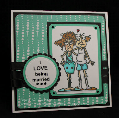
Married....

.....for 18 years today!  Yep, the Toad and I have managed to put up with each other's quirks for 18 years.  Actually, longer.  More like 22 years. 

Geesh.  That is like, FOREVER. 

And not.

When I say 18 years,  it sounds like forever, but when I think 18 years, it doesn't seem as if it has been that long. 

I've decided  I prefer the thinking of 18 years versus the saying of 18 years.  Saying it makes me feel old.  Thinking it I can ignore the reality that I am getting older and can just pretend that I'm still that young, 20 something year old who was in shape.  And had abs.  And had actual muscles. 

ANYWHOOS!  I digress (once again!).  This weekend I decided that the Toad deserved a card for this occasion.  'Cause, supposedly, that is what I do, make cards.

Now, one thing you have to understand about the Toad and I is, we are not a mushy, googoo eyes at each other couple.  We are snarky.  And obnoxious (he, more than I, of course).  That is how we show affection and love.  Hey!  It seems to have worked for 18 years + so far!!  So, this image from Bugaboo stamps was perfect.


Inside:

It's great to find that one special person you can annoy for the rest of your life!!


BWHHAAAA!!  If you only knew how perfect this was for us!!

Card details:  5 1/2" square base from Gina K's pure luxury.  Design paper and colored mat paper from S*E*I Black Orchid (this has been in my stash for a while, not sure you would be able to still find it).  The image was resized and  printed out on Georgia Pacific paper since my printer hates my preferred paper of Pure Luxury.  Colored with Copics.  According to the pile of markers on my desk, that would be seventeen different copic markers.  Sorry, I'm too lazy to list all of them!! 

The sentiment actually comes with the image, but I had to type it out on my computer because for the life of me, I couldn't figure out how to edit it to fit the circles.  I'm sure it is not that difficult for anyone who has one teeny tiny bit of computer savvy.  That person would NOT be me, so it is just less frustrating to type it out again.  Spellbinders Classic circles and scalloped circles were used to cut and emboss the mats and the sentiment panel was popped up over the looped ribbon with dimensionals.   The inside sentiment was matted the same way, but used Spellbinders Classic rectangles and scalloped rectangles for the shapes.  SOMEBODY forgot to take that picture of the inside and it is too dark to get a decent one now!!  Some self adhesive 1/2 pearls from Want2Scrap cover the fact that I grabbed the wrong punch when I meant to round the corner versus ticket punch the corner on the main image.  A touch of Glossy Accents covers the glasses and the heart. 

So, Happy Anniversary Babe!  Here's to another 18 years!!

Friday, September 16, 2011

Bea A. Ware!!!

Hey People!  Remember me?!  I know that my posting has been very lacking lately.  I'll spare you the long version excuse and cut to the chase:  LIFE!! Not enough hours or energy in the day/week and the creativity time is the first to go!!

BUT!!  Lucky for you, Mz. Daisy has issued another challenge for the E-Team!!


 And no E-Team blog hop would be complete without the chance of winning some awesome goodies from the eP store!  Daisy is putting together an "Tag/ATC" goodie box that will have a variety of tags and tag surfaces, some Twinery Samples and other eP goodies!!  Three randomly selected winners will be chosen from the comments left from TODAY UNTIL SUNDAY, SEPT. 18, on each of the participating Team member's blogs. 

BUT WAIT! There's more!!  Leave a comment on the eP blog about your favorite Halloween treats and another lucky person will win a $25 eP voucher!!

The E-Team
and ME!
Micki and Latrice are not able to join in today, but make sure you stop by and let them know they were missed!!

 Ok!! Onto the fun stuff!! 

My project started out with this little guy:


It's an M&M mmmmMUMMY!! This little guy was so quick and easy to make!  I started with one of these plastic tubes.(this is the smaller of the tubes).............


.............cut 1/2" and 3/4" strips of Sticky Back Canvas and haphazardly inked the edges with Distress Tea Dye Ink.  Randomly wrap the strips of canvas around the tube and across the top and around the lid, glue on some googly eyes and MUMMY!! You've got yourself a cute little treat holder that your kids can make for their entire class or neighborhood!!

But then my brain got to thinking (yes, it hurt),that all Mummy's deserve a nice home to haunt.  So I got out some Distress Ink in Weathered Wood and Pumice Stone.  Randomly squished it on my craft mat and spritzed with Tattered Angel's Glimmer Mist in Pearl and Patina and layed a piece of Pure Luxury card stock in the pooled ink (this is my version of Wrinkle Free Distress). A little selective shading with my Copic markers, using C1, C3, C5 and C7, a little dry embossing along one edge.


I REALLY wish the shimmer from the Glitter Mists showed up in the picture!  It is just enough shimmer to make the tombstone look like granite!

Of course, it's the little decorating details that make a home stand out.  Since I currently lack the Raven and Branched Tree dies in my collection, I had to resort to drawing my own!  The great thing about ravens and barren, dead trees, is~~ they are suppose to look bad!! BWHAHAAAA!! I drew out my rough ideas on scratch paper and then traced the templates onto Black Pure Luxury card stock.  I spritzed the raven with Tattered Angel's Glimmer Mist in Cinder, which added a great blue/black shimmer.  I deliberately left my pencil marks on the raven to add a faint definition of detail, with so much black!

The tree was embossed with the Texture Fade Woodgrain.  Paper easel's were made to hold the leaning tombstone and tree.


After I was all done with the mummy's home, my kiddo's informed me that Mummy was too "cutesy" for the grave site!! Siiiigh.  If you ask for constructive criticism, you better be willing to listen to the answer!!

So, Mummy will not be moving into this particular grave site.  He will just have to haunt some cute little kid's candy bucket instead. Or, he would make a great ghoulish party favor!!

As for Bea A. Ware's final resting spot~~I think it would make a great table name tag setting.  Change out the name for a guest's name.  Or make each tombstone have some funny play on words.  Both would be just SPOOKTACULAR!!

Until next time...........................


Thursday, June 16, 2011

It's Better with Color, Part 2


Are you ready for another epic ride with the E-Team?!  Along with the amazing projects and helpful hints and tips you'll find on E-Team member blogs,  there are the eclectic offerings and prizes that Daisy is so generous in giving!  Check this out: For leaving a comment on each team member's blog from Thursday, June 16, until Sunday, June 19, you will have the chance to win:

a $25 gift voucher to eclecticPaperie (two random winners will be chosen from the E-Team member's blogs)

Leave a comment on the eP blog for an additional chance to win an assortment of flower stamps and 4 New Copic Color Sketch Markers.

Winners will be posted on eP blog on Monday, June 20.

NOTE:  eP is going to discontinue to carry Copic ORIGINAL & CIAO styles so you will want to check out the clearance price on those items. Sketch Markers are also on sale. There are also some Copic cases that will be slashed to clearance price. There are also an overstock of the PALE Copic Color bundle that Daisy is going to slash at clearance price, too. Finally, there will be some "Flower Stamp" grab bags that will be available for purchase.

E-Team Blogs
Starla (me!)

Ok!  Enough of the business details!  Let's get this hop going, shall we?!

A frequent request of the E-Team follower's blogs has been for more details on how we color with Copics, and more specifically, how we color floral images with Copics.  Today, I would like you to look at your Copics as more than just a way to color a stamped image.  I would like you to consider using your Copics to CREATE your image.

I started by die cutting two of the largest daisy's from Spellbinders Daisy Head from Pure Luxury card stock.  In case this is your first time visiting my blog, let me catch you up to speed on this paper.  It is my FAVORITE paper for coloring with Copics!  I started using it as a base for my cards due to it's 120# weight.  I loved the fact that it was strong enough to hold up on all the layers, embellishments and various ink treatments that I wanted to use, without "buckling".  THEN I discovered the bonus fact that I could color images for single layer cards with no bleed through.  I will admit that I have not tried any of the other popular papers used with coloring with Copics, so I cannot compare.  I am very happy with this paper and haven't felt the need to change (at this time, anyways!)

Lousy picture, but you get the idea! 

I did not emboss the die cut image.  There was a very faint impression of the center of the die that I used as my guide for cutting individual petals.  You could also lightly trace a "center" with a pencil.

After I made my petals, I  went online and found some pictures of daisy's for inspiration. 


I then picked what colors I thought I might like to work with.  I always pull out my Copic Color Chart to help me get started.  I printed this chart out on Pure Luxury card stock and have filled in the "blanks" of the markers that I own.  This gives me a more accurate idea as to what the colors look like on the paper that I am using, versus my previous method of "scribbling" on whatever scratch paper that I had lying on my desk.  Starting with my lightest color (in this particular case, RV21, light pink), I made broad swiping motions from the center of the flower to the tips of the petals.  I did not worry about covering everything evenly or any overlapping of lines.  I wanted the texture this type of stroke makes.


 I then took a slightly darker marker and made more random swipes from the center to the petals, but varied the length of the strokes and did not make as many strokes.


Already, this "image" looks more realistic!  But to add a bit more detail, I then took two darker markers and repeated the above steps, but with shorter, swiping strokes with each color.  I used the last two chosen markers to make the center of my flower.  Instead of "coloring" the center, I just made random dots, first with the lighter of the two markers, then added more "shading" with the darker marker. 


If you look closely at the photo (click on the image to see it larger), you will notice that one of the darker colors has a more "lavender" or "purple" hue to it.  To me, this just adds to the realism.  I do not stick to keeping my chosen colors in the same family of classifications. Don't be afraid to mix your color families!!

At this point, you may chose to leave your daisy image as is, or go back with the first, lightest, marker that you started with and again, make random, swiping motions to "blend" all the colors a bit more. 

NOTE:  I did color the backside of my "image", using the same technique, but in a much sloppier version! LOL!  I wanted some color on the backside as I planned to curl the petal a bit, but wasn't too concerned with "details".

I also wanted to show that this "technique" of coloring will work on other mediums as well!  I used the same markers as above (with R59, Cardinal, added to the mix) on Wendy Vecchi's Clearly for Art Whiteout.
The flower on the top of your screen was done on the Whiteout.


It is difficult to see, but in real life, the lines on the Whiteout are a bit more "streaky".  Helpful hint:  when using Copic markers on Clearly for Art Whiteout, or another "glossier" type surface, let the ink dry just a bit between colors.  The alcohol stays "wet" longer and trying to apply more color or a new color too soon, will actually cause you to remove the previous color.  After you have done your basic coloring, if you'd like to add more color, to increase the intensity, let the ink dry for a several minutes THEN apply more color.  I used my heat gun on the alcohol ink on the Whiteout to shape the flowers with no change in the color intensity. 

DONE!  You've now created an image with your Copic markers! 

And for a project using the daisy's cut from the Pure Luxury.

I am in need of a wedding card for this weekend.  The jury is still out as to whether or not this looks like a wedding card or a fru-fru baby girl card! LOL!

Being in the overloaded, panicked phase of an over booked week, I used the Mojo Monday Sketch 194, as my starting inspiration.  Card base is a 4 1/4" x 5 1/2" Pure Luxury (I told you this is my favorite paper!) with an SU Pink Pirouette, sponged along the edges with Distress Spun Sugar, matted onto basic black card stock.  Scrap Pure Luxury card stock was embossed with a Cuttlebug embossing folder and scalloped along the bottom with SU's scallop punch. All the white panels and the flower were spritzed with Tattered Angel's Glimmer Mist in Pearl to add a lovely shimmer in real life, that for the life of me, I could not get to show in a photo!  The sentiment is from SU's retired Warmest Regards, and was stamped using Archival Jet Black ink. 

And because the jury hung on the Wedding card versus Baby Girl card~~~same song, different verse


I used C1, C3, C5, C7 on the flowers.  Shimmer applied to all the white panels.  Still couldn't get that to show!!

I hope this little tutorial on creating your own image with Copics will inspire you to try creating your own images! 


Friday, May 20, 2011

World of Color

eclecticPaperie and the E-Team are beginning another series of fun for you!  And to kick off all the festivities, we are joining the Stampavie DT team! 


Of course, as with any great party, there has to be goodies! Besides 10% off the Stampavie stamps that eP carries AND 10% off of the available preorders for the newest releases of Stampavie images,  5 random winners will be chosen from the comments left on the E-Team blogs and the Stampavie Blogs to receive a Stampavie image and some extra eP goodies!!  All you need to do is leave a comment on the participating blogs between today, Friday, May 20, and Sunday, May 22.  The winners will be announced on the eP blog on Monday, May 23.  

E-Team


Stampavie DT


Let's get down to to the fun stuff, shall we?!!

Today I chose to work with the Mo Manning image Swine Flu


I decided to color with my current favorite coloring medium Copics.  My favorite paper to use with Copics is Gina K's Pure Luxury, #120.  It's smooth surface makes for wonderful blending and if I so desire to make a one layer card, NO bleed through!!

I usually stamp images with Archival Jet black ink, but for this image, I used Memento Tuxedo Black.  Occasionally, I will find that when I am using the lighter shades (such as the colors used on Swiney), the Archival ink will smear.  I don't know why, even if I heat set it.  It doesn't always happen.  But it did for this image and I just went with the Memento Tuxedo Black.  No smearing!!

Now, I'm about to share my secret to coloring with Copics or any other coloring medium for that fact:  I have no set rules for coloring and just go with my gut instinct.  I don't worry about picking colors from the same classification (confession:  I can't figure out the Copic classification system!). I'm not afraid to mix colors or color families. Sometimes this means I have to re color an image.  That's ok with me.  It's an experience that I don't mind repeating.  I don't make a certain type of stroke with my pens.  Sometimes I blend, sometimes I like the harsh lines.  I DO try to remember where my light source is coming from, LOL! But have been known to mix that up too and usually, no one notices but me (unless I tattle on myself).

I don't follow "rules" for coloring.  I just go with the moment and COLOR. 

And because I just go with the moment of coloring, I usually will not share what colors I used for a project because I'm grabbing, hit or miss and in the end, really have NO idea which colors I actually ended up using!

I printed off a Copic Color Chart onto Pure Luxury card stock and filled in the squares with the markers that I do have.  This is always out when I color for a starting point as to which colors I might like to use.  I also usually start with my lightest base color and add the darker shading after.  I have to say, that the Mo Manning images are so wonderfully drawn and detailed, that shading is pretty much pointed out for you! Some of my shading on the tissues was lost in the photo, as it is so slight (but a detail noticeable in real life).


I really did intend to show a more step by step demonstration of my coloring! But, I got caught up in the "moment", and that quickly went out the window!!  I DID manage to keep all the markers I used for this image separate today. 


19 different markers were used for this project. I'm not kidding when I say I will grab, hit or miss!! LOL!

Other details on the card:  I had pulled out some design paper that I had intended to use on this card.  But one drawback of just going with the moment of coloring, is that very often, my finished product does NOT end up matching the colors I had intended to use!  I ended up pulling out some SU papers from my stash (I know that Almost Amethyst and Wild Wasabi were used.  The SU blue is unknown).  I also went back to  a basic of stamping, by stamping my own background.  I used SU's Blue Bayou on the unknown blue with the retired SU Print Pattern.  The image was die cut with Spellbinder's Classic Circles.  While the paper was still in the die, I carefully went around the edge with the pale lavendar and gray that I used for the floor shadows.  The base is 5 1/2" squre Pure Luxury.  Black ribbon placed at an angle in the corners makes this a pretty CAS layout. 


The main point that I would like you to take away from this project is Don't get hung up on what are suppose to be the RULES of coloring.  Go with what the moment brings!  

'Till next time.......................


Sunday, May 15, 2011

Get Whale Soon

So, it would appear that my computer is just psycho. 

Seriously.  I think it needs to be put on medication.

It would seem that said computer takes great pleasure in giving me false hope with little snippits of times where it will work, only to snatch it away when I'm in the middle of trying to get something accomplished online.

This is one of those snippits of time that it appears to be working.  So, I am going to QUICKLY try and post a project.

                                                                        *************

There are just some cards I wish I NEVER had to make.  Sympathy cards are one.  But this isn't a sympathy card. 

This is a Get Well Soon card.  For the 15 y/o daughter of good family friends.  On Tuesday, she will undergo brain surgery to try and remove a 1.5 cm tumor from the cerebellum vermis (a very important part of the brain that controls proprioception and movement). 

Scary.

But!  This young lady has a very positive attitude and a whole lotta spunk!  She posted on her Caring Bridge page that she thought that everyone should just "Save the Whales and Kill the Tumor". 

Her Motto and design have been made into a T-shirt., which will raise money to help bring awareness to brain tumors. 

I decided that I know NOTHING about what 15 y/o girls are into and wouldn't think as corney (as it would seem I'm surrounded by barrels of testostrone).  So I went with the Whale Theme.   The jury is still out on whether or not this is too cutsey or corney, but I will take refuge in the fact that I'm probably at the age where all 15 y/o kiddo's will just roll their eyes at me and think that I'm just another corney adult. 


The 5 1/2" square  base is Gina K's Pure Luxury.  The design paper is from My Mind's Eye and comes from my "I've had forever stash".  The Whale image, from Stampin' Up's Silly Sea Life, was stamped using Archival Jet Black ink onto a scrap piece of Pure Luxury.  I die cut around the image with my Classic Circle Nestabilities.  Leaving the image in the die, I made a mask of the whale and lightly sponged Distress Ink in Tumbled Glass for the sky and a combination of  Distress Broken China and SU's Pacific Point for the ocean.  I added some waves with Copic markers. 

The whale was also colored with Copics and then covered with Glossy Accents.  The waves were highlighted with Distress Rock Candy sticklesHint:  Do NOT try to speed up the drying of Glossy Accents (even from the back of your paper) with a heat gun.  This poor guy has a blister on his head that required an attempted fix by adding more Glossy Accents.  Just sayin'.

Finally, the image and design paper were matted with an unknown SU blue. It would seem that SOMEONE just bought all the blue paper's from her former upline when said upline decided to quit stamping.  But SOMEONE has no idea what blue this particular shade is, as she has not kept up with the latest from SU.  Robin's Nest Dew Drops finish off the bling on the card. 

*********

That's about it for me today.  I need to start tackling the mile long list of projects that need to be done over the next two weeks as school winds down!  Keep your fingers crossed that my computer will continue on the  "I like you phase". 

'Till then..............give your loved ones a Whale of a Hug. 

Monday, April 4, 2011

Hitting It Out of the Ball Park

Hey Peoples!! Are you ready for another week?!  How in the heck did we get to APRIL?!! I swear life is zooming past me over 90mph!  I'm to the point of just hoping to catch the draft and keep life in site!!

Saturday night the Oldest Kiddo received a text from a friend asking him if he could come to a BBQ celebrating his friend's 13th birthday.

Did I mention that the text came at 9:00pm?!

Did I also mention that the BBQ was for the following day at noon?!

You would think that by now I would have a stash of cards ready to go for such situations.  Guess what?!  I don't.  And in all likely, I never will. 

But!  Once again, I pulled it off and got the card done.  Do you think that Stamper's have creative lives?  I wonder if you get another 1/2 life for passing the test of having to make "That's cool" cards for your kid's friends on very short notice?  'Cause at this rate, I'm going to need all the extra lives I can get.  I think I'm pushing the limits on the regular creative lives!!

The Kiddo's buddy is a baseball player.  And a BIG boy.  I found this image at Bonibleaux Digital Designs.  PERFECT for the birthday slugger!


I resized and printed the image on Georgia Pacific #110 paper.  Have I ever mentioned how it destroys me that my printer refuses to accept my absolute favorite paper Pure Luxury?!  After coloring the image with my Copics, I used one of the Spellbinder Classic Diamonds to trace the frame behind the slugger.  Light sponging was done with Distress Ink in Tumbled Glass.  The image was then mounted on SU's Real Red.  The base is Pure Luxury 120#.

The Inside:

Just ignore my thumb in the picture.  I could NOT get the card to stay upright after I flipped the front over.  Have you ever tried to take a picture in focus while trying to hold something?  I lack those particular photography skills. 


For the inside, I printed the sentiment on my computer, leaving space for the number stickers. I die cut the baseball with Spellbinders Classic Circles. I used the direct to paper technique with Distress Ink in Antique Linen to "age" the ball.  Light shading along one edge was done with the ink that was left on my Vintage Photo sponge dauber.  I used a small Classic Oval to trace the shape of  the stitching line with SU's Creamy Caramel marker.  Real Red was used for the "stitching".  The number stickers were from my stash of scrapbooking goodies from a life time ago. 


                                                                 **********
I'm down to the ninth inning, with bases loaded for the next E-Team installment of the Distress Series. Hold on to your hats, People!!  Mojo is throwing a temper tantrum and the clock is ticking!!  I'm hoping to see you again tomorrow for the final pitch and the game outcome!!

Wednesday, March 30, 2011

Good News/Bad News

It's Wednesday.  That's Good News. 
It's Wednesday and life/work is still going 90mph past me.  That's Bad News.

It's Wednesday.  So that means it is time for another WOYWW.  That's Good News.
It's Wednesday. The only reason I have anything to post for WOYWW95 is that on Monday afternoon I was "assigned" to make the card for the Boss's 40th birthday.  TODAY.  Good News/Bad News on that one, as my schedule on Tuesday really wasn't going to allow me to have time to make the card.

It's Wednesday.  I got the card done.  That's Good News.
It's Wednesday.  I made a mess getting the card done.  That is Good/Bad News.

First~~The Mess


My trusty copic color chart and the mass of copic markers that I was pulling to color Gus, from Bugaboo Digital Stamps.

The Card:
Inside:   The Bad News--
You have now reached the age
Where you can wear anything
You'd like.............


Quick deets, no links today!  Sorry, the clock is ticking and I'm behind! LOL!

Card base is a 5 1/2" square piece of  Gina K's Pure Luxury.  Covered with SU's Real Red.  Design paper by Nikki Sivils Flaming Butterfly.  Image from Bugaboo Stamps, printed on Georgia Pacific 110# (not my favorite for copic coloring.  Bleeds on the other side.  Miss the nice smooth/shiny finish on the pure luxury.  But my printer HATES Pure Luxury).  Light sponging done with Distress Ink Tumbled Glass.  Image and sentiments layered on SU's Real Red.  Spellbinders Classic Ovals used for the sentiments.  Sentiments inside and out are computer generated. 

Make sure you stop by Ms. Dunnit's to see what all the fuss is about sneaking peeks on everyone's desks.

It's Wednesday.  I have to go to work now.  Could someone please clean up my mess so I can maybe find the missing MoJo to create this weekend?  Thanks

Saturday, February 12, 2011

In the Pink

Today my computer decided to FINALLY recognize my camera cards!! YEAH! 

Of course, it is now throwing little snits in other areas.  But I'm just going to ignore those for the time being and get this card posted before the stupid thing decides it is going to cut me off of blogging!!

I know I'm always making excuses for my poor photography skills.  Obviously, I need to increase the practice in that area.  But! In my defense on this photo, may I just remind you that my computer REFUSED to download my pictures yesterday?  Therefore, I was  unable to see if I needed to have a repeat photo session.  I did.  But the card has been given to the birthday gal already.  There are no "do overs".  So, we must all do with what we have!!


Yes, I used the dreaded pink on this!! For those of you new to my blog, pink is NOT a color a I gravitate too!  It is just a TAD too girly for me! haha!  Once again, I pulled out the Bugaboo digi's for my fun, somewhat snarky card.  After resizing and printing out on GP 110# (my printer REFUSES to accept my preferred Pure Luxury), I colored the image with copics.  I matted the image on a piece of SU pink ( I have NO idea which pink this is...perhaps Pixie Pink?  Regal Rose?).I used the scallop punch from SU to trim the bottom portion and sponged all the edges with Pixie Pink.  The dp is from S-E-I's Black Orchid. The paper obviously has some embossing on it, as it glaringly shows! Again, that was layered on the pink and adhered to a Pure Luxury 5 1/2" square base.


The sentiment comes with the image and was again re sized and printed out on the GP paper.  I used the classic and scalloped oval dies from Spellbinders to frame it.  Sponging was done on the scalloped edges with Pixie Pink.

I actually decorated the inside too!!  Those pictures were in no shape or form presentable! I edged the bottom with another strip of the dp on the pink.  I then used my computer in a matching font (as close as I could find) to print out May your bank account be overflowing on your birthday!  This was also cut out with the classic and scalloped ovals.  I had even colored some self adhesive gems pink and used them above and below the sentiment.  Too cute.  You'll have to take my word on that!

My desk is already cleaned up and ready to start the next project!  Now, if I could only say the same about my kitchen! snort! 

'Till then.....................make some creative time in your weekend!

p.s.....like the wonderful white highlighting?  OMG......tried to fix it.....it's still there.  I'm leaving it.  Time to walk away before I do something I may regret!

Sunday, December 12, 2010

Christmas Bunny

Hey Peoples!!  I was just finishing the boss's Christmas card from all of us at work and lo and behold!  It actually fits the Try a New Technique Challenge!!  The challenge was to use sponging on our card.  Easy! I  have not had time to do a challenge in FOREVER so I'm going to make this short and sweet!


Inside:  To Wish you a Very Merry Birthday!!
Sorry, forgot to take a picture of the inside.  And I'm trying to get to bed at a some what decent time so I'm not going to take the time to set up again for an inside shot.  The inside sentiment is layered like the outside sentiment.

Ok!  Let me explain this Christmas card!! My boss ALWAYS gives us the wrong holiday card (like Christmas or Easter) for our birthday's.  Sooo, he will get a Easter/Christmas/Birthday card from all of us at the office!!  Twisted and Demented.  The BEST type of cards!! hehe

The details:  Once again, Bugaboo Stamps comes to my rescue for twisted and demented!  I sized the image and printed it off on Georgia Pacific 110# paper as my cheapo printer HATES my preferred Pure Luxury paper!!  I colored the image with copics.  I then used Breezy Blue sparkly fluff on the bunny jammies and slippers. I have to tell you that the Sakura Quickie Glue pen was PERFECT for this!! It is not like other glue pens where you have to push down or squeeze the body of the pen to get the glue to come out.  This pen literally just "writes" the glue!! Wonderful for smaller areas like the sleeves on the jammies! I used the same glue pen and some white fun flock (I have had this stuff for YEARS in my stash!!) for the tummy and the puff balls on the slippers and the tail. I sponged around the edges with Distress ink in Stormy Sky.

The sentiments on the outside and inside are computer generated.  I cut  and embossed the sentiment layers  using Spellbinders Classic Ovals.   While the sentiment was still in the die, I sponged the center, leaving a white border.  The front sentiment is adhered with dimensionals.

The base of the card is a 5 1/2 x 5 1/2 top folded piece of Pure Luxury.  The design paper is Basic Grey's "Mellow" that I have had in my stash for a couple of years, I believe!

I'm so excited I got to participate in the challenge!!  I'll be back again with some other projects that I worked on over the weekend. Yes, my holiday to do list has gotten a tiny bit smaller.  Till then..........