Showing posts with label Tim Holtz products. Show all posts

Sunday, September 21, 2014

Falling for Inspiration

I think fall is my favorite time of year.  Day time temperatures are warm but not melting.  Evening brings open windows and thoughts of light sweat shirts to ward off the chill in the air.  Colors that are rich, warm and golden.

For the past two weeks, fall has been but a dream. Triple digits temperatures that only fell to the upper 90's at night.  Humidity that is rare for this part of California.  

Basically, weather that zaps all energy, smiles and creativity.  So, once again, I turned to my Pinterest inspiration board when the need arose for a birthday card for the Toad's grandfather (aka "Big Papa").  This card caught my eye due to the fall theme I was craving.  

My version:


Supplies: 
Paper: Gina K's Pure Luxury in Ivory
Stamps:  CHF 6x6 Vintage Text, Tim Holtz: Falling Leaves, SU Warmest Regards
Inks:  Distress inks, Memento Rich Cocoa

As I finish up this post it would seem that possible the first signs of fall are here!! Cooler temperatures and open windows today! 

'Till next time....................enjoy what makes you happy

Wednesday, August 27, 2014

A 5 Minute Card

Happy Wednesday!!  I've been trying to find the time to post since the weekend, but with the kiddo's now in school full time, time has been spent getting back into the groove of after school sport practices and then directing the focus on homework.

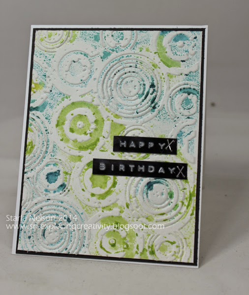
This card was literally a 5 minute card to put together.  Inspiration seemed to have left the building so when another teen boy card was needed at the last minute I went through the pile (quite sadly, that is a literal description) on my desk and came up with this rejected background that was made while I was playing with the stamping with embossing folders technique.   On this particular piece, I believe (ahem.  I am a TERRIBLE detail blogger lately!! I'm guessing here as to what I did!!) I used the Distress Stains again, but this time I actually ran the embossing folder through my Big Shot to emboss the image.  The stains seemed to dissipate, leaving a more blotchy, random look.  I grabbed the piece, trimmed and then using my "old style" label maker, punched out the sentiment and used the mini stapler to add a little extra to the simplicity of the piece.


For the LIFE OF ME, I cannot get a decent photo when I use this label maker!! I don't know if it is the shine of the tape, the shine and combination of the raised lettering, but my camera just can't seem to focus on the whole picture!  Apologies, but hopefully, you get the gist of the idea!!

A splash of color.  Embossed, raised background.  A simple sentiment/embellishment combination. A quick card but for a young teen who was probably more interested in the gift card inside.  Works for me!!  Maybe I should call this reality stamping, LOL!

A 5 minute card and a 5 minute post!!  Laundry and Back to School Night on the agenda now!!

'Till next time...................remember that some times rejections can lead to other opportunities!!


Saturday, August 16, 2014

Embossing with Distress Stains

Hey People!!  Can you believe it is the middle of August already?!!  This past week has been dedicated to trying to get this house under some type of order before the Kiddos start back to school next week.  Needless to say, I didn't get as much accomplished as I had hoped, but a couple of steps in the right direction will make the To Do List a bit easier to manage, I hope!!

I am sharing yet another card that uses the stamping with embossing folders technique  that I have used on the last three cards I have shared. On this particular card, I used Distress Stains instead of paint for my background medium.  I also went for a more masculine look, which, if I do say so myself, turned out quite well!

Due to an unfortunate idea gone horribly wrong, I was left with only a portion of my original stained print. I made the best of what I had left and went for a minimalist look.   Rather than leave the panel whole, I cut it into strips to break up the pattern just a bit.  The dies are from Cottage Cutz.  Clean and simple and perfect for a masculine card!!

I apologize for the slightly blurred picture.  Once again, my last minute photo sessions and not downloading immediately to check out the outcome has become my nemesis. 

That's it for me today. I have two cards that need to be made tonight; one for a teenage boy and a baby shower card.  No time to chit chat as one is needed by tomorrow afternoon and the other Monday afternoon.  One would think that I would quit this procrastination creating, LOL!! 

'Till next time...........................

Saturday, August 9, 2014

LOOK!! More Butterflies!!

Hello there!!  It's been a bit longer than I had planned between posts, despite the fact that I actually have a couple of cards that I have made and need to share.  Ahhhh!! The joys of being busy!! 

After my last card, it would appear that I had a rough time branching out from the butterfly genre.  I needed another teen card for a young lady mere days following the panic creating for the last birthday celebrations. Those creations can be found here and here, for those of you who may wish to refresh your memories or get a gander for the first time.  

I usually try to create cards that are not overly "girly" for the fairer peeps of my boys, as I would rather they not be embarrassed to give the cards.  

Not to mention that if one is going to embarrass their children, one should be able to see them squirm, am I right?!!

Despite my best efforts this card turned out to be a bit more "girly" than I was aiming for. BUT!! I used the last of my scraps from the papers made for the previous two cards and I got the card done fairly quickly, which in itself, is rather a miracle.


I apologize for the poor lighting of this card.  I took the pictures just before leaving to take the youngest kiddo to the party and didn't have time to download to make sure I had something presentable. You will just have to use some of your creativity to "lighten" the card to a brighter shade!!

As I said, the making of this was fairly simple.  I dug through my hoard and found a box of Glimmer Mist Masks and spritzed with a combination of light pink shades of Glimmer Mists. 

Would someone PLEASE let me know why I even own PINK Glimmer Mists?!!! It is driving me crazy as to why I would have purchased these colors!! But, apparently, I'm using them, so maybe I'm more of a "pink" type of gal than I want to acknowledge! 

The butterflies were die cut using a Tim Holtz die and a Martha Steward punch.  A bit of bling for the bodies.  Stamped the sentiment, adhered the butterflies with rolled glue dots down the center of their bodies so that the wings could be bent and popped up for "flight".  The front panel was cut slightly smaller than the card base and popped up with some dimensionals.

Easy peasy.  

I promise that my next couple of cards will NOT have butterflies, LOL!! In fact, I'd say they are at the opposite end of that spectrum!  

'Till next time................................

Monday, July 28, 2014

Winged Birthday Wishes

Hey there!! Today I thought I would share the second card I made using the same background technique I shared in my last post  but in a different way.  If you followed the link to the video of the technique  you will recall that it was recommended to use water color paper for the background. Call me a rebel a curious soul, but I wanted to see how the technique looked on different papers.  I used a heavier paper, (sorry, I think it was from Walmart.  I no longer have the info on it as it was a NEED STURDY PAPER NOW purchase and I was willy nilly in throwing away the information), along with the water color paper to compare the outcomes.

Recommendations are a good thing.  I liked the outcome of the technique better on the water color paper.  Much crisper image, but if you are looking for a more "water colored" or slightly more imperfect image, try it on card stock.  I'd be interested to see how the images compare from heavier weight to lighter weight card stock too.

Anyhoos!! I decided to use the results from the card stock paper with some punches.


I wanted a very light background paper as the butterflies added quite a bit of pattern on their own.  Again, the card size is a bit larger, 5x5.5" (?).  And I have NO IDEA what retired paper pack I used from my stash on this card as I had pulled out just about every pad I own trying to find a subtle background that wouldn't  distract from the butterflies.  Geesh.  I'm really slipping.  Obviously I'm not pushing any specific products, LOL!! I'm quickly becoming the antithesis of a design team member!!  I DO know that the punches are a combination of Tim Holtz, Martha Stewart and retired Spellbinders.  And the sentiment is retired SU.  Inks are the same as the last card: 
Distress Paints in Fired Brick, Spiced Marmalade and Wild Honey.  A mixture of Glimmer Mist Pearl and Luminarte Radiant Rain Pearl Blue. Embossing folder Sizzix Tropical Paisley.

I tried to get a photo of the shimmer on these winged wishes, but I couldn't capture the subtle shimmer. 

More shimmer to come!!

'Till next time.........................I hope you have a fabulous and creative week!! 


Sunday, July 20, 2014

Using my Inspiration Boards

How many of you utilize Pinterest?  I LOVE, love, LOVE Pinterest! It is a smorgasbord of unending inspiration and ideas.

And, believe it or not, I actually make recipes from ideas pinned and use my inspiration boards for ideas when creating.  Now if I would actually use the organization and cleaning pins!! snort!!

This past week, I have had to make a total of FOUR  cards in a span of a couple of days.

Four cards.  In a span of a couple of days.  People, I haven't created four cards in a MONTH in a very, veryveryvery long time!!

I needed two cards for office birthdays that we were celebrating the same day at an office lunch.  And, I got asked to make the cards the day before the lunch.   Of course, my creative mojo decided it wanted a vacation.  My Pinterest Inspiration board to the rescue!!

Basically, I took the easy way out and CASEd (copy and stole shared everything) of this fabulous card by beesmom on Splitcoaststampers. , but I had to do it with a twist as I couldn't find a die large enough to cut a frame to fit the  enlarged card size needed for all the office to sign and hold the gift certificates.

And I had a slight problem cutting down on the background!! I REALLY liked it! LOL!!


I wish you could see the shimmer on the background.  Very slight, but eye catching in person! I popped up the main images with dimensional tape to add an extra pop.

Details:  Cards size.  I honestly don't remember. I believe the base was 5"x 5.5".  Distress Paints in Fired Brick, Spiced Marmalade and Wild Honey.  A mixture of Glimmer Mist Pearl and Luminarte Radiant Rain Pearl Blue. Embossing folder Sizzix Tropical Paisley.  Dies: Tim Holtz's Garden Greens, Sizzix Bird w/Leaves and Flower.

The technique video that I used for the background can be found here.

I will share the second card I made using this same technique but in a totally different way in a few days! 

Until then................use those inspiration pictures and create!

Wednesday, May 28, 2014

Patterns

Believe it or not, I have been trying to get this card posted for over a week now!!  

It would seem that my secretary tends to overbook the calendar. I really need to fire her.  

Oh wait.  That would be me. 

Can one be fired from a job that one doesn't get paid for?

Sigh.

At any rate, I made this card for a fellow paper crafter, who just happens to be our office PR gal. We celebrated her birthday last week.  

I originally had just planned to use another print from this particular paper pack that had these wonderful flocked/raised flowers on it.  I was running short on time and was going to let the paper do all the work for me.

Then, I had a brain freeze and decided to embellish the card myself.

 No, I prefer to think that I took advantage of the excuse of needing to make a card to carve out a bit more creative time.  

Or, I had a brain freeze. 


The 5 inch square card base is Gina K's Pure Luxury 120# in Ivory.  I then ruined utilized several pieces of black paper in my attempts to try and punch out the decorative border, keeping a straight line.  I obviously failed and after the millionth attempt, (only a slight exaggeration, I assure you), I gave up and figured no one would notice the uneven framing of the patterned paper (from an old DCWV paper pack) but me.

The flower was die cut from some bright, rich red metal that a friend gave me.  I could not capture the actual color with my photo or correct with my limited photo editing skills.  The flower was die cut using the Tattered Florals Die.  I used a decorative wheel and the Cuttlebug Swiss Dots embossing folder to make the pattern and lightly sanded with a burnishing block.  

I had figured out that I could stamp on the ribbon BUT! Alas, another brain freeze attacked and I adhered the flower (with E600 glue, no less) prior to the stamping.  That rendered my trusty stampamajig useless as I could not bend up the petals enough to place the jig where I needed it to make sure my stamping was straight.  After several failed attempts to fashion a more narrow jig from Legos that actually worked correctly, I finally stamped on some velum paper and adhered with velum adhesive to the ribbon.

Note to self:  DO NOT USE YOUR PRECIOUS METAL FOR CO-WORKER'S CARDS!!!  It would seem that when other co-workers are signing the card, they don't appreciate the the delicacy of embellishments.  This poor flower was smooshed, smashed, bent and crumbled every which way!! 

That's it for me today!! I now need to change the creative gears and try to come up with a card for the Oldest Kiddo.  It would seem he needs a b-day card by Friday!!

Nope.  No panicking here!!

'Till next time!


Sunday, February 23, 2014

Red, Turquoise, Box?!!

There are some days (weeks) that I am amazed that I am even able to complete a project.  Not because of time restraints, but because my brain continually zigs and zags all over the creative route. I start out with one idea, then ZIG! Another idea leaps in, changing the path. I go along happily on the new path and ZAG!! A major rut cuts down the path, resulting in another detour.

This creative endeavor is a prime example of my wandering creative journeys.  I started on a path for a birthday card that included red metal altered with alcohol inks against a design paper that brought thoughts of a sunny blue sky with wispy clouds floating.

ZIG!!

Found a few jewelry trinkets that I decided would accompany the  birthday card.  Just so happens the jewelry was turquoise and leather.  Okay, switched gears a bit and decided to make the card coordinate with the gift.  Got out some new metal, paper and accents.

For the life of me, I just struggled with the card.  While I liked the elements for the card, I could not escape the feeling that something was "off".

ZAG!!

Detour number two took me from a card to a box to hold the trinkets.  Ahh! Yes!! Finally! I could see the path through all the weeds!!


Supplies:
Box: from my stash
Paper:  (from my stash):  From Fabscraps Shabby Chic Romance
Metal:  Ten Second Studios  Peacock and Dark Chocolate metal.  Kabuka mold #13. Decorative wheel and fine tip refiner
Embossing folder: Cuttlebug  Swiss Dots
Dies:  Tim Holtz's Tattered Florals and Garden Greens by Sizzix
Other:  SU Antique brad altered with Copic marker.  Suede ribbon: stash.  Brown Paint 
Adhesive:  Glue and Seal, Beacon's Glass, Metal and More

The flower creation was totally inspired by Lin from Yours Artfully .  She graciously allowed me to create a tutorial based on her flowers for SCS a while back.  The step by step photos can be seen here on the SCS resource page or the video below


'Till next time.........remember the path we start out on may not be the path we actually travel!!


Saturday, February 15, 2014

Ode to the 1920's.....and the '80's?!!

Windows are open. Cherry trees are blooming.  Short sleeves are becoming the norm.

Somehow it is hard to fathom that most of the country is blanketed in snow when it would seem spring has sprung here!!  While I looove the warm temperatures, we are so going to regret not getting any moisture this winter once all this new growth starts to brown and burn!!

I really didn't pop in today to gloat  talk about the weather we are having.  I actually made a card.

Twice, in ONE month.  

Miracles never cease!!

Oldest Kiddo once again needs a birthday card for a classmate's celebration later this evening. Once again, it would seem the card request is for a young lady.

I'm beginning to think that only girls at this age have birthday parties.  It would appear to me that the guys just pound on each other, give a fist pump and figure that meeting at Del Taco is a good enough celebration.

Or, maybe, it is because 17 year old boys can not be bothered to "plan"  events.  Events would require thinking beyond what their next meal/snack is going to be. And possibly moving from the sprawled position on the couch.  

I digress.

 I usually try to make birthday cards for the young ladies a bit more CAS (clean and simple) and not overtly girly, so that the Kiddo doesn't cringe in giving the card.  Now, "A" is a young lady who likes the drama. Not drama as in "roll your eyes AGAIN" drama. But as in, the theatrical presentation of everyday life.  One can count on "A" to not be afraid to step out on the stage and PERFORM! LOL!

Case in point.  Tonight's birthday theme is the 1920's.  Everyone is to dress from the '20's and be prepared for a dinner/mystery party.

"A's" catch?  She has assigned each guest a role to play.  BUT! The guest isn't suppose to dress up as that role. They are to dress up representing the 1920's.

Example:  Oldest Kiddo is to pretend for the evening that he is an '80's hairband rock star.

Yeah.  Not sure how that is suppose to work, but I'm not 17 any more so I expect I'm not suppose to figure it out!!

So, I had the idea to step out of my little CAS girly box and be a bit more dramatic in the presentation.

I must have succeeded. I got a "Whoa!  Now THAT's cool!" reaction from the Kiddo himself.


This card is a collection of hoarded supplies.  I've challenged myself to use up my vast supplies versus buying new stuff that I no longer have the space to store. While it pains me to cut into papers I just love to look at and use embellishments that other's might not appreciate, it is beyond ridiculous that I fight using it.  Plus, if I actually use the stuff I already have, that means I can buy NEW stuff, right?!!  

This paper pack, from Graphic 45's Curtain Call, is probably one of my all time favorite lines from this company.  I am so sad to be down to only a few scraps.  I actually combined it with a couple of hoarded sheets of Bo Bunny paper for the background and flower. I have had this paper stashed away for so long that I no longer recall the paper line as it would seem I had trimmed off that information at some point in time. I even dug out an old antique brad from my SU days and used my treasured film strip ribbon.  

The feathers?  Another hoarded craft supply from who knows what kiddo project!!

I'm going to go finish another card that uses more treasured supplies.  I just might need therapy after this weekend to get through this painful trial of letting go! 

'Till next time................


Saturday, August 24, 2013

Using Up Some of Those Hoarded Supplies

Helllllo!! Well, summer is officially over now as the Kiddo's started school this past week. Now, I get the pleasure of trying to figure out three different schedules again!! The sport practices are what throw me for a loop!! All three boys are involved in one or two different sports, so keeping track of who is where and when can get my head a spinnin', LOL!

I needed to come up with yet another masculine teenage birthday card this weekend.  Of course, MoJo decided to throw a little fit since I've neglected her for a while and decided not to cooperate when I needed her most! Go figure!! You would think that by now I'd realize that I am not one of those who can just turn on the "WOW" creative juices on a whim!! I need to keep that line dripping at all times or it takes a while to get the wheels turning again!!

I had a very vague idea floating in my head, but have to admit that the supplies (or lack of) dictated that I forge a different route.  While not the direction I would have preferred to go, given my last minute ahem! deadline and lack of MoJo, I'm thankful that I got a card made and used up a bit of of chipboard pieces that I have had in my stash forevah!!!

I started with some Pure Luxury card stock in Ivory, because much to my dismay, I discovered that I'm out of white!! YIKES!! I dripped a couple of drops of Distress Shabby Shutters and Tumbled Glass on my craft sheet and spritzed with water.


Using an old toothbrush I splattered the watered down ink on the front of my card.


I did a little sponging around the edges of the card with Distress Ink Vintage Photo.  I then decided to keep things simple and adhered some old DCWV chipboard embellishments and idea-ology alpha parts Ransom numbers that I swiped with Distress Paint in Picket Fence.


Not necessarily a WOW card, but it rated a "That's cool" from the Youngest Kiddo, so that must count for something!!

Now I just need to keep that trickle of ideas going!!

'Till next time.................hope you have a creative week!!

Sunday, July 14, 2013

The Process of Creating

The Oldest Kiddo has been invited to a classmate's 16th birthday bash this weekend, which resulted in a swift kick in the rear to clear off enough space on my desk to make a card.  To make it more of a challenge, the party is in honor of a lovely young lady.  

Eeeaaak.  A sweet 16 card that can't be so girly that my son is uncomfortable in giving her the card.  

During the process of creating this card, I made an enlightening discovery.

It is now understandable as to how I can take HOURS creating a simple card and have a huge mess made in the process.

I thought I share just a teeny tiny behind the scene look as to how my brain functions when I create. I will spare you the complete process, as I'd hate to put anyone's creative mojo into shock.

The Sweet 16 celebration is to take place at the beach and the invitation had a wonderful color combination of soft sea green and a blue/teal, which I used as my starting point.  Went through all my "beach" stamps and decided that they were either too cutesy or not what I envisioned for a 16 year old.  Pulled out a couple of old SU retired stamps and had the idea to go a bit more trendy with a more geometric type look.

I then pulled out some distress inks and smooshed (technical term) them randomly on my craft sheet and spritzed with some glimmer mist.

Nope. Didn't like the look today.

Then I took Glimmer Mists in Honey Dew and Patina and spritzed on my craft sheet.  Smooshed (that technical term again) my paper in the mist and came up with a background that I liked.


PERFECT soft, sea foam look I was going for!! 

Then I stamped the sketchy circles from SU's retired So Much set using Memento Rich Cocoa ink.  Added the circle dot stamp with Distressed Tumbled Glass.


And here is the final project


Did your head spin 360 degrees?!!

Yeah.  This is how my brain works.  I start out with one idea, then I go off on a completely different path!  

After I got the first basic background done, I die cut the numbers and wasn't feeling the groove. Dragged out several different paper packs and nothing was bringing that background to life. Mind you, this is after cutting SEVERAL different colors of card stock for the base and matting layer thinking that would help the creative flow.  Nothing was flipping that "OH YEAH" trigger.  I think the background had turned out too grungy or masculine for this particular young lady.  So, I started messing with different ideas on scratch paper (I'm a slow learner). I liked the sketchy circle, I just had to find a way to use it in a more feminine way.  Finally, the idea to use SU markers in Rose Red and Old Olive randomly on the stamp clicked with the die cut numbers. First tried making the flower in a solid red, but didn't like that.  Went with the basic white with a bit of Rose Red sponging on the edges.  Stamped the sentiment in Old Olive, cut the flag banner by hand and sponged the edges and curled it.  Got everything all layered for Oldest Kiddo's approval before final taping was done.

Oldest Kiddo;"Oh. That's cool. Thanks Mom."

Showed him the original background.

Oldest Kiddo; makes weird face. "Nah. I don't like that one as much. It doesn't fit *L and I think it is too busy.  I like the white better."

Smacking my head.

Details:  Card base and white layers:  Gina K pure luxury card stock. DP:  Basic Grey Sweet Threads. Stamps:  SU (retired) So Much and Celebrate Everything. Inks:  SU Rose Red, Old Olive.  Dies:  Spellbinder's/Donna Salazar Rose Creations.  Tim Holtz/Sizzix Word Play.  

'Till next time.........let the creative path lead where it may!

Wednesday, April 24, 2013

Be Yourself

Hey there Peoples!! Today is my last day as guest DT on the eP blog.  I started out with the idea of exploring a more layered mixed media journal page and ended up with more of my usual style of  CAS (clean and simple) mixed media canvas instead!! LOL!

AND I used PINK!!!  

I am dying of laughter on that one!! I find it beyond amusing that I titled this project "Be Yourself" and I used PINK!!! BWHAHAAA!!

 Yes, for those of you who may not know, I am sooo NOT a pink type of gal but for some unknown reason I reached for some pink stains and inks on this one!!


I hope you will visit the eP Blog  to see more details about this "girly girl" project!!

Wednesday, April 10, 2013

Canvas Message Board

I am so thankful that Kim from eP invited me to be a guest DT for the month of April.  My creative wheels have been turning in over drive!!  

This week I'm sharing how I altered an 8 x 8" canvas board to create a message board.


I hope that you will head over to the eP blog  for more details as to how I made this!!

'Till next week.....make sure you add some creativity time on your calendar!!


Saturday, June 30, 2012

Steampunk Time

Wow!  Thanks so much for all the wonderful comments you have all left in regards to the retirement of the 
E-Team.  Knowing that you all found inspiration in what we all shared is humbling and inspiring to keep on creating!  There is still time to leave a comment and be considered for the chance to win the generous blog prize of some yummy Ten Second Studio metal and molds!  Comments can be left here until Sunday!

While I won't be a design team member anymore, I'm not going anywhere! I'll still be around sharing bits and pieces of what grabs my creative fancy!  

Today, that fancy would be a card.  I was asked by the front office gals to make the office birthday card for one of the assistant therapists.  *L has a bit of an eclectic side to her, so I went with Graphic45 and a Steampunk theme. 

Because one can never go wrong with Steampunk when thinking eclectic, in my humble opinion.  


Card details:  Base is Gina K's Pure Luxury Ivory in 5 1/2" square.  Graphic45's Steampunk Debutante Collection for all the design paper elements.  I used Tim Holtz's Idea-ology Timeworks mask with Distress Ink in Antique Linen to sponge the large clock on the background.  I adhered scrap portions of the butterfly border to Wendy Vecchi's Blackout modeling film, cut them out and heated to shape.  The body's of the butterflies were then attached to the border using some Glossy Accents. Sponging with Distress Vintage Photo ink was done along the edges of butterfly border and the background border.  The butterfly border was then adhered with dimensionals to give more of a "framed" look.

I stamped Unity's Itty Bitty Time Flies onto a scrap piece of the Graphic45 paper and covered with Glossy Accents.  Due to an impatient glitch on my part, I had to apply another layer of the glossy accents to try and smooth out my "oops".  It's not perfect, but I did not have time to do it over, so it is what it is!!  

The wings were die cut from TenSecond Studios Rock Star Black metal using Tim Holtz's Alterations die Heart Wings.  I then embossed the wings with an embossing folder (sorry, I don't have the name on the folder...it is a Cuttlebug folder) and sanded off the raised portion, exposing the aluminum.  The Time was adhered using a double layer of dimensionals.  


Lousy picture, but it does show the dimension of the butterflies!  I like the fact that these butterflies will NOT get smooshed!!

I hope you are enjoying your weekend!  I got to take a nice long walk/hike (we did a bit off trail!) this morning with friends and now I need to the disaster zone that was once my kitchen!!  

'Till then....enjoy some creativity!


Wednesday, April 25, 2012

Inspired By

TODAY IS THE DAY!  The BIG reveal of the project you have all been anxiously awaiting! Just go with my disillusions here! hehe.   The E-team is starting a new series that I think we will all enjoy and hopefully grow from!

This new blog hop is featuring our own personal journals as we embark on a journal that is
INSPIRED BY WORDS.

Visit each E-Team blog participant and leave a comment between today, April 25 to Sunday, April 29th for the chance to win a $25 eP gift certificate.  Winner's will be announced on the eP blog, Monday, April 30. PLUS!!  Join the E-Team in our journal adventure and post your journal cover on the eP blog by May 4th and we will pick 2 people to join us next month for the next journal adventure!!

ME!

I'm really excited about this new series!  I have been wanting to do an art journal for a while, but just never jump off the ledge. Add my love of inspirational words and this series has become the icing on the cake!  I'm so glad the Daisy snuck up behind me, and shoved! LOL!

I decided to make my own journal book instead of buying one.  My thought is that this will allow me to add what ever type of base paper or medium I would like to work with for that particular entry.  And I can add as many pages as I can fit my binding rings around! haha.  For my journal cover, I wanted to combine a couple of my favorite mediums; paint, metal and most recently, Ice Resin.  I started with a couple of Zutter book covers and painted a base coat of TenSecond Studios Verday paint in Bronze.  

Tips:  shake the paint well before applying.  The Verday paint is an acrylic paint that has actual metal particles in it.  You want to make sure that those particles get dispersed from settling on the bottom of the bottle.  

After letting the base coat dry for a couple of hours, I took a rough sea sponge and lightly dabbed more VerDay Bronze paint randomly onto the cover.  Immediately, while the paint was still wet, I misted with the VerDay Patina.  I put my Verday Patina into a cheap, fine mist bottle (like "hairspray" bottle), found  in the area where travel sized accessories are at Target.  
Let the Verday chemically react with the paint overnight.


After drying, I felt that I had gotten a bit heavy handed with the sponging/VerDay and had too much patina. I then just took my course sea sponge again, dipped it into a bit more VerDay Bronze paint, dabbed off on a paper towel and "dry" sponged randomly on the top of the covers to add more copper

Here is a picture, deliberately angled so that you can see all the wonderful metallic bronze shine


I have to say, I hated to cover up all this wonderful patina!!  LOL!  But cover it up I did!  Here is the cover to my journal.


I die cut various layers from the Tattered Floral die and from Spellbinders Carnation Creations from TenSecond Studio's Barn Red metal. I ran some of the flower layers through the Big Shot with an embossing folder and some layers I just hand doodled squiggle lines and others I used a decorative wheel tool on the metal to make patterns.  I then intensified the color with some alcohol inks 


I then shaped the flowers and applied a thin layer of Ice Resin to both sides of the individual layers using a small paint brush.  I recommend wearing gloves for this step.  It gets rather messy and you will get Ice Resin on your hands while trying to paint both sides of the petals.  I left a small portion of the bottom of the flowers unpainted so that I could set them down on my craft sheet to dry.  I was hoping that the Ice Resin would harden the metal enough that the flower petals would be more stable and would not bend as easily.  The Ice Resin DID help stabilize the metal.  I'm thinking that if I were to add another layer, it would make the metal really solid.   After letting the Ice Resin cure for a couple of days, I glued the layers together with Beacon's Glass, Metal and More Permanent Glue.  This is the first time I have used this glue and I was pleased at how relatively quick it set. I would highly recommend using it in a well ventilated room though! It has a bit of a strong odor!

The leaves were die cut using a combination of Spellbinders Carnations Creations and Foliage from TSS's Peacock metal.  


Here is my tutorial , with a video link for making flowers out of metal.  

And a close up of my "first" journal entry.  


The journal entry was typed on the computer, then each word cut out and sponged with Distress Vintage Photo ink.  I cut off a flap from a cardboard box, saturated it with water and peeled off the smooth layer of cardboard, revealing the rough layer underneath.  Distress Stain in Picket Fence was randomly applied.  The words were then attached using glue dots.  

The final touch was adding some swirling bling from Want2Scrap.  

I also finished the inside of the cover. 


I like to think that the TOTALLY different look is reflective of what I hope to accomplish with this journal.  No preconceived ideas.  No limits.  Just go for it.

I first covered the inside with Claudine's gesso.  I didn't really worry too much about how thick the coverage was.  Since I was totally impatient, I heat dried the gesso with my heat gun.  I then dropped random spatters of alcohol ink onto the gesso and hit them with a blast of canned air, dispersing the inks.  A light mist of Tattered Angels Glimmer Mist Tuscan Sun  was added on top.  After drying, I stamped the sentiment from Wendy Vecchi's I Am My Art set, using Archival Jet Black Ink.  Tip:  I would HIGHLY recommend that you do the inside of the cover before completing all the dimensional work on the outside.  It would make getting a clean, crisp stamped image soooo much easier and you will be able to avoid having to go over the stamped image with a black Sharpie.  Just sayin'.  

I'm really excited about this new adventure!  I hope that you will check out all the other E-Team's journal cover's and be inspired to join us!!


Saturday, March 24, 2012

Pigs are Now Flying

When I create a card I tend to over think.  I agonize over the colors, layout, embellishments and technique.  It is only once I start the actual creating that I will let things flow.  And then I tend to get sidetracked with thoughts of "WAIT!! Maybe I should try this!! NO, WAIT, this other idea would be better!! AHHA!! This LAST idea is the best yet!!"

Needless to say, creativity does not get completed quickly here.  I would say hours versus minutes is more the norm.

But!! Today, I went off that beaten path and created a card in under 15 minutes, with at least 5 of those minutes attempting to get a decent stamped image. 

And so Pigs are now flying as I NEVER thought I could actually make a card this quickly.

Layout:  Simple
Colors:  only two
Technique:  Fun and could easily become addictive

Result: 
Don't know what is going on here.  My edited photo is in focus.  When I click on this photo for a larger view, it is in focus.  This is NOT in focus.  I highly suggest clicking on the picture for a in focus view!

Details:  Card base is top fold, 4.25 x 5.5" of Pure Luxury.  The next layer is SU's glossy card stock that I dripped Alcohol Inks in Sunshine Yellow, Red Pepper and Butterscotch on and blasted with some canned air to spread out. I then embossed the inked paper in the Alterations Rays embossing folder. FYI:  the texture fade folders on CRAZY SALE at ep!!  The circles were cut and embossed from SU's Summer Sun and Real Red card stock using Spellbinder's Classic circles.  The sentiment is from SU's retired set So Many Scallops. I used Summer Sun, Real Red and Basic black markers to ink up the image and stamped onto a scrap piece of Pure Luxury. 

I'm thinking that I need to stop over thinking!!

Friday, January 20, 2012

Getting the Faux on..........

Hey People!  The E-Team is starting the New Year with a New Series:  Getting Your Faux On!! 


Of course, it wouldn't be an E-Team hop with out some goodies!!  All you have to do is leave a comment on each Team member's blog for a chance to win one of  THREE $25 eP gift vouchers!  You will have from today, Friday, January 20 until Sunday, January 22 to leave a comment.  Winners will be announced late Monday, January 23 on the eP blog.

E-Team Members
Me!

The lovely Wendy Vecchi posted a fabulous faux technique, Faux Crazed Porcelain, on her blog a while back, using Glue n Seal and Rock Candy Crackle Paint.  Our fearless leader, Daisy, challenged the E-Team to use this technique and see what we could come up with to inspire you to give it a try!!   

I did a lot of experimenting with this technique.  Let me first share my project, then I'll share some tips on what I discovered.

Let's just ignore the fact that I put my cage on base at an angle.  Yes, it really bothers me, as I was wanting it to be straight!  The bent "bars" would be my failed attempt trying to correct the angle of placement after the fact.  Obviously, sometimes you just have to let those little mishaps go. sigh.

I decided to make a decor item or wall hanging.  The base is a piece of foam board that was cut to 6x6".  Two layers of Pure Luxury Ivory card stock the bottom layer is slightly larger than 6x6") were distressed and form the base.  All the decorative papers come from My Mind's Eye 6x6 pad Madison Avenue.  The fall seasonal Distress Ink Gathered Twigs was used to add distressing along the edges of the papers.  The cage was die cut from Ten Second Studios Dark Chocolate metal. It's difficult to tell from the picture, but the cage was bent to form a 3D effect off the base.   The butterflies were punched using a MS butterfly punch and Alterations  movers and shakers  Mini Butterflies. The Clearly for Art modeling film was used to add dimension to the butterflies. 


Other accessories used were Old Lace Glimmer Mist (on the base design paper and the Fleur de Lis "lace", made with the Spellbinder's die), 1/2 back self adhesive pearls (from my stash) and the decorative pearl swirls, also from my stash.  The sentiment tag is just a scrap of Ivory card stock, distressed with Gathered Twigs ink that I wrote the saying on. 

NOW for the faux porcelain!!  One of the surfaces for this technique that I tested was the Clearly for Art modeling film.  I brushed a thin coat of Glue n Seal onto the film and after that had dried, I coated again with the Rock Candy Crackle Paint. I die cut the flower pieces with the Tattered Floral die and then used the reinker for Distress Ink Spun Sugar to color the  flower.  I just dropped several pools of ink onto the film and used a paper towel to rub it into the cracks and wipe off the excess.  The color and technique seemed to hold well, even with the heating of the film to mold the flower petals. 

The center of the flower was made with a Viva Pearl Pen in Cream.  I colored it with Copic markers to match the flower. 

The leaves were done the same way, only I used a transparency sheet from Office Depot for my base. 


Let me share some tips/tricks with you that I learned while exploring this technique.

Surfaces:  This technique works on a variety of "slick" surfaces.  I tested it on glass, transparency and Clearly for Art modeling film.  You MUST use the Glue n Seal (or perhaps Elmer's Glue) for a base for the crackle paint to adhere too.  Otherwise, the crackle paint will rub off!!  A thicker layer of crackle paint will yield larger cracks, but I have found it takes a VERY thick layer to get large cracks.  You can speed up the drying process with your heat gun once you notice the cracks appearing.  Just beware that if you happen to hit a thicker pocket of paint, it may bubble with the heat gun.  It can sometimes result in a different texture than the rest of the cracks.  I'm not sure if that is from the paint or perhaps the glue bubbling. 

I also tried this technique on Ten Second Studio's metal, using the same methodology. While the technique works on the metal, I found that the cracks were sooo fine, that they were difficult to see with the shine of the metal. And I'm still experimenting as to what type of inks I could use to highlight the cracks more. I really wanted LARGE cracking on the metal versus the fine cracking that I was getting more often than not. So far, I have found that it takes a VERY, VERY thick coat to crack large on the metal, but that is not consistent. I also tried to speed up the drying process of the paint, once cracking was noticed, with my heat gun, but it seems to have a reaction with the glue/paint/metal and results in a change in color of the metal. I will be experimenting more with this technique and metal and will let you know what I come up with at a later date!!

Coloring:  Surprisingly, Distress Stains and the Distress ReInkers seem to color the faux porcelain without rubbing off.  I found that I could get a second layer of color on if I allowed the first layer of color to dry.  I still need to test permanent inks to see how those will color.  The mottling effect of darker Alcohol inks tended to obscure the detail of the cracks since the ink will adhere to the smooth surface under the cracks.  The lighter color of inks look FAB!

Other:  I also tried using the glue as a base for other crackle paint on these same surfaces.  Worked well, but you obviously don't get the transparency as you do with the Rock Candy crackle paint. 

 Tip:  If you by chance find that your crackle paint has dried up, mix in some water.  It doesn't seem to affect the crackling compound of the paint.  DO NOT  use a glaze to thin the paint.  That, DOES seem to affect the crackling!!  Also, Linda L, had a great suggestion to store your paints and Distress Stains upside down to help prevent air from getting into the jars and bottles.   Just tip the paint jars upright for a minute or so, before using them, and the paint will drip off the brush back into the jar.

I hope that you found this technique inspiring and will give it a try! 

'Till next time.................explore a new technique or experiment, with a twist, using an old favorite technique!!