TODAY IS THE DAY! The BIG reveal of the project you have all been anxiously awaiting! Just go with my disillusions here! hehe. The E-team is starting a new series that I think we will all enjoy and hopefully grow from!


This new blog hop is featuring our own personal journals as we embark on a journal that is
INSPIRED BY WORDS.
Visit each E-Team blog participant and leave a comment between today, April 25 to Sunday, April 29th for the chance to win a $25 eP gift certificate. Winner's will be announced on the eP blog, Monday, April 30. PLUS!! Join the E-Team in our journal adventure and post your journal cover on the eP blog by May 4th and we will pick 2 people to join us next month for the next journal adventure!!
ME!
I'm really excited about this new series! I have been wanting to do an art journal for a while, but just never jump off the ledge. Add my love of inspirational words and this series has become the icing on the cake! I'm so glad the Daisy snuck up behind me, and shoved! LOL!
I decided to make my own journal book instead of buying one. My thought is that this will allow me to add what ever type of base paper or medium I would like to work with for that particular entry. And I can add as many pages as I can fit my binding rings around! haha. For my journal cover, I wanted to combine a couple of my favorite mediums; paint, metal and most recently, Ice Resin. I started with a couple of Zutter book covers and painted a base coat of TenSecond Studios Verday paint in Bronze.
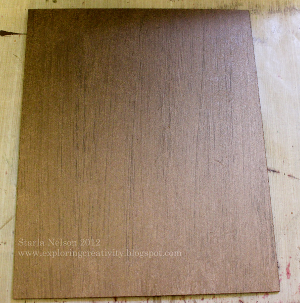
Tips: shake the paint well before applying. The Verday paint is an acrylic paint that has actual metal particles in it. You want to make sure that those particles get dispersed from settling on the bottom of the bottle.
After letting the base coat dry for a couple of hours, I took a rough sea sponge and lightly dabbed more VerDay Bronze paint randomly onto the cover. Immediately, while the paint was still wet, I misted with the VerDay Patina. I put my Verday Patina into a cheap, fine mist bottle (like "hairspray" bottle), found in the area where travel sized accessories are at Target.

Let the Verday chemically react with the paint overnight.

After drying, I felt that I had gotten a bit heavy handed with the sponging/VerDay and had too much patina. I then just took my course sea sponge again, dipped it into a bit more VerDay Bronze paint, dabbed off on a paper towel and "dry" sponged randomly on the top of the covers to add more copper

Here is a picture, deliberately angled so that you can see all the wonderful metallic bronze shine

I have to say, I hated to cover up all this wonderful patina!! LOL! But cover it up I did! Here is the cover to my journal.

I die cut various layers from the Tattered Floral die and from Spellbinders Carnation Creations from TenSecond Studio's Barn Red metal. I ran some of the flower layers through the Big Shot with an embossing folder and some layers I just hand doodled squiggle lines and others I used a decorative wheel tool on the metal to make patterns. I then intensified the color with some alcohol inks

I then shaped the flowers and applied a thin layer of Ice Resin to both sides of the individual layers using a small paint brush. I recommend wearing gloves for this step. It gets rather messy and you will get Ice Resin on your hands while trying to paint both sides of the petals. I left a small portion of the bottom of the flowers unpainted so that I could set them down on my craft sheet to dry. I was hoping that the Ice Resin would harden the metal enough that the flower petals would be more stable and would not bend as easily. The Ice Resin DID help stabilize the metal. I'm thinking that if I were to add another layer, it would make the metal really solid. After letting the Ice Resin cure for a couple of days, I glued the layers together with Beacon's Glass, Metal and More Permanent Glue. This is the first time I have used this glue and I was pleased at how relatively quick it set. I would highly recommend using it in a well ventilated room though! It has a bit of a strong odor!
The leaves were die cut using a combination of Spellbinders Carnations Creations and Foliage from TSS's Peacock metal.


Here is my tutorial , with a video link for making flowers out of metal.
And a close up of my "first" journal entry.

The journal entry was typed on the computer, then each word cut out and sponged with Distress Vintage Photo ink. I cut off a flap from a cardboard box, saturated it with water and peeled off the smooth layer of cardboard, revealing the rough layer underneath. Distress Stain in Picket Fence was randomly applied. The words were then attached using glue dots.
The final touch was adding some swirling bling from Want2Scrap.
I also finished the inside of the cover.


I like to think that the TOTALLY different look is reflective of what I hope to accomplish with this journal. No preconceived ideas. No limits. Just go for it.
I first covered the inside with Claudine's gesso. I didn't really worry too much about how thick the coverage was. Since I was totally impatient, I heat dried the gesso with my heat gun. I then dropped random spatters of alcohol ink onto the gesso and hit them with a blast of canned air, dispersing the inks. A light mist of Tattered Angels Glimmer Mist Tuscan Sun was added on top. After drying, I stamped the sentiment from Wendy Vecchi's I Am My Art set, using Archival Jet Black Ink. Tip: I would HIGHLY recommend that you do the inside of the cover before completing all the dimensional work on the outside. It would make getting a clean, crisp stamped image soooo much easier and you will be able to avoid having to go over the stamped image with a black Sharpie. Just sayin'.
I'm really excited about this new adventure! I hope that you will check out all the other E-Team's journal cover's and be inspired to join us!!
47 comments:
WOW! I absolutely love this journal. I have purchased the metal and it is just sitting so I will now have to get it cut. The inside cover is a great idea.
Love this cover. Must go buy the metal as it's my favorite color - a happy red. And the totally different inside. You nailed it for the "no preconceived" notion.
Thank you.
Starla, this is fabulous! I just knew all those cut out words were for a journal. Doesn't it feel great to get started?
Your flowers certainly are a great pop of color. I love how different everyone's cover is.
you are so amazing, love it congrats
Hee, hee, love your comment about doing the inside first, what you did is exactly how I would do it, the hard way :). Mostly because I wouldn't think of it until after it was all finished.
I am in love with both the outside and the inside covers. They are each so different, but so colorful and unique. I am looking forward to more of your creations!
Loving that Ver-Day. The flower is simply stunning. Can't wait to see how your journal progresses.
What fun, great pop with the lovely flowers, but the words are super cool. It's been on my list a while so maybe this will get the MOJO movin.
Thanks for the fun.
So inspirational! I love that you created your own cover...and how it really does look like aged metal. And you know how much I love your metal flowers. Great job!
Wonderful journal - love the added metal blossoms!
What great ideas you have given - Gives me inspiration for my own journal. Keep up the great work.
Who would have thought that page of words could pack such a punch when incorporated with all your lovely color! Fantastic creation my friend!
Wow, fantastic start to what will be a great journal. I love your cover and the cardboard was a great addition. Cool alcohol inking on inside cover as well.
I love the tattered flower....gorgeous!
Gorgeous cover! I love that you used the new VerDay paint.
i'd be good at what i do if i had more patience. i'm too quick to do anythiing. get 'er done... NOW.
these are absolutely gorgeous!
i love the colors you chose for your flowers & leaves. you so totally rock in my book!
hugs :)
Love your cover, the metal flowers look great, thank you for sharing.
Looks like you have started a new path, Starla, your journal covers are fabulous! Love the Patina, and the words, they don't cover it all up! Enjoy doing your journal. My daughter has been doing them for years, I am still so behind, I have started on yet! Have a wonderful day!
The patina is gorgeous! And I love the metal flowers.. I want to try them.
Blown away. Love the cover.
Wow ... those flowers are amazing, love the various textures, and the color combination is cool !
Awesome, Starla! I love that bronze patina look and I love your pieced together quote on the cardboard. And it just wouldn't be right without your signature metal flowers! I'm excited to be starting this too!
OMG!! Fabulous on the outside and inside! I'm in love with those cool metal flowers!
Great journal cover... loved the inside, too. I want to try making flowers like yours! Thanks for showing us how you did it.
This is the first I've seen VerDay. Very pretty Patina. Your cover is beautiful.
Beautiful--especially the flowers! Love it!!
Love it! The cover background and flowers are fab! And I LOVE the inside cover... all that glorious color! Yum!
DeniseB
Wonderful! Love that patina paint- looks great! And I really like how different the inside cover is from the outside.
So pretty! Your flowers are beautiful.
What a gorgeous cover! Love what you did with the flowers... can't wait to play along on this fun new challenge/hop.
This is beautiful! love those flowers.
Wow...I absolutely love the base of your cover and the red flowers pop out and make me want to try my hand at them too! The inside cover is beautiful too and totally unexpected. Thank you for sharing..I love everything about both covers!
My brain is a spinning with all the great ways you girls have done your journals I especially love your inside the cover page!! I love splatting LOL thanks and I can hardly wait to get started on mine such wonderful inspiration!
Beautiful job! Love the cover both inside and out! TFS
KimMJ
bast830@comcast.net
WOW! My gosh that Verday paint and patina makes an astob=nishing baclground! I want some right now! And I get that you must not overdo the patina right? Great journal cover!
I agree..I hated to see you cover the journal cover because the look was just stunning! But you've managed to add to it tastefully so that all is not lost.
I love the stunning red flowers, beautiful cover.
Sensational cover! The Wendy Vecchi's "Do Not Disturb the Artist" is one of my favorite stamps.
Wow I came to your blog last and can truly say the best was last. I love the look of this cover and the saying is great. I hope to one day be at this point in my own art. Thank you so much for sharing.
Wow - is all I can say - love that Verday paint and thanks for the heads up re shaking it - the patina is amazing. Your covers are fantastic - thanks for the inspiration
Wow, gorgeous amazing work here. I have a journal that I bought a month or so ago and have been too intimidated to open it! You are inspiring me to give it a shot.
OMG - what a shame to cover up that spectacular background. But your metal flowers are beautiful works of art!
i love the base of your journal. thank you for sharing. rush88888 at gmail dot com
This is the most amazing thing I have seen in ages!!!(sorry, sweet Micki, but I like hers better :) I don't even know where to begin to tell you how much I love your cover. I am so looking forward to seeing what you add inside. Go forth and create. I want to journey into the depths of your creativity and be inspired. Since this is about words, the one that keeps popping in my mind is FATHOM or maybe it should actually be fathomless...
yes i agree with you I am very excited too. I am having a blast running around looking at all the journal covers and soaking in all the techniques I get to try. as well as a few more blog's that I want to follow. your faux patina looking cover is awesome. those metal flowers rule. I wish I had that die now. thanks for the ideas great hop
This is an absolutely STUNNING Journal cover! thank you for the step by steps they are chock full of inspiration...and the embossed metal flowers are so beautiful! The inside cover is equally lovely..."Do Not Disturb the Artist"...Love it! You should make prints of that...I'll be first in line to purchase one for my studio :)
Amy*
Amazing cover art! Love the colors and the patina ... and the corrugated bits and the embossed flowers and ... EVERYTHING!
Post a Comment