Showing posts with label Embossing. Show all posts

Wednesday, August 27, 2014

A 5 Minute Card

Happy Wednesday!!  I've been trying to find the time to post since the weekend, but with the kiddo's now in school full time, time has been spent getting back into the groove of after school sport practices and then directing the focus on homework.

This card was literally a 5 minute card to put together.  Inspiration seemed to have left the building so when another teen boy card was needed at the last minute I went through the pile (quite sadly, that is a literal description) on my desk and came up with this rejected background that was made while I was playing with the stamping with embossing folders technique.   On this particular piece, I believe (ahem.  I am a TERRIBLE detail blogger lately!! I'm guessing here as to what I did!!) I used the Distress Stains again, but this time I actually ran the embossing folder through my Big Shot to emboss the image.  The stains seemed to dissipate, leaving a more blotchy, random look.  I grabbed the piece, trimmed and then using my "old style" label maker, punched out the sentiment and used the mini stapler to add a little extra to the simplicity of the piece.
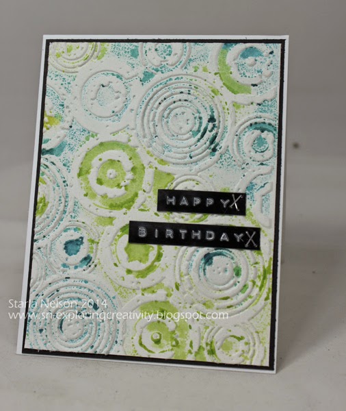

For the LIFE OF ME, I cannot get a decent photo when I use this label maker!! I don't know if it is the shine of the tape, the shine and combination of the raised lettering, but my camera just can't seem to focus on the whole picture!  Apologies, but hopefully, you get the gist of the idea!!

A splash of color.  Embossed, raised background.  A simple sentiment/embellishment combination. A quick card but for a young teen who was probably more interested in the gift card inside.  Works for me!!  Maybe I should call this reality stamping, LOL!

A 5 minute card and a 5 minute post!!  Laundry and Back to School Night on the agenda now!!

'Till next time...................remember that some times rejections can lead to other opportunities!!


Wednesday, April 24, 2013

Be Yourself

Hey there Peoples!! Today is my last day as guest DT on the eP blog.  I started out with the idea of exploring a more layered mixed media journal page and ended up with more of my usual style of  CAS (clean and simple) mixed media canvas instead!! LOL!

AND I used PINK!!!  

I am dying of laughter on that one!! I find it beyond amusing that I titled this project "Be Yourself" and I used PINK!!! BWHAHAAA!!

 Yes, for those of you who may not know, I am sooo NOT a pink type of gal but for some unknown reason I reached for some pink stains and inks on this one!!


I hope you will visit the eP Blog  to see more details about this "girly girl" project!!

Saturday, March 24, 2012

Pigs are Now Flying

When I create a card I tend to over think.  I agonize over the colors, layout, embellishments and technique.  It is only once I start the actual creating that I will let things flow.  And then I tend to get sidetracked with thoughts of "WAIT!! Maybe I should try this!! NO, WAIT, this other idea would be better!! AHHA!! This LAST idea is the best yet!!"

Needless to say, creativity does not get completed quickly here.  I would say hours versus minutes is more the norm.

But!! Today, I went off that beaten path and created a card in under 15 minutes, with at least 5 of those minutes attempting to get a decent stamped image. 

And so Pigs are now flying as I NEVER thought I could actually make a card this quickly.

Layout:  Simple
Colors:  only two
Technique:  Fun and could easily become addictive

Result: 
Don't know what is going on here.  My edited photo is in focus.  When I click on this photo for a larger view, it is in focus.  This is NOT in focus.  I highly suggest clicking on the picture for a in focus view!

Details:  Card base is top fold, 4.25 x 5.5" of Pure Luxury.  The next layer is SU's glossy card stock that I dripped Alcohol Inks in Sunshine Yellow, Red Pepper and Butterscotch on and blasted with some canned air to spread out. I then embossed the inked paper in the Alterations Rays embossing folder. FYI:  the texture fade folders on CRAZY SALE at ep!!  The circles were cut and embossed from SU's Summer Sun and Real Red card stock using Spellbinder's Classic circles.  The sentiment is from SU's retired set So Many Scallops. I used Summer Sun, Real Red and Basic black markers to ink up the image and stamped onto a scrap piece of Pure Luxury. 

I'm thinking that I need to stop over thinking!!

Saturday, February 25, 2012

Inspired Thanks

Happy Saturday!  I hope that you are enjoying the weekend.  It is GORGEOUS weather here!!  I enjoyed an hour long walk this morning (with short sleeves!!) and have the windows open!  Ahhhh!! You can't beat Southern California weather this time of year!!

I needed to make a Thank You card for the Oldest Kiddo to give to his optometrist.  It would seem that said Kiddo threw his back pack one too many times and somehow smashed his glasses to smithereens, despite having them in the case. Well, his optometrist just so happens to be the father of one of Kiddo's classmates.  He graciously took the Kiddo's glasses into work with him and replaced the lenses, saving me a drive.

The Inspiration Challenge on SCS today was perfect to get the creative gears grinding.  Today's inspiration site was the Galleria Arts and Crafts in Calgary.  I found this Raku pottery plate as my inspiration


And here is the card that I came up with from this inspiration


Card base is (?) SU's Not Quite Navy and is 4 3/4" x 5 1/2" with the corners rounded on one side with my Zutter 1/2" corner rounder.  I embossed a piece of brushed copper card stock (from my stash) with Sizzix Texture Fade Sheet Music.

For the main image, I started with a piece of Pure Luxury Ivory card stock and made a masked for the "moon" out of scrap paper.  I then randomly squished (that would be the technical term) Encore metallic copper ink on the paper.  I then applied Distress Stain in Broken China twice, drying between layers with my heat gun. I then used some Distress Ink in  Faded Jeans to darken the blue areas even more.  Everything was then spritzed with Tattered Angel's Glimmer Mist Abominable Snowman. 

The heron is actually a line stamp from Just for Fun Stamps. I stamped the image and then used a black marker to fill in all the open space.  I then free handed the grasses around the heron. 

At this point I totally messed up my outline of the moon.  Soooo, I cut out another "moon" lightly sponged it with Distress Broken China ink and adhered it over the previous moon.  This meant that I had to use my stampamajig and re stamp the heron. Sigh....

The sentiment is from Stampin' Up (?) All Year Cheer.  I stamped it on a scrap piece of Pure Luxury Ivory with Ranger's Archival Ink in Jet Black.  I rounded two of the corners, lightly sponged more Distress Broken China along the edges and adhered. 

This is a little different than my usual, but I rather enjoyed going a different path!!  Sometimes it's good to get off the beaten path!!

I'll be back later this week with the E-Team!!  We've got another hop in the works for you!!  'Till then.....

Wednesday, November 23, 2011

Merry and Bright

Hey People!  Yes, yes!  Your eyes do not deceive you!  I'm back with another project.  It is amazing how much crafting one can do when off work!

Well, I made it to the semi final round for the SCS CAS winter DT challenge!  Here is the card I came up with for this round.


Let me just say that in real life, the paper and metal match so much better!  You'd think that as much as I like to use metal in my projects, I'd figure out how to photograph the stuff better!! Haven't figured out how to avoid over exposing and glares!!

Base is Pure Luxury 4.25"x 5.5" top fold.  I started with some Barn Red metal and embossed it on TenSecond Studio's Christmas Kubka mold (Sorry, it must be currently sold out as I cannot find it in the eP store or TSS!!).  I used a small wire brush to remove the metal color to a matte finish for the background of the package and a decorative wheel for the frame.  Swiss dots embossing folder was used on the SU Real Red background.  The sentiment is from Hero Arts Joy to All, and was stamped with SU's Real Red.  Added the button and the twine and called 'er done!

Well, I'm off to go make the yearly requested cranberry salad.  I'm also thinking of making some Ooey Gooey Caramel Pumpkin Blondie's.    No one in the family is ever overly excited with Pumpkin pie.  Everyone will eat it (except my FIL), but no one is thrilled with it.  The last couple of years, I've been trying out different pumpkin recipes to take the  place of the pie. I'm thinking that you can't go wrong with caramel and chocolate added to the mix!! 

And lastly, but not the least:  I hope everyone has a safe, wonderful Thanksgiving tomorrow!  I know that I am very thankful for the visits, comments and friendships that I have made through this blogging adventure!!  

Saturday, November 19, 2011

Just Another Note

Happy Saturday, People!!  It s a dreary, wet day here in California. What is up with that?!!  But, the weather makes it easy to stay inside and tackle the holiday To Do List!!

I was editing some photos for the family calendar that one of the in-law uncles puts together each year.  While scanning through the very limited photos I have of my boys in the last year, I came across a card that I haven't posted yet.  Thought I would share today!

This was actually made for an attempt at publication.  Obviously, since I'm posting it here, it wasn't accepted! haha!  It was for a sketch in one of the popular magazines.  I had just finished my Blue Note card and as everything was still out on my desk, I had this image on the brain and it seemed to me to work perfectly for the sketch (shows how much I know, huh?!).


Let's see if I remember the details on this!!  Standard 4.25"x 5.5" top folded card base from Pure Luxury White.  The image, Hero Arts Vintage Musical Clef, was found at Michael's.  Since I lacked black embossing type ink, I first stamped the image with VersaMark, then over stamped with Archival Jet Black ink and clear embossed with Ranger's Clear embossing powder.  While I had the clear ep out, I covered strips of black SU card stock in VersaMark and clear embossed to give the black card stock a nice glossy shine.  I cut my black piano keys and set aside. 

The white piano keys were cut from SU glossy card stock.  Then both sets of keys were carefully layed out onto black card stock.

The sentiment was computer generated.  Is it just me, or does anyone else lack sentiments in just the right size and font for sentiment flags?!!  I trimmed the flag by hand and scored and adhered by the flattened area, so the the sentiment is raised over the note. 

This will probably accompany a small Christmas gift to the kiddo's music teacher at school.  I'm thinking that he might appreciate it, even if the magazine wasn't wowed, haha!

So, even though this didn't make the publication, I am proud to say that I tried.  Will I submit again?  Maybe, maybe not.  To be honest, I'm trying to make a very conscious effort to use papers, embellishments and such that I have in my over flowing stash versus buying "new" stuff.  Publication requires all the "new" stuff.  I understand that people who read and get inspiration from the magazines want to be able to find the same product.  But, lately, it just seems to me that I am wasting money on "new product" that only gets used for a very short time then is cast aside since it is no longer the IT" thing. Disclaimer:  This is not to say that I won't be buying anything new, haha!!  It just means that before buying something new, I'm trying to USE what similar "old" stuff from my stash first. 

And on that NOTE (couldn't resist!), I'm off to tackle more of the To Do List.  Fun, fun!  'Till next time....remember to take time to explore some type of creativity!!


Sunday, June 5, 2011

Still Marching for Graduation

Hey Peoples!  How is your weekend going?  We are still in the graduation mode here as we have family friends celebrating High School graduations this weekend.  I came up with another CAS (clean and simple) card that I can see being used again and again as the kiddos the Toad coaches graduate. 

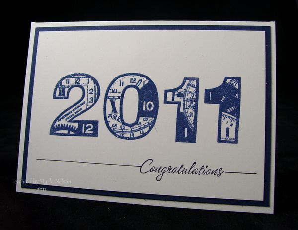
This is a very simple card to make in school colors and mass produce!  Base is 6 x 4 1/4" Pure Luxury.  SU's Real Red mat.  The numbers are from PaperArtsy (clocks 7 and clocks 8), that were stamped with VersaMark and embossed with red embossing tinsel.  In real viewing, the embossing tinsel adds a festive sparkle.  Pulled out the retired SU set of Warmest Regards for the sentiment and stamped using Archival Jet Black ink and then drew a line to weight down the main image. 

I made this also in the colors of another local high school for another family friend.  Got a little blip of ink mishap by the zero, but decided that the kiddo (being male) probably wouldn't notice or care.  I just wasn't up to redoing it, when in all likely, it will see the trash can!!


This still uses Pure Luxury for the base but substituted SU's Night of Navy for the mat.  I used Distress Chipped Sapphire ink and clear embossed. Sentiment is the same as above.

That's it for today!!  I'll be back in a day or so and share a very nontraditional graduation card! 

'Till then.......................enjoy the start of a new adventure today!

Friday, January 7, 2011

Let's Get CRRRAAACCKKIN'!


Hey People!!  The E-Team has another fabulous blog hop for you today!!  Daisy challenged us to pull out some of those goodies that we all have stashed away and GET CRACKIN' for the New Year.

Of course, Daisy also has some wonderful goodies for two lucky blog hoppers!! How's this:

TWO winners will receive a BOX FULL of Paper, a sampling of Distress Stickles & Rock Candy Crackle Paint!

It's easy peasy to get your name in the drawing!  Just visit each of the gals listed below for some wonderful eye candy and leave a comment!! Daisy will visit each blog and winners will be chosen from all the comments. 
 
 
You will have all weekend, though Sunday, to visit and leave your comments on each team member's blog and Daisy will chose the winners and announce them on the eP blog on Monday, January 10th.  
 
Today I'm sharing a an oldie, but goodie technique.  Cracked glass.  BUT!! With a little different spin on it!!


You can find a wonderfully written tutorial on Cracked Glass on my favorite resource site, SCS.  But, I thought I'd share my twist on today.  Disclaimer (you knew that was coming, right?  The author (aka ME) takes no responsibility for the blurry pictures of the following abbreviated tutorial. It would seem that SOMEONE was more interested in doing the actual project than worrying about how the photos might look!!)
 
I began with a piece of transparency (I used Office Depot's Write On Transparency) and covered it with Versamark ink.  You could also use embossing ink....this is just what I had on hand.  Cover with Ultra Thick Embossing Powder. 


Carefully melt the UTEE with your heat gun.  I kept my heat gun close enough to melt the powder, but not too close as to melt the transparency.  Repeat the above steps 3-5 times (I believe I actually repeated 4 times).  Your transparency now has a thick coating on it.  ETA:  I had a comment stating that the transparency would curl when heating.  Yes, it does a bit, especially the first layer.  But, for me, the added layers of UTEE provided a coating and made the transparency thicker and decreased the curling. 


Then stick the coated transparency in your freezer for 3-5 minutes.  Don't panic if the transparency "curls".  Trust me that it WILL flatten out again!! 
 
Immediately after removing the transparency from the freezer, carefully place it in Tim Holtz's Cracked embossing folder and run it through your Big Shot or Cuttlebug or what ever die cutting machine you use.  Don't worry about any cracking that happens to the frozen transparency while trying to put it in the folder.  It will just add to the cracked look.  The result is a clear cracked window!! 
 
How about a close up of that cracked "window"?!


Just ignore that glare off that "glass", haha
 
You would not have to run the transparency through the embossing folder if you didn't have it.  You could carefully crack the frozen UTEE with your hands.  But those "cracks" will tend to be finer cracks and I was wanting a more dramatic look......as if the winged heart had broken the glass. 

*****
 
Now for the details on the rest of the project.  I started with Wendy Vecchi's Art Parts rectangle frames and randomly applied acrylic paint in black and "maple syrup" brown.  I did this in a more haphazard fashion, not smooth lines.  After a couple of minutes of letting the paint dry, I stamped the smaller of Tim's Fabulous Flourishes with Versamark ink onto the frame and sprinkled Ranger's clear embossing powder over it and heated with my heat gun.   Hindsight:  I should have stamped in black and embossed in black so that the flourishes would show up more!


I then used my rinsed out paint brush (bristles still wet) to apply a light wash randomly over the embossed frame with "butter pecan" (tan) acrylic paint.  I immediately wiped off areas with a wet paper towel, so it wasn't so bold. 


The heart and wings were a discarded element for another project. I do know that they were cut using Tim's Winged Heart Alterations die.  The required (haha) metal piece is TenSecond Studios Spiced Rum that was die cut then embossed with Tim's Patchwork embossing folder and lightly sanded.  The heart was attached to the frame with a double layer of dimensionals under the wings. 

The sentiment, from Tim's Just Thoughts stamp set, was stamped with SU's white craft ink and embossed with Ranger's Clear embossing powder.  I added the Locket and Key with Claudine's Multi Matte Medium.

Have I mentioned that the Multi Matte Medium is becoming my favorite go to glue?  OH MY.  It takes a bit to dry, but when it does, NOTHING is going to move.  Just sayin'. 

I used my cropadile to punch a hole for the hitch fastener and wrapped some craft wire around it to hold the key.


The two panels were connected to each other with strips of grunge paper that have some Distress Vintage embossing powder and Distress Vintage ink and Black Soot ink rubbed onto it.  I used a stapler to attached them to the back of the panels.  

And the final project once again


I love the sentiment on this project!! I think I'll clear a space off my work area so that it can be a visual reminder to me to LEAP.

I hope you pull out some of those forgotten supplies and get CRACKIN' on some of these techniques the
E-Team has shared today!! 

'Till then....................remember to LEAP into some creativity!!

Wednesday, May 12, 2010

Life is like a Bicycle

Happy Hump Day, Peoples!!  Today is a busy day as I have to work and my kiddos have their spring music concert this evening.  BUT!! I've got goodies to share first!! 

Last night I got a peek at the sketch challenge on SCS and it got the creative wheels turning using some new stamps from Cornish Heritage Farms that have been waiting to see some ink. It's been forever since I've been able to play in one of the daily challenges!  I was able to get most of the card layed out late last night and finished it up this morning.  Lucky for me, I don't have to be in to work until a bit later, which gives me time to get this posted!!


I "expanded" the sketch to a square 5x5 card with SU's Kraft being the base layer.  I then made a slightly smaller Certainly Celery mat.  The Chocolate Chip layer was scored using my Scor Pal (kind of difficult to see in the photo.....my excuse is that that "photographer" has a very poor set up for late night or early morning photo sessions!). 

The "newspaper" layer was made using the wrinkle free distress technique with Distress inks in Tea Dye, Old Paper and Antique Linen.  This is my hands down favorite technique!! I LOVE the fact that I can make "designer paper" to match any project with just some ink and water!!  The Newspaper Ads scrapblock was stamped with Distress Walnut Stain.  The edges were distressed and sponged with some more Tea Dye.  The bicycle was stamped with Distress Walnut stain and clear embossed (which again, the photograph does not show!!) on a scrap piece of  "design paper".  The edges sponged with Tea Dye.  The sentiment (both  are from Bicycle Life) was also stamped with Walnut stain and again sponged along the edges with Tea Dye. The bicycle was matted on Chocolate Chip and Kraft. The sentiment was matted on Certainly Celery and Chocolate Chip. The striped layer is from My Minds Eye "Bud's Paper" (I've had it in my stash for a couple of years.  That hoarding habit finally paid off!) and was matted on a piece of Chocolate Chip.  Both the bicycle and sentiment are mounted with dimensionals. 

The final touches were to add the idea-ology "gears and "game pieces".  Dimensionals were cut and glue dots rolled to adhere those!! Supplies:  Stamps: Bike Life from Cornish Heritage Farms. Inks:  Distress Inks in Tea Dye, Old Paper, Antique Linen and Walnut Stain.  Papers:  SU's Kraft, Certainly Celery, Chocolate Chip, Very Vanilla.  My Minds Eye.  Accessories:  dimensionals, Tim Holtz's idea-ology, Scor Pal.

I have to say I absolutely LOVE how this turned out!! In real life the colors are rich and the texture from the different embossing techniques adds that extra "pop".  I think that this will be either the Toad's or my FIL's Father's day card!!

I'm headed off to work now.  Thanks for dropping by again today!! Remember to make time to explore some creativity!!

Thursday, April 15, 2010

Bronc Bustin'

Hey Peoples!! Happy Thursday! Quick post today.  I'm trying to get some much needed laundry and house work done as I have to work tomorrow and have an all day continuing education class this weekend.
 Believe it or not, I've been stamping up a storm the last couple of days.  Remember the Grandparent's Day festivities that I painted the backdrop for?  Well, belately, we decided that we really should have some thank you notes for those who donated their time to make the day a success.  So, I've been mass producing cards!
 I started out by stamping the main image on glossy paper with Distress Black Soot ink and embossing with black embossing powder. Now, my idea was to make the cards look like the background so I pulled out Distress inks in Spiced Marmalade, Barn Door and Fired Brick and did my sponging in layers.  Funny thing.  The inks blended more than the paints did and I got more of a orangish background versus the redish background I was going for (IRL the main image IS more orange....camera (not the photographer!) changed the tone!!)  I layered the image on some Basic Black cardstock and some Spiced Curry that was distressed using my SU distressing tool.  The card base is Tangerine Tango with SU's Sanded background stamped using Distress Rusty Hinge. 

Decided against embellishments as I had to make 15 of these and didn't want the cost of mailing them to go up!  Pretty simple, but I think it will get the job done!!  Supplies:  Paper:  SU's Tangerine Tango, Crushed Curry, Basic Black and Glossy.  Ink:  Distress inks in Black Soot, Spiced Marmalade, Fired Brick and Barn Door. Stamps:  SU's Bronc Buster.  Accessories:  Black Embossing Powder, heat gun, 1 1/4" circle punch, distressing tool.

I'll have another card tomorrow for the Just for Fun® Friday Color Challenge!!
Thanks for dropping by!! I hope you have an enjoyable evening!!

Sunday, March 28, 2010

Yellow Jersey

Hey Peoples!!  Hope your weekend is going good!  I'm still fighting the tail end of what ever crud I caught earlier this week (or what ever the exhaustion decided to turn into).  But!! I'm starting to feel somewhat human again and finally found the energy to put together a birthday card for my boss today.

Now, for those of you who do not following professional bicycling (gasp!!) let me just give you a little background.  In professional cycling, and more importantly, in the Tour de France, the leader of the over all race wears the Yellow Jersey or the Maillot jaune.  It it the most prized possession and in Europe, if you are one so lucky to have worn the Maillot jaune, you are considered a super star (much like how we treat the stars of Hollywood).   You may have heard of Lance Armstrong?  The guy who came back from cancer to win a record 7 Tour de France's? (we will not get into the controversary of whether or not he did it clean or with drugs.....personally, I'd like to believe that since the man looked death once in the eyes, he would not risk his second chance at life by taking something that could possibly kill him.....but I digress!)  Well, my boss is a big fan of Lance's (and cycling in general).  So for his birthday, the other girls and I decided to order the boss man a cycling jersey from Lance's Livestrong foundation (now whether or not you are a fan of Lance personally, the man has probably brought more attention to the fight of cancer in the last 10 years.  And I have read countless stories from other cyclists and those who are not cyclists of how much his foundation helped them find the information and doctors they needed to fight their own battles against this disease.  I think it is a good foundation.  I have supported it in the past and will do so again). 

Again, I digress!! (sorry, the brain is not back to functioning normally again it would appear!) So with the jersery colors in mind, the cycyling theme in mind and the fact that my boss usually gives us VERY generic cards for our birthdays (he finds it amusing to give Christmas cards for those of us with birthday's in December, Easter cards for those in March/April....you get the picture!) this is what I came up with:


 This acutally came together quite quickly.  The image of the bicycle is a stencil from Dreamweaver/Lynell Harlow.  Initially, I did the whole lightbox and stencil routine and then messed around trying to custom color the bike with my copics and the stencil still in place (now, I think that would have worked, IF I had actually tried to hold the stencil in place and had tried to color carefully, instead of doing it really quick).  After doing some investigating (and having a major AH-HAH!! moment after reading Claire Brennan's blog on using the Cuttlebug and stencils) I decided to give Claire's version a try.  I inked up my stencil using SU's Summer Sun.  Then I made my sandwich of the A plate, B plate,  stencil, 120# pure luxury cardstock in white, 4 paper shims, black embossing pad (or the spellbinder tan one) and the other B plate. I ran it thru my neglected Bug (the Big Shot tends to get used more).  I then trimmed the image, rounded the corners, matted it on some basic black , rounded the corners again and adhered that to my 5 3/4" x 6" 120# pure luxury card base.  Stamped the sentiment from SU's It's Your Birthday using my stampamajig  and Archival Jet black ink(and yes, even then, I managed to get it slightly crooked and down a hair lower than I would have liked!).  Pretty CAS and QUICK!!  Not a WOW!! card, but I think it fits the bill for the boss man!

Hope you find some time to create something today before the week is upon us again!! I'm off to work on some mass produced thank you cards for those who helped with Grandparent's day and coach the different basketball teams at the school.  Think today's key word is CAS!! LOL!! 

Thanks for dropping by again!!  Till then.......


Wednesday, November 11, 2009

Golden....

It has been forever and a day since I've done one of the weekly challenges on Splitcoaststampers.  So today I decided to combine the sketch challenge with the CAS (clean and simple) challenge which was a color challenge using white and ONE other color.  This is the idea I came up with while walking the pooch (hmmm....maybe I should try walking him more often! lol)


Did you notice the RIBBON?!!  I actually got this tied on the VERY FIRST TRY!! (yeah, I just about passed out!! I'm not getting my hopes up yet that ribbon and I can work out our differences...but I'm giving points to the ribbon for at least working with me on this!!) 

I stamped the Holly Swag from Just for Fun Stamps with Encore gold metallic ink and embossed using SU's gold embossing powder.  I filled in the stem using my new Krylon gold leafing pen.  Scored an edge around a piece of Whisper White using my Scor Pal and used the gold leafing pen to add an edge.  I then ran this piece  it thru my Cuttlebug with the embossing folder (ok, I'll admit...have NO idea what folder this is!!).  I cut out my squares (2 1/2 x  1/2 inches) and embossed an edge again using my Scor Pal.  Added gold leafing to these edges as well (gotta luv the look of lots of layers without the bulk!!).  I then cut out my main image using my Spellbinders rectangle nestabilitie and did the edge as the previous ones. 

Quick and easy!! LOL!! I will admit that the ribbon is a little more fru-fru than I consider my style (grunge to fru-fru...how's that for an ecletic collection?) Supplies:  Paper:  SU's Whisper White.  Stamps:  D2762 Holly Swag from Just for Fun Stamps.  Ink:  Encore metallic gold.  Accessories:  Cuttlebug and cb embossing folder.  Spellbinders rectangle nestabilities, Krylon gold leafing pen.  SU's gold embossing powder.  And the beautiful ribbon came from my friend Melody!!

******
On an unrelated subject.  It would seem as if my outdated computer is wanting to die.  It is still (kinda) working, but I'm having major issues with pop ups, virus warnings and my every day applications not working like they should.  I think that a new computer is in the works.  But! Just wanted to let you kow  what was going on if I disappear for a while (oh yeah!! I've prepared you all for that possibility with my flaky postings already!!  Well, good.  At least this time I have an excuse other than my over scheduling of life!! hehe)


Thanks for stopping by again!  I really appreciate all your comments.  It helps the creative juices to keep flowing!
'Till next time!

Monday, November 2, 2009

Secrets, Wisemen and Snowglobes.....

Wow!! Three days in a row! People~~I think we've made history here!! LOL!!

A while back I mentioned that I had a secret. Guess what?! I'm spillin' the beans today!

Several weeks ago, my friend Sherry (aka Yoda to me or BadSherry on SCS)asked me if I would consider becoming a design team member for Just For Fun Stamps. I was absolutely thrilled to be considered for this team made up of such incredible talent! You HAVE TO check out these ladies!!

Broni Holcombe~Splashes of Watercolor
Heidi Blankenship~Embellished Dreams
Linda Duke~Linda's Works of Heart
Sandy Sandrus~Cleverideas
Sherry Cheever~Walking on the Bad Side

Today, I'm showing off the versatility of one particular stamp used two differnt ways. First: A fun interactive shaker card:

As soon as I saw this snowglobe I knew it was meant to be made into a shaker card!!  I stamped the top of the snowglobe onto a transparency using white stazon. I cut out a frame from SU's bashful blue paper using two of my circle Nestabilities.  The snowglobe was then cut out using the same large circle nestability.  The background paper was some retired SU paper that I had in my stash and was also cut using that same large circle nestie.  I glued the transparency to the frame using Ranger Glossy accents and let it dry.  Some Martha Stewart snow glitter was placed in the center.  The snowman (also from Just for Fun!) was stamped using my SU markers in Basic black, Chocolate brown, Only Orange  for the nose and Old Olive for the scarf and hat.  I cut him out and adhered him using dimensionals to the background paper.  I carefully used dimensional tape (take off the backing to bend the tape in a circle) and adhered the frame and image together! (A great tutorial on shaker cards can be found on SCS here).  I  stamped the bottom of the snowglobe twice using SU's chocolate chip ink onto some SU close to cocoa paper.  I cut those out and adhered them together using dimensionals.  I then put the strip of coordinating DP behind the snowglobe and added the brads.  All of that was placed over the Cuttlebug embossed background and adhered to the 5x5 old olive card base.  Just a few added dots with my old olive marker and wah-lah!!  A fun card!!
Now....before someone mentions it, let me point out my MAJOR mistake!! Notice how the fold of the card is on the right hand side vs the top?  That is what happens when one decides to add the designer paper behind the image and turned the card without realizing it!! DOI!! LOL!! Supplies:  Stamps:  Just for Fun Stamps~C2937 snowman, G3374 Snowglobe.  Inks:  SU's old olive, real black, chocolate chip, only orange markers.  White stazon.  Papers:  SU old olive, bashful blue, whisper white and retired dp.  Accessories:  Spellbinders circle nestabilities, Big Shot, transparency sheet, Martha Stewart snow glitter, dimensionals, dimensional tape, brads. 

Next~ a card that could easily be massed produced for those of you who like to join me on December 24 doing 70+ Christmas cards!! BWHAHHAAA!! 

Seriously, this took NO time at all to make!! I stamped the snowglobe using Encore copper metallic ink and heat embossed the image using copper ep.  I then used my stampamajig to line up the Wisemen image (don't you just love how these different images can be used together?!!) and stamped that again with the copper ink and embossed.  I then made the medallion frame using my SU scalloped border bunch.  Spent more time trying to tie a decent white bow over the copper cording than I did in making the entire card (you'll notice that the white bow is not present.  Let's just say that we are taking some time apart to settle our issues!!).  Adhered the copper layer to a 5x5 white card base and now I have an easily mass produced Christmas card! Supplies: Stamps~Just for Fun stamps~G3374 snowglobe, B3377 Wisemen silhouette.  Paper:  SU whisper white, brushed copper from Marco's Paper.  Inks:  Encore metallic copper.  Accessories:  Copper ep, copper cording, SU scalloped edge punch.

Thanks for stopping by again today!! It would seem that I've shared the icks that I got last week with both my kids (the youngest was home last week for two days, today I've got the oldest home with a low grade fever, congestion and the blahs).  Fun, fun times!!  I'm dreading when DH gets it....ohhhh!! That will not be fun!! I'm not in the mood to deal with a "man cold"!! hahaa!!

Monday, October 12, 2009

Sorrow in Fall

Earlier this week I found out that a friend's brother decided that he could no longer face this life. I'm telling you this because I had a long discussion with *K and her feelings about this. She is a high school teacher and was wondering what she should tell her students (since they know that she lost her brother). We discussed talking about his mental outlook and how he could not see an alternative outcome when there were sooo many other options that he could have chosen (obviously, she would omit any "details"). I told her that I felt she should discuss this, his feelings, her feelings (including the anger) and the repercussions of his decision. That deep of a depression is something that most of us cannot fathom. But it exists. And so often young people (especially teens) face this, but are "brushed off" as being "moody" or are labeled as "just going through a rough time". I feel that if ONE person facing this type of mental battle, even 10~ 15 years down the road, can remember that a teacher shared her feelings and wishes that her brother had reached out for help just ONE (more) time, then maybe it will save THEIR life.

Sorry to have such heavy thoughts starting out the week! But, obviously, sorrow exists in this life and sometimes requires a special thought from us. So, here is the card that I made yesterday (on rather short notice as I decided to hand deliver vs. send it in the mail).

(Once again, I will apologize for the EXCELLENT photography of this card. Since the "creator" procrastinated until the last minute in making the card, the "photographer" was not able to re-take shots once the "proofs" were viewed on a larger scale on the computer screen)

I FINALLY broke down and bought a "sympathy" set. I have been wanting to make one of these tri shutter fold cards since it was a challenge on SCS. I went to the resources page and found the directions here. I have had this retired vellum from SU for about 3-4 years!! I wanted to use it as I LOVE the paper and I felt the leaves repeated the main image theme. I pulled out some wonderful dark metallic brown/copper paper, also retired from SU and managed to ruin one 12x 12 sheet by first making my slit wrong (I probably could have made it work, but that time crunch thing!!) and then scoring incorrectly (the Scor-Pal is wonderful...but if someone is rushing and scores incorrectly, it won't fix it! hehe) I then proceeded to stamp and emboss the main image using Encore copper metallic ink and copper embossing powder. I used my Spellbinders nestie ovals to cut out and emboss the main image (mind you, the above process was NOT a one shot deal. This took me at least 5 times to get right... I managed to rock the stamp a couple of times, ruined my embossing and cut/embossed the image crooked. Why is it what when you have a timer ticking, EVERYTHING goes wrong?!!). The vellum DP was layered over a small whisper white mat using vellum tape. The little scalloped edges on the two long panels have some piercing. The sentiment was also stamped and embossed using the copper ink and embossing powder and cut/embossed using one of my square nesties. I'm really bummed that the little details like the sparkle of the main background paper and the embossing details didn't show up in the photos. Oh well. Maybe someday I'll learn to get these things done in a timely manner so that I can take the proper time to photograph! (bwhhaaaa!! I crack myself up! That is SOOO likely to never happen!)

All in all I'd give this a personal rating of **** out of ***** stars. I like the clean and simple look, and IRL, the sparkle, and little details. And I gave myself an extra star for just getting it done! (wink!!)

This is one project of the three that are being worked on. Off to finish project number 2!!

Thanks for dropping by. And remember~~listen to your loved ones and friends. Take seriously the troubles they share as they may be reaching for help. And give them a hug. Each day is precious!!

Friday, July 24, 2009

Taking Dares

This Thursday started the Dare to Get Dirty challenges on SCS. Each day thru Saturday, eight challenges will be hosted by previous/current Dirty Gals. Welllllll......................I will admit that there is a teeny tiny person inside me who would love to be a Dirty Girl on SCS (ok...she is probably bigger than I'd like to admit, but I'm all for denial of my weight!! hehe). So, I had to pull out that inner dirty girl and play!

I wish I had time to do each challenge separately, but reality is: that is just soooo not happening!!


So I straining my brain I came up with a project that includes 7 of the 16 challenges already posted (if I really s...t....r...e...t...c...h....e...d I could get two more in on the list, but I really consider that cheating in my case as I know the challenge was meant a little differently!!)


Here's the list (condensed) that I completed so far: Tag art (using tags in the creation), Making it clear (as in transparency sheets/windows etc), Creative Packaging using premade or invented boxes/bags, Using Wings (butterflies, angels, birds, etc), Food related creation (packaging, displaying recipes, etc) and Use of Texture (embossing folders, embossing, beads, glitter, etc) and last but not least~make your own designer paper.


And my creation:

I made a clear box from a transparency sheet (that I get from Office Depot). The box is 4 1/4" high by 2 1/2" wide. It was made with the idea to hold snowballs (those little white cookies) or fudge. But all I had to show was chocolate chips (FYI: this little box will hold a 11.5oz bag of chocolate chips). I would have LOVED to have baked some real goodies to showcase this clever little gift box. But it is like 95+ degrees here. My oven is SOOOO not getting turned on. And the fact that baking would have required me to go to the store (with two boys) And then bake. And this project is already on day two in trying to get completed!! ANYWHOOOS!! The base and lid are SU's Ballet Blue. I tried Cool Caribbean at first but I felt that it looked like a Tiffany box and I was going for a richer/Christmas blue look. I love DP that has texture on it. So I made my own DP by stamping with SU's white craft and embossing with Iridecsent Ice (this is of course after I first tried stamping with my glue pad and using Dazzling Diamonds. Which looked ok, except a little lighter than I wanted and of course, someone didn't center her images and it looked all off). Then I made the scalloped edge with SU's scalloped edge punch. I used white Stazon to stamp the bird from Inkadinkadoo's Winter Birds on the front. BTW: stamping on transparency is HARD. Very easy to smear. Obviously, I could have tried again to stamp a better image...but in reality this is the third time this was stamped. The first time I had added some more snowflakes/swirls to the entire box. Put it together to decide that it was just too busy. Re-stamped. Messed up. Re-stamped again. Good enough (now you know one of the many reasons why I will never make the Dirt Pile. It takes me six times to get something half way right and then I just get lazy and say forgetaboutit!!!). Where was I?

The tag. This (of course) is not the first tag that I had in mind. I actually have a lovely oval tag stamped with the new Christmas Punch set. Problem? I don't actually have the punch that goes with the image I chose. No biggie~~I have Spellbinders nestabilities with the oval in plain and scalloped. Great. Except that the tag ended up too big for my little box. I couldn't get it to look right on the box (of course). This whole project is just starting to wear on me at this point!! So, I pulled out my tag punches (WHICH if I really stretched, I could claim I did another of the challenges which was to use dies/punches in the project. But my brain says it should be more of a punch/die creation vs just a small punch accent). Made the bow from a silver fiber ornament hanger (AGAIN!! I could claim another challenge here which was to use ribbon/fibers in the project, but!! I know the hostess was hoping for something more creative than a little bow!!). Using my Cropadile, I punched a hole at each corner of the lid, threaded some silver cord through the holes and the tag and then added some TEXTURE with the beads.

FINALLY!! It is done. Of course, I will be able to whip out more of these cute boxes much faster now that I've made all my mistakes (and now have my templates in hand). I think these might make cute teacher gifts or for the neighbors. (HOLY COW!! I just made something that is Christmasy in July....geesh!!! I might get ahead of the game at this rate!! BWHHAAAAA)

Thanks for stopping by!! I'm going to see if I can find 2" of clean space on this desk so that I can maybe do a few more of the challenges.

Saturday, June 20, 2009

Foiled.....

.....that pretty much describes my afternoon~~~foiled.

The Toad (aka DH) and his dad took the boys (including the dog) for an overnight camping trip this afternoon. They are driving within 2 miles of their camping spot then loading up all their gear and the boys' on their mountain bikes and "biking" into the camping spot.

WONDERFUL, GLORIOUS FREEDOM TO CREATE ALL DAY!!

Except I got foiled. By a book. I'm sure that I'm the last person to read (or as the book cover indicates, seen the movie) My Sister's Keeper by Jodi Picoult. Yup. Finished 423 pages today (ok...I had started it yesterday...but had only read the first 70 or so pages as of this morning). All my FREE hours that I was going to create, create and then create some more were taken up with reading and ended with me bawling my eyes out over this book and giving myself a headache.

But!! I still need a card for DH's grandfather and for DH for father's day (which, according to my calendar, is TOMORROW). Soooo, I remembered a card that Gina K did on stamp TV. Loved the technique and the colors. Decided to adapt the idea for DH's grandfather's card.

I used SU's exclusive texture plate with an extra piece of paper for the sandwich in my Big Shot with regular tin foil. Stamped my sentiment form SU's All Holidays and did all the matting/layering. IRL the sentiment does NOT look like it is layered crooked. I have looked at it several times to make sure my tear fatigue eyes are not playing tricks on me!! The "brads" are faux made with my 1/4" hand held punch. How can someone run out of something so basic as black brads, I ask you?!! Leave it to me, I would be the one! But this needed something to add that little extra "pop".

I wish I could say that I LOVED how this turned out. But I'm going to be honest here. This one was better in my head (ok, ok, it was better when Gina did it!!). I'm going to walk away from it and see how it hits me tomorrow. Hopefully, I'll have time to come up with something else if the effect is still the same in the am. Supplies: Paper: SU's cranberry crisp, whisper white, basic black. Stamps: SU's All Holidays. Inks: SU cranberry crisp. Accessories: Tin foil, Big Shot, Texture plate, 1/4" hole punch, mini glue dots

Thanks for dropping by again! I'm going to try and stamp out the new images I ordered for DH's card (how many hours do I have before they get home?!! Nothing like procrastination to make one create!!)


Tuesday, June 9, 2009

Pop of Red

Today's color challenge on SCS was to use white as our main color. The catch? Make it a one layer card!!

Now, I personally love this look and definitely wanted to play along. Got a light bulb idea and went to whip out my card. Easy peasy, right? NOPE! Go figure that I'd slip and totally mess up the sentiment when I stamped!! But, mistakes are just a another chance! So I ended up changing the sentiment and the color and rather like the outcome:

I used my Cuttlebug Swiss dots embossing folder along the top and my Scor-Pal for the other embossed lines. The flowers are from SU's Pretties kit and colored with my copic markers. I think that this would be a great card to mass produce and leave the sentiment blank for those last minute "need now" cards. Supplies: Paper: Gina K's 120# pure luxury. Stamps: SU's Warmest Regards. Ink: SU Real Red, copic ciaos. Accessories: Pretties Kit, decorative brad (unknown), Scor-Pal, Cuttlebug, Swiss Dots embossing folder

Thanks for dropping by today!! I'm off to continue my quest to get my house CLEAN!

Tuesday, February 24, 2009

Inspired by Textures

I'm BAAAACK!!

I got some new toys this past week, just in time to try and come up with an idea for a workshop that I had this past weekend. Wellll, inspiration was only part way there. I knew I wanted to use SU's Inspired by Nature and was hoping to use my new texture plates. The problem was, I couldn't come up with a layout idea. So, once again, I turned to Splitcoaststampers to find the answer. And what a beauty I came across!! My card was inspired by this card by Dawn, a.k.a TreasureOiler on SCS. Now Dawn is a Dirty Girl Alumni, so of course my inner wanna be Dirty Gal was drawn to her card, hehe!!

I didn't want to try and figure out the frame for this card as this was going to be for a workshop that consisted of a couple of gals who really haven't stamped. I took Dawn's basic layout and color scheme BUT I didn't have any designer paper that would wow. So out came the texture plates. BUT~ not enough "pop" for me. So I played around with an idea. I took my ink pad DIRECTLY to the texture plate then embossed. YES!!!! It mad the subtle texture POP!!! (insert major happy dance here________!!!) Now, someone else may have already come up with this idea, but I haven't seen it used yet. And I love the results. This is the card that we madeDidn't this turn out GORJUS?!! (I hate trying to type accents btw!) This was just perfect for what my gals wanted to do!! Supplies used: Paper: Kiwi Kiss, Whisper white. Inks: Old Olive, Basic Black, Pink Pirouette. Accessories: Big Shot, SU Butterfly die, Textures plate, Pretties kit, Paper piercer, sponge daubers, grosgrain ribbon, glue dots, stampamajig, scalloped edge punch
Now here is here the only bummer deal about this card: the image pretty much covered up all that LOVELY texture. So, today I played around with another idea. Here is that result:

Let's just pretend that I'm Jan Tink for just a moment (yes, I know that this is REALLY pushing the envelope, but imagination is always good for the soul!!) ISN'T THIS JUST GORJUS!! YILMS!! (yes, I love myself too, right now! hehe)
After several tries at using the inkpad directly to my texture plate and getting kinda streaky results, I used my BRAYER (major lightbulb moment!) and got rid of the streaks. BUT!! There is a catch to this technique: you have to be VERY, VERY careful when you put your paper down on your inked plate. It it slides, even a teeny, tiny, itsy bit, you will get small smudges on your embossed area (ask me how I know this! Just don't ask how many times it took to get this section! hehe). But the effort is SO WORTH it!! This is a PERFECT technique to make your own FABULOUS designer paper!! It is just lucious IRL!! (ok, before you fear that my head may blow from all this self congratulations: let me put that to rest right now. Somehow, over the 30 min that it took me to tie that ribbon on this card, my sentiment slipped up a bit from it's original position. Then I realized that my cut edges are frayed as I need to replace the blade on my cutter. So, this card is NOT perfection, BUT IT'S DANG CLOSE BABY!!! lol) Supplies used: Paper: Very Vanilla, Chocolate chip. Inks: Chocolate chip. Stamps: SU's Warmest Regards. Accessories: Big Shot, Texture plate, brayer, scalloped edge punch, paper piercer, Spellbinders die cut tag, sponge dauber, ribbon.
Thanks for stopping by! If you decide to try this technique, please link me your creation! I would love to see what you do with this idea!!

Tuesday, January 13, 2009

Beyond Master Yoda's Help


Ok....this card has been sitting on my desk for a couple of days now. It seems that something is missing. What? I have NO IDEA!! I have tried to put something in the lower right corner, but then it looks too crowded. I have tried to add the dreaded ribbon. WAY too crowded. I even went so far as to contact Master Yoda (what?!! You don't have a Master Yoda to contact when you get stuck on a card?!! hehe.....) but, alas, being the stubborn padawon that I am, I didn't heed her advice (it just messed with my force connection). Sooooo, I have come to the conclusion that it is in the design of the card itself. I like this idea....just needs tweeking......somehow.
Supplies used: Paper~SU Whisper White and Basic Black
Accessories: Sizzix Big Shot, Bird w/Leaves & Flower die cut, Provocraft embossing folder

So, I'm going to walk away from this and move on to the next REQUIRED project. Think babies. I may even try and do my first tutorial. Stay tuned. You never know what excitement we might encounter on our next crafting adventure!!