Showing posts with label Cards. Show all posts

Sunday, September 21, 2014

Falling for Inspiration

I think fall is my favorite time of year.  Day time temperatures are warm but not melting.  Evening brings open windows and thoughts of light sweat shirts to ward off the chill in the air.  Colors that are rich, warm and golden.

For the past two weeks, fall has been but a dream. Triple digits temperatures that only fell to the upper 90's at night.  Humidity that is rare for this part of California.  

Basically, weather that zaps all energy, smiles and creativity.  So, once again, I turned to my Pinterest inspiration board when the need arose for a birthday card for the Toad's grandfather (aka "Big Papa").  This card caught my eye due to the fall theme I was craving.  

My version:


Supplies: 
Paper: Gina K's Pure Luxury in Ivory
Stamps:  CHF 6x6 Vintage Text, Tim Holtz: Falling Leaves, SU Warmest Regards
Inks:  Distress inks, Memento Rich Cocoa

As I finish up this post it would seem that possible the first signs of fall are here!! Cooler temperatures and open windows today! 

'Till next time....................enjoy what makes you happy

Sunday, September 7, 2014

Geometric Gelli Print Card

Hi All!!

Just a quick post tonight.  Our day was spent in HORRIBLY HOT, HUMID weather (with included a downpour) while watching the Oldest Kiddo play flag football.  While I only watched from the sidelines, I am drained!! LOL! How these kids can play 2-3 games in this type of weather is beyond me!!

I realized while looking through the cards I have yet to post (YES!! Believe it or not, I'm actually behind in my postings!! You might want to look out your window to see if pigs are flying!) I realized that all the cards that I have shared lately have been birthday cards.  While one can never have too many birthday cards on hand, I find it a bit sad that my creativity of late has been dictated by need versus free flow creativity.

It is what it is.

Another quick card needed for yet another teen boy.  Pulled out my Possibility File (experiments that might have potential)  and found a few similar Gelli plate prints that I die cut into various square sizes.  A few snips, fussing over the placement and Wah-La!! Card was done.


Can I just say that the money I spent on the two sentiment dies from Cottage Cutz was just about the best investment I have made in a long time?!!! I am going to wear these dies out!!

Sorry for the lack of chatting, I need to get the cattle prod out for two Kiddos (and The Toad) who are busy talking about the games today instead of focusing on homework that needs to be done NOW. 

'Till next time................


Wednesday, August 27, 2014

A 5 Minute Card

Happy Wednesday!!  I've been trying to find the time to post since the weekend, but with the kiddo's now in school full time, time has been spent getting back into the groove of after school sport practices and then directing the focus on homework.

This card was literally a 5 minute card to put together.  Inspiration seemed to have left the building so when another teen boy card was needed at the last minute I went through the pile (quite sadly, that is a literal description) on my desk and came up with this rejected background that was made while I was playing with the stamping with embossing folders technique.   On this particular piece, I believe (ahem.  I am a TERRIBLE detail blogger lately!! I'm guessing here as to what I did!!) I used the Distress Stains again, but this time I actually ran the embossing folder through my Big Shot to emboss the image.  The stains seemed to dissipate, leaving a more blotchy, random look.  I grabbed the piece, trimmed and then using my "old style" label maker, punched out the sentiment and used the mini stapler to add a little extra to the simplicity of the piece.


For the LIFE OF ME, I cannot get a decent photo when I use this label maker!! I don't know if it is the shine of the tape, the shine and combination of the raised lettering, but my camera just can't seem to focus on the whole picture!  Apologies, but hopefully, you get the gist of the idea!!

A splash of color.  Embossed, raised background.  A simple sentiment/embellishment combination. A quick card but for a young teen who was probably more interested in the gift card inside.  Works for me!!  Maybe I should call this reality stamping, LOL!

A 5 minute card and a 5 minute post!!  Laundry and Back to School Night on the agenda now!!

'Till next time...................remember that some times rejections can lead to other opportunities!!


Saturday, August 16, 2014

Embossing with Distress Stains

Hey People!!  Can you believe it is the middle of August already?!!  This past week has been dedicated to trying to get this house under some type of order before the Kiddos start back to school next week.  Needless to say, I didn't get as much accomplished as I had hoped, but a couple of steps in the right direction will make the To Do List a bit easier to manage, I hope!!

I am sharing yet another card that uses the stamping with embossing folders technique  that I have used on the last three cards I have shared. On this particular card, I used Distress Stains instead of paint for my background medium.  I also went for a more masculine look, which, if I do say so myself, turned out quite well!

Due to an unfortunate idea gone horribly wrong, I was left with only a portion of my original stained print. I made the best of what I had left and went for a minimalist look.   Rather than leave the panel whole, I cut it into strips to break up the pattern just a bit.  The dies are from Cottage Cutz.  Clean and simple and perfect for a masculine card!!

I apologize for the slightly blurred picture.  Once again, my last minute photo sessions and not downloading immediately to check out the outcome has become my nemesis. 

That's it for me today. I have two cards that need to be made tonight; one for a teenage boy and a baby shower card.  No time to chit chat as one is needed by tomorrow afternoon and the other Monday afternoon.  One would think that I would quit this procrastination creating, LOL!! 

'Till next time...........................

Saturday, August 9, 2014

LOOK!! More Butterflies!!

Hello there!!  It's been a bit longer than I had planned between posts, despite the fact that I actually have a couple of cards that I have made and need to share.  Ahhhh!! The joys of being busy!! 

After my last card, it would appear that I had a rough time branching out from the butterfly genre.  I needed another teen card for a young lady mere days following the panic creating for the last birthday celebrations. Those creations can be found here and here, for those of you who may wish to refresh your memories or get a gander for the first time.  

I usually try to create cards that are not overly "girly" for the fairer peeps of my boys, as I would rather they not be embarrassed to give the cards.  

Not to mention that if one is going to embarrass their children, one should be able to see them squirm, am I right?!!

Despite my best efforts this card turned out to be a bit more "girly" than I was aiming for. BUT!! I used the last of my scraps from the papers made for the previous two cards and I got the card done fairly quickly, which in itself, is rather a miracle.


I apologize for the poor lighting of this card.  I took the pictures just before leaving to take the youngest kiddo to the party and didn't have time to download to make sure I had something presentable. You will just have to use some of your creativity to "lighten" the card to a brighter shade!!

As I said, the making of this was fairly simple.  I dug through my hoard and found a box of Glimmer Mist Masks and spritzed with a combination of light pink shades of Glimmer Mists. 

Would someone PLEASE let me know why I even own PINK Glimmer Mists?!!! It is driving me crazy as to why I would have purchased these colors!! But, apparently, I'm using them, so maybe I'm more of a "pink" type of gal than I want to acknowledge! 

The butterflies were die cut using a Tim Holtz die and a Martha Steward punch.  A bit of bling for the bodies.  Stamped the sentiment, adhered the butterflies with rolled glue dots down the center of their bodies so that the wings could be bent and popped up for "flight".  The front panel was cut slightly smaller than the card base and popped up with some dimensionals.

Easy peasy.  

I promise that my next couple of cards will NOT have butterflies, LOL!! In fact, I'd say they are at the opposite end of that spectrum!  

'Till next time................................

Monday, July 28, 2014

Winged Birthday Wishes

Hey there!! Today I thought I would share the second card I made using the same background technique I shared in my last post  but in a different way.  If you followed the link to the video of the technique  you will recall that it was recommended to use water color paper for the background. Call me a rebel a curious soul, but I wanted to see how the technique looked on different papers.  I used a heavier paper, (sorry, I think it was from Walmart.  I no longer have the info on it as it was a NEED STURDY PAPER NOW purchase and I was willy nilly in throwing away the information), along with the water color paper to compare the outcomes.

Recommendations are a good thing.  I liked the outcome of the technique better on the water color paper.  Much crisper image, but if you are looking for a more "water colored" or slightly more imperfect image, try it on card stock.  I'd be interested to see how the images compare from heavier weight to lighter weight card stock too.

Anyhoos!! I decided to use the results from the card stock paper with some punches.


I wanted a very light background paper as the butterflies added quite a bit of pattern on their own.  Again, the card size is a bit larger, 5x5.5" (?).  And I have NO IDEA what retired paper pack I used from my stash on this card as I had pulled out just about every pad I own trying to find a subtle background that wouldn't  distract from the butterflies.  Geesh.  I'm really slipping.  Obviously I'm not pushing any specific products, LOL!! I'm quickly becoming the antithesis of a design team member!!  I DO know that the punches are a combination of Tim Holtz, Martha Stewart and retired Spellbinders.  And the sentiment is retired SU.  Inks are the same as the last card: 
Distress Paints in Fired Brick, Spiced Marmalade and Wild Honey.  A mixture of Glimmer Mist Pearl and Luminarte Radiant Rain Pearl Blue. Embossing folder Sizzix Tropical Paisley.

I tried to get a photo of the shimmer on these winged wishes, but I couldn't capture the subtle shimmer. 

More shimmer to come!!

'Till next time.........................I hope you have a fabulous and creative week!! 


Sunday, July 20, 2014

Using my Inspiration Boards

How many of you utilize Pinterest?  I LOVE, love, LOVE Pinterest! It is a smorgasbord of unending inspiration and ideas.

And, believe it or not, I actually make recipes from ideas pinned and use my inspiration boards for ideas when creating.  Now if I would actually use the organization and cleaning pins!! snort!!

This past week, I have had to make a total of FOUR  cards in a span of a couple of days.

Four cards.  In a span of a couple of days.  People, I haven't created four cards in a MONTH in a very, veryveryvery long time!!

I needed two cards for office birthdays that we were celebrating the same day at an office lunch.  And, I got asked to make the cards the day before the lunch.   Of course, my creative mojo decided it wanted a vacation.  My Pinterest Inspiration board to the rescue!!

Basically, I took the easy way out and CASEd (copy and stole shared everything) of this fabulous card by beesmom on Splitcoaststampers. , but I had to do it with a twist as I couldn't find a die large enough to cut a frame to fit the  enlarged card size needed for all the office to sign and hold the gift certificates.

And I had a slight problem cutting down on the background!! I REALLY liked it! LOL!!


I wish you could see the shimmer on the background.  Very slight, but eye catching in person! I popped up the main images with dimensional tape to add an extra pop.

Details:  Cards size.  I honestly don't remember. I believe the base was 5"x 5.5".  Distress Paints in Fired Brick, Spiced Marmalade and Wild Honey.  A mixture of Glimmer Mist Pearl and Luminarte Radiant Rain Pearl Blue. Embossing folder Sizzix Tropical Paisley.  Dies: Tim Holtz's Garden Greens, Sizzix Bird w/Leaves and Flower.

The technique video that I used for the background can be found here.

I will share the second card I made using this same technique but in a totally different way in a few days! 

Until then................use those inspiration pictures and create!

Tuesday, July 1, 2014

Saying Hello and Goodbye

Hello?

Hello?

(tap, tap.  Is this thing on?)

HELLO THERE!!

I know it's been awhile since I last posted.  I actually have projects to share, I've just lacked the time, and even more so, the energy, over the last month to sit down and edit photos and write up a blog post.  In the weeks I've been "gone", I've made 16 graduation gift bags (mass produced), 22 graduation cards (again, mass produced), attended graduation ceremonies over 4 days, co-hosted a graduation party, made  a birthday card and a goodbye card for a co-worker.

Nothing that should have prevented me from posting sooner.

BUT!! Not included on that little list was attending a week long basketball tournament (kids were there for up to 10 hours a day.  Me---several hours a day) followed by increasing my work hours due to two co-workers moving on to new jobs and now 2-3 games per week for summer league basketball.

Have I mentioned I seem to be lacking in the energy department lately?!!

Seriously, life is good, but I have pushed crafting and blogging to the way side to attend all my kiddo's games and just spend down time together as a family.  This year's graduation ceremonies smacked me over the head that my Oldest Kiddo will be leaving our little nest a year from now.  I have days, not years, left of him being home full time and I'm determined to grasp every last second I can!

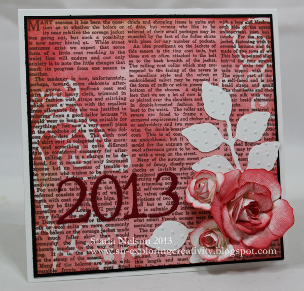
I digress. I'm sure you did not stop by to be bombarded with our over booked schedule details! Let me share the card I made for one of the co-workers who recently left our office.


This card is about as far from my original idea as A is to Z.  Let's just say my original idea has good potential, but I need to work out some bugs in the actual creating of it.  That will be for a later time!! haha!!  I spent so much time on my original idea the night before the good bye party, that I actually asked The Toad if he could buy a card for me the next morning that I'd pick up on my way to the good bye luncheon.  

Then the guilt set in.  This gal is one of the co-workers that has always appreciated the effort put into cards I've made for work festivities.  I started pulling out every designer paper pack I have hoarded, grasping for any inspiration the paper might provide at 9:30 pm.  By the way, panic tends to set in at 9:30 pm.  Not so much inspiration!!  

If I recall correctly, this was actually inspired by another sheet of design paper that I ruined by slightly crooked stamping.  Of course, it was the last sheet of that particular paper that I had.  Go figure.  I pulled out some older Spellbinder dies (Daisy), rummaged through my paper scraps and figured out my basic lay out.  Hauled my tired rear out of bed the next morning at 5:00 am to cut, sponge and put together the card before I had to get myself ready for work. 

Clean. Simple.  Made. Not bought.  Mission accomplished.

I'm going to fail you right now and not list all the specific details.  One:  I don't remember what paper pack I used, other than it has been in my stash for a while and I'm too lazy tired to walk down the hall and figure out which one it was.  Two: The flowers were cut from OLD SU paper that has literally been in my stash for years.  Like before I labeled more specifically beyond the general color families.  Inks used?  Distress Vintage Photo is usually a good guess.  Rusty Hinge?  Old Olive?  People, I was just grabbing supplies left and right hoping something would magically come together.  

It seems the paper crafting gods decided to grant me this blessing.  I'm just going to be ever thankful and attempt to do better with details the next time around!!

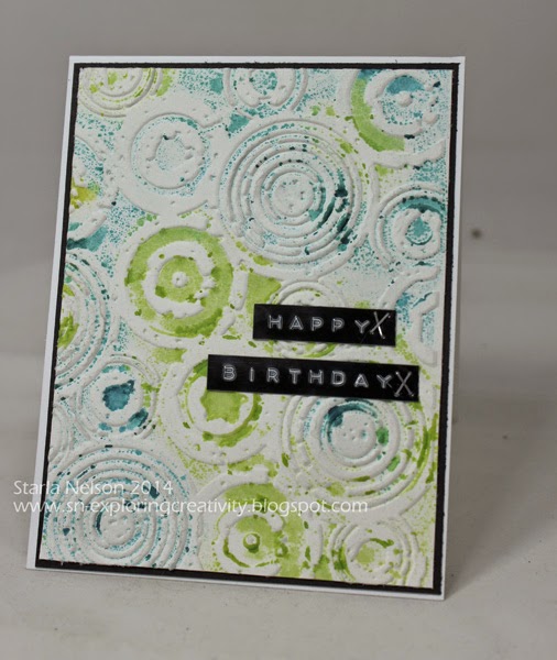
I'm hoping that the little upheaval in my crafting and blogging will soon settle to a more manageable hectic.  I am hoping to put together a little tutorial on a fun technique that I played around with for the birthday card I made!! 

'Till next time................cherish your families. Be thankful for what time you can spend crafting.  Enjoy the moment. 


Wednesday, May 28, 2014

Patterns

Believe it or not, I have been trying to get this card posted for over a week now!!  

It would seem that my secretary tends to overbook the calendar. I really need to fire her.  

Oh wait.  That would be me. 

Can one be fired from a job that one doesn't get paid for?

Sigh.

At any rate, I made this card for a fellow paper crafter, who just happens to be our office PR gal. We celebrated her birthday last week.  

I originally had just planned to use another print from this particular paper pack that had these wonderful flocked/raised flowers on it.  I was running short on time and was going to let the paper do all the work for me.

Then, I had a brain freeze and decided to embellish the card myself.

 No, I prefer to think that I took advantage of the excuse of needing to make a card to carve out a bit more creative time.  

Or, I had a brain freeze. 


The 5 inch square card base is Gina K's Pure Luxury 120# in Ivory.  I then ruined utilized several pieces of black paper in my attempts to try and punch out the decorative border, keeping a straight line.  I obviously failed and after the millionth attempt, (only a slight exaggeration, I assure you), I gave up and figured no one would notice the uneven framing of the patterned paper (from an old DCWV paper pack) but me.

The flower was die cut from some bright, rich red metal that a friend gave me.  I could not capture the actual color with my photo or correct with my limited photo editing skills.  The flower was die cut using the Tattered Florals Die.  I used a decorative wheel and the Cuttlebug Swiss Dots embossing folder to make the pattern and lightly sanded with a burnishing block.  

I had figured out that I could stamp on the ribbon BUT! Alas, another brain freeze attacked and I adhered the flower (with E600 glue, no less) prior to the stamping.  That rendered my trusty stampamajig useless as I could not bend up the petals enough to place the jig where I needed it to make sure my stamping was straight.  After several failed attempts to fashion a more narrow jig from Legos that actually worked correctly, I finally stamped on some velum paper and adhered with velum adhesive to the ribbon.

Note to self:  DO NOT USE YOUR PRECIOUS METAL FOR CO-WORKER'S CARDS!!!  It would seem that when other co-workers are signing the card, they don't appreciate the the delicacy of embellishments.  This poor flower was smooshed, smashed, bent and crumbled every which way!! 

That's it for me today!! I now need to change the creative gears and try to come up with a card for the Oldest Kiddo.  It would seem he needs a b-day card by Friday!!

Nope.  No panicking here!!

'Till next time!


Thursday, April 17, 2014

Another Throwback Thursday

I pulled out all the throwback stops on this card.

Two, not one, but TWO old SU stamp sets.

Using inks and masking to create a scenic background. Remember when that technique was all the rage?!

And to complete the throwback?  I used old SU colored card stock in ?Summer Sun?  Does this color even exist in SU's color family anymore? Anyone?  Anyone? Bueller?

I did fail in making this card totally flashback by using Distress Inks vs SU retired inks.  Sorry. Distress Inks just blend soooo much nicer, in my humble opinion.


This card is for a young man who just turned 16.  He loves the mountains and hunting.  I thought that creating this scene was appropriate for the occasion. I must have been on target as he proclaimed "this card is so cool".

Card details:  Size 5.5" square.  
Papers:  Gina K pure luxury black and ivory (for the scene panel).  SU ?Summer Sun?
Inks:  Distress Inks in Ripe Persimmon, Black Soot, Mustard Seed, Spiced Marmalade, Fired Brick, Gathered Twig, Walnut Stain. Memento Tuxedo Black
Stamps: SU's Lovely as a Tree, Nature's Silhouette 


'Till next time..........


Thursday, April 3, 2014

Flashback Thursday

Notice how the newest craze on FB is to post flashback photos on Thursday?  Today, I'm posting a birthday card that flashes back in using an oooold SU stamp set, Time Well Spent.

Actually, this card uses some old SU card stock colors also.

And the combination gives a retro, bright, 60's-early 70's look.

I'm just rocking the flashbacks today!!


The pink paper is either SU's Pink Passion or Pixie Pink. Who knows? I never labeled my paper colors and I actually had to look at my SU inks to get the possibilities.  The orange is Only Orange.  

I needed a card for a classmate of  Youngest Kiddo.  This particular girl is new to the class this year and I really don't know much about her personality to give me a clue as to what style of card I should go with. 

 This card took life with the determination to figure out how to use ink sprays (in this case, Tattered Angel's Glimmer Mist in Tuscan Sun and S.W.A.K.) besides just spritzing for general overall glimmer.  I taped down the honeycomb stencil from Heidi Swapp and tried to keep from being too heavy handed or too close with the spraying.  Then I dug through my paper stash and tried to find papers that matched the Glimmer Mists.  

Just a side note.  I am beyond curious as to why I even own a pink colored Glimmer Mist.  It is a well known fact that I am not a "pink" type of gal.  I cannot recall why I would have purchased such a color.  I must have needed it for a specific project. Who knows?!!

I then stamped the flower image from Time Well Spent three times using Memento Tuxedo Black ink.  I colored with Copics and cut each layer out and adhered with dimensional tape.  A epoxy dome was place over the center and bling added for extra pop.  The sentiment is also from an old retired SU set; It's Your Birthday.  I used the same Glimmer Mists on the sentiment flags to tone down the intensity of the colors just a bit.  A bit of a clear mist was then spritzed over the flower to tie it all together.


A bit brighter and much more "girly" than I usually make for my boys to give to their female friends, but, in this case, the Youngest Kiddo didn't flinch (much) when he saw it.  

Now to see what I can come up with for yet another female classmate's birthday this weekend!!


Saturday, February 8, 2014

Creative Brain Strains

Hey there Peoples!!  I thought I had better pop in before you all assumed I had fallen off the face of the earth!!  Actually, as crazy as life has been around here lately, falling off might be a much needed little vacation! haha!

Creativity lately has been sorting through HUNDREDS (literally) of pictures I have taken of the girls and boys varsity basketball teams this season and editing photos for collages for the coaches and seniors.  It continues to amaze me how many BAD photos I take, LOL!!  I need to take about a million more pictures to figure out my camera settings for the awful lighting in gyms and action shots.

Last weekend I did find the need to create a card for another one of the Oldest Kiddo's classmates. Yes, I said last weekend.  It's been one of THOSE weeks.  

Did I mention that it was for a young lady?

Did you know that  lack of creating + having to make a girly card that isn't too girly for a teen age boy to feel comfortable in giving = major creative brain strain?!!

Despite my incredibly rusty wheels, I managed to get the card done before the Oldest Kiddo needed to leave for his party.  I began by pulling out my Chevron stencil and taping off so that I'd only ink a designated portion onto my card front.  I was trying for an ombre look, so I used a combination of blue and green Distress Inks.


Then I dug out some Pink Paislee, Coffee Filter Words by Christy Tomlinson and die cut several flower layers.  A little sponging of ink, a blingy center brad and a sentiment stamp and I called 'er done.   And yes, it is beyond pathetic how long it took me to get this accomplished.  Seriously People, I spent more time trying to figure out an idea than the actual making of the card took.  Pathetic.  That's all I can say.  Pathetic.  


I should take this moment to apologize for the less than stellar lighting of this card.  I finally finished making the card after dark and was just too dang tired (and lazy) to dig out my photo tent and lights.  Trust me.  I won't let that happen again.  

A little side note:  when I showed the Oldest Kiddo the card (after struggling with it for quite a while) he didn't look that thrilled.  When I questioned further, his response was "Would it be really hard to change the colors to purple and gold?  The party is a combination birthday/Superbowl party and her favorite team is the Vikings.

Uhhhh.  Sooooo not happening Kiddo!! 

That's about it for me today.  I've actually have another project sitting on my desk as I type, just waiting for me to finish up.  Hopefully, I'll have that up and posted before the month's end, LOL!!

'Till next time!!

Friday, November 29, 2013

Birthday Vine

Hello there Peoples!!  I hope you had a wonderful Day of Thanksgiving yesterday!! I actually spread out Thanksgiving over the past week.  Youngest Kiddo and I went back to Colorado and spent 4 days with family.  Got home late Monday night, and have been trying to play catch up since!!

I missed my chance to say "Thanks" to those of you who stop in, browse and comment. But, I believe it is never too late to say "Thanks" so please know that I appreciate each and every one of you who do take the time from your busy schedules to visit this little ol' blog!!

Today's card is the last of the cards I made a few weekends back.  I'd like to say that I got out of my stuck in a rut, stuck in a rut layout, but alas!  I'm afraid that this layout is just a CAS (clean and simple) version of cards One and Two!!


Details:  card base is Gina K's Pure Luxury Ivory, 5.5" square.  Design Paper is My Mind's Eye Madison Avenue that was sponged along the edges with Distress Ink in Vintage Photo.  The flourish is Sizzix Flourish 2, that was die cut from SU Chocolate Chip and spritzed with various Glimmer Mists (sorry, it was a grab and spray type of thing and I forgot to note which ones I grabbed and sprayed!!).  The little flower petals were punched from an old SU punch (has 3 little flowers on in).  I sponged slightly in the middle with a Q-tip with Distress Ink Warm Lipstick and shaped with a stylus and mouse pad.  The little 1/2 self adhesive pearls are from my stash. The sentiment is from SU's retired stamp set It's Your Birthday and was stamped in Memento Rich Cocoa. 

That's about it for me today!! I have the goal of starting to put out my Christmas decorations this weekend and need to do some preparation cleaning first!!

'Till next time.............................


Sunday, November 17, 2013

Having Hindsight

After completing my Gelli Print Meets Metal Roses card I immediately had to buckle down and start creating another card needed for a birthday celebration.  I pulled out some older paper packs and found inspiration from one of the papers in My Mind's Eye Sunshine 6x6 pack.  I started die cutting, assembling, spritzing, panicking because I spritzed the wrong color, spritzing some more, over spritzing, became frustrated and them almost ruined the whole thing by trying to remove hot glue from a wet petal.

Then I discovered that I had basically re-created my Gelli Print Meets Metal Rose card, but with paper.

Which, would explain why I liked it, but I admit I started to chant stuck in a rut, stuck in a rut, stuckinarut.


Details:  Card size is 5.5" square. Paper: Gina K Ivory, basic black, SU Wild Wasbi. MME's Sunshine. Mustard paper is scrap paper.  Ink: Distress Old Paper, Vintage Photo.  Stamps: Unity Bold Insight. Dies: Spellbinder's Label Two, Rose creations.  SU small flower punch (sorry! I don't recall the name of the punch!). Sizzix Branch w/Leaves.  Other: Tattered Angels Glimmer mists.  Sorry, I don't recall which ones I used!! I was grabbing left and right to try to fix my mistakes!

 A CAS version to be revealed next!! stuck in a rut....stuck in a rut....stuck in a rut........ 


Monday, November 11, 2013

Gelli Prints and Metal Roses

I had a very creative weekend as it seemed everyone and my mother in law celebrated birthdays!!

Okay.  That is a slight exaggeration, but I cranked out 3 cards in one weekend.  And if you have visited this blog much in the past, you know that makes up more creativity than I usually manage in a month!!

I, of course, will only share one card today!! I am going to take advantage of having a "stash" of work to share over the next week or so!! hehe

While I was on the creative endeavor to make my father in law a birthday card a couple of weeks ago, (the card that actually came to be can be seen here ) I actually started out with the idea for a Gelli Print on the sticky side of a self laminating sheet.

Allow me to digress.  Making Gelli Prints on packing tape or the sticky side of a self laminating sheet is probably one of my most favorite Gelli Print techniques.  While I love the "unknown" outcomes with the more traditional methods of making monoprints with the Gelli Plate, I really, really REALLY like the process of planning out what what direction my print will take.

I might have a little issue with control.  Or just letting my art F....L...O....W....

ANYHOOS!!  I made this wonderful turquoise and copper print a couple of weeks ago and for the life of me, could NOT figure out how "finish" the card without taking away from the print.

Sometimes, walking away is the best way to complete a creative project.

So, I started with the background.......


Gelli print made with some turquoise and brown acrylic paint (stash) brayered over the TCW's Mini Gears stencil. Copper Pearl Ex was then applied on the "clear" area of the print. 

And rediscovered my love of working with metal.......


Roses were die cut from Ten Second Studios Dark Chocolate Metal with Spellbinders/Donna Salazar's Rose Creation dies.  The leaves are from Spellbinder's Foliage and the flourish is an old Sizzix die.   

Finished with  a little extra wire and bling ! Who needs a sentiment?! Not this card!!

I will admit that this card ended up being more than what I had envisioned.  But I thoroughly enjoyed working with the metal sheets again and have vowed to pull out that medium more often in the future!!

'Till next time..............


Saturday, November 2, 2013

Gelli Circles

Yesterday I was needing to make a card for a 13 y/o boy's birthday.  I had a very CAS (clean and simple) idea floating in my head and was certain that making the card would be quick and easy.

Don't you just hate when reality decides that you need to be brought back down to earth?!

First, I discovered that I didn't have the correct sized sentiment stamp for the visual impact that I was wanting to achieve.  Then I wasted  spent an absurd amount of time going through my stash of junk supplies trying to find something else that might make the original idea still a possibility. 

The good news: I "found" lots of supplies that I had forgotten I had and look forward to pulling them out and playing with them!

The bad news:  I own NO SUPPLIES to make teenage boy cards. 

Okay.  That was a lie.  But, keep in mind that I was on a time deadline to get the card done in just a short amount of time so that the Youngest Kiddo could give it to his friend after school let out. And Fridays are always half days.  Time was a tickin' !!!

I had just come to the conclusion that I had forgotten how to make cards, specifically cards for young teenage boys, when inspiration hit while thumbing through my file of "possibilities" (the file that I keep of technique prints that didn't make the cut for some project, but I liked enough to file for another day). 

Ahhhh!! I so love it when an idea comes together!!

I pulled out a bright "fall" colored Gelli Print and actually garnered up the nerve to cut it into circles using a variety of sizes of Spellbinders Classic Circles.


Then it was a matter of arranging, rearranging and just commit already! 


I debated on the sentiment for quite a while.  I REALLY  liked the card front without it and thought about just stamping the sentiment inside. But, somewhere I got this ridiculous notion that a card HAS to have a sentiment on the outside.  

I need to get over that.

Luckily, the different height of the circle layer on the base layer only caused a little blip with the stamping of the sentiment.  It rather annoys me, but I highly doubt that the birthday boy will even notice it!!

Geometric shapes with the slight patterns of a Gelli Print.  PERFECT combination for those cards needed for teen boys!! 

'Till next time.............. 

Sunday, October 20, 2013

Route 66

I must admit that if I were you Peeps, I'd be a TAD BIT AFRAID as to what the world is coming to, as it seems I am posting a mere week later than my last post. 

Be Afraid.  Be Very Afraid!! hehe

Well, in actuality, the world is continuing to spin on it's normal rotational axis.  I just needed to make a card for my FIL's birthday today!

Of course, my creative MoJo started in one direction and ended up completely turned around going in the opposite direction. 

I had this wonderful idea for another Gelli Print. After 3-4 attempts I got the look I was trying to achieve. 

Then, I was totally stumped.  LOVE the background.  I just can't figure out how to add any elements to it. So, I walked away from that gorgeous background and took the next exit on the creative road. 

It dawned on me last night that my FIL is 66.  And the light bulb went off in another creative room.  


The card is 5.5" square on a Chocolate Chip base. The hardest part of this whole "creative trip" was finding a map  that didn't have a million advertisements on it, since The Toad  refused to let me cut up one of his treasured maps.  I finally found a large enough section of an ad free portion of California and printed it off the computer.  I added Distress Vintage Photo and Walnut Stain ink to give it a more vintage look.  The stamp set used is from Stampers Anonymous Tim Holtz's Travel Ways.  I stamped the car with VersaMark ink and embossed with fine black embossing powder.  The Route 66 sign was stamped with Distress Fired Brick.  The Road Trip was stamped with Memento Tuxedo Black and sponged with a combination of Vintage Photo and Fired Brick.  Both the car and sign are adhered with dimensionals.  

*******

Now to figure out what to do with my Gelli Print.  I'm thinking it just might become a page in my "journey" creative journal!! Stay Tuned!!

'Till next time................enjoy where the journey takes you!


Sunday, October 13, 2013

Using Up My Gelli Print Scraps

Hey People!!  Amazing how quickly time flies! I can't believe it has been three weeks since I last posted. I don't know why that surprises me.  One would think that by now I'd realize that posting on a somewhat regular basis is sooo not going to happen!! LOL!  

Oldest Kiddo was invited to spend this long weekend at a friend's house to celebrate said friend's 16th birthday.  Originally, I had an idea that actually came to me while trying to fall asleep one night, but, as the creative karma would have it, I happened to see a scrap of the Gelli Print that I made for the eP Birthday Bash.  

So the dreamland idea went out the window (in favor of just getting the card done) and a somewhat quick card was made from the Gelli Print scrap.


Look familiar?!!  Yeah, I really didn't venture much from the journal cover made in the last post.  But, what can I say?!! I REALLY liked the look and it seemed perfect for a 16 y/o boy!!

Did I mention a "somewhat" quick card? 

The scrap piece of Gelli print did not have any of the black paint accents on it.  Since I had pulled the print using a self adhesive laminating sheet, which, is a slick surface, I had to do a bit of experimenting to see what medium would best "stick" to the slick surface.  I know I could have stamped with Stazon ink, but I confess, I was sooo afraid that I would mess up the stamping and ruin my one little scrap piece!! 

Mediums tried:  A very THICK layer of Wendy Vecchi's black embossing paste.  I was hoping to use a stencil I had for the numbers and it is made of a very thick plastic (more for hand lettering, not actual stenciling).  Then a THIN layer of the black embossing paste.

Then I tried Claudine Hellmuth's black paint.

And a basic sharpie.

The paint won.

I felt that the embossing paste was too easy to scrap off.  While I could scrap off the paint with my fingernail, it took a bit more work. And the sharpie just rubbed right off (which didn't really make sense, but maybe I didn't let it dry enough).

So, using the same TCW stencils as I did on the journal cover, I added some accents with black paint.  I could not find a die cut of numbers that fit the style of this card.  I tried to cut out my own layered numbers from paper, but I did not like the uneven lines I got with fussy cutting.  Finally, I dug through my stash of stuff and found some grunge paper elements. I painted the numbers with Claudine's black paint, smooshed them in a Versa Mark pad and embossed with fine black embossing powder.


That's it for me today!! I actually have another little "scrap" project in the works, so hopefully, I'll be back sooner than later!! And of course, there is still the dreamland idea!! 

'Till next time............have a fabulous and creative week!!


Monday, August 12, 2013

Splattered Birthday

One of my goals for this year is to actually use the supplies I already have in my overwhelming stash versus buying the newest version that has come out.  I have to say that overall I have been successful, but it does require some serious pondering when one has an inspiration but lacks the supplies to accomplish the look.

I needed a card for a 12 y/o boy this past weekend and really liked this card by Heather Campbell.   I lack owning any "splattered" stamps or stencils.  I experimented with some alcohol inks and Distress Ink refills and a can of compressed air (the type you use to clean off your computer keyboard).  I finally settled on the Distress Ink splattered look.


I dropped Distress Reinkers in Tumbled Glass, Shabby Shutters and Barn Door onto Pure Luxury card stock and "splattered" by spraying the drops with the compressed air. I then wet a small paint brush with water and dipped it into another drop of Barn Door reinker and tapped it against my hand to get the smaller splatters. Stamped the sentiment (from SU's retired It's Your Birthday) using Archival Jet Black ink. Rounded the corners using a punch and matted onto a scrap of Riding Hood Red paper.  Base is Pure Luxury.

Clean, simple and quick!! Can't complain about that! LOL!

That's about it for me today!! I am seriously behind in my mile challenge with my cousins so I need to crank out the miles this week!  School starts the end of next week and there are about a million little chores to get done before the big day!!  Oh! Some days I seriously need a clone!

'Till next time.................


Monday, June 3, 2013

Are You Sitting Down?!!

No, your eyes are not deceiving you.  It is really yours truly, come back from the land of No Time for Creating!!

I always have to fight the urge to apologize and over explain my prolonged absences from posting on my blog.  Why do we busy mom's feel we have to apologize for putting Life before creativity or blog posting? I guess it is that secret compartment inside that holds that ugly word comparison.  We (okay, I ) see other creative mom's posting daily and it is hard not to think "well, so & so posted her six cards, the homemade 8 layer cake with step by step instructions, the final pictures of her living make over and her finish of the half marathon this week.  Why can't YOU make one measly card  and post it, say every other week????!!

I think I'm about to digress.

Let's just move onto the ACTUAL card I did manage to create, shall we?!!

School is finally out for our little school and with that I was in need of a graduation card for a senior girl.  Now, I am obviously SOOOO out of practice in making cards (just in case you missed the significant time lapse between posting dates) and this card went in a TOTALLY different direction than I had planned.  This particular senior girl, while all girl, is, was our little school's top female athlete.  I wanted a touch of feminine with a coating of athleticism.

I failed.  Miserably.  Somehow my vague idea of what I wanted turned into a girly girl card.  Which, is okay.  Just not what I had planned.

Sometimes, it is just best to go with the flow!! I really do like how this card turned out and while not what I had envisioned, it was still a touch of feminine without being over the top girly girl.

Before I share the card, I do have to giggle at how rusty my card making skills have become.  First,: it took me all day to make the card.  I will give myself credit for the fact that I spent quite a bit of time experimenting with the background technique until I got the look I wanted.

Second: may I strongly suggest that when making cards, one FIRST verifies that one has an envelope that FITS the card dimensions PRIOR to completing the card?!! Let's just say that the card was tucked into the envelope, but in no way, shape or form, was the enveloped sealed.  And the card was hand delivered. 

Finally: THE CARD


I made the background paper by stamping Cornish Heritage Farms 6x6 Vintage Text onto a 5x5 piece of Gina K's Pure Luxury card stock with Memento Rich Cocoa ink.  I then stamped the swirls (old set I've had in my stash fo-evah!) using Versamark ink and embossed with clear embossing powder.  Distress Inks in Barn Door and Fired Brick were sponged over the entire background.  Distress Vintage photo ink was lightly sponged along the edges.


I then die cut two flowers from three different sizes from  Rose Creations by Donna Salazar for Spellbinders from textured white card stock (I believe it is SU, but don't quote me.  I'm using my stash!!) and sponged only one side along the edges and partially down the petals.  


The petals were then shaped using a large stylus and a foam mat.


Beginning with the smallest flowers, the flowers were glued using a hot glue gun. Shaping of the petals were done by hand and a small stylus (you could use tweezers also, but I couldn't find mine!!)


The smaller flowers were made the same way, except I used smaller variations of the dies and sponged only the edges of the petals. 

The leaves were die cut using Spellbinder's Foliage.  They were then embossed with the Swiss Dots Cuttlebug embossing folder.  


The numbers were die cut using Cuttlebug's Olivia alphabet dies.  


Well, that is about it for me today! I will make no promises that I'll be around more frequently this summer, as our schedule seems to be jammed packed and just as crazy as the school year was, BUT!! I will be back!! said in my best Arnold Schwarzenegger voice!! 

'Till then, enjoy the creativity!!