Thursday, June 30, 2011

Getting out the Alcohol

.......INKS!!  hehe

Yep!  It's time for another ride with the E-Team!  Today we are continuing our series It's Better With Color sharing tips and projects using Ranger's Alcohol Inks

Of course, Daisy is offering goodies!!  Here are the deets:

*4 winners chosen randomly from E-Team blog comments plus 1 from eP Blog


*4 winners will receive $20 vouchers

*eP Blog winner will receive a some alcohol inks goodies including an assortment of alcohol inks, blending solution, blending tools and some other surprises

*one comment per person per blog beginning Thurs June 30th -  and ending Monday, July 4th.

Winners will be posted on eP Blog on Tuesday, July 5th

All alcohol inks will be on sale at 20%

Broni and Linda are already starting their long weekend celebrations, so they won't be participating in this hop (you might just want to stop by and tell them that you missed their creativity tho!! wink!), and in all honesty, I don't know if Latrice's new little one has kept her from creating.  Again, why don't you just stop by and let her know that she is missed?!    Here are the links to the rest of the team that is participating this weekend:

Starla (me!)

WARNING! DISCLAIMER OR HEADS UP!!

It would seem that the combination of covering for vacationing therapists and the fact that it is summer vacation and the preference for spending my evenings with the family enjoying the longer days has resulted in a lack of creative time spent in my craft area.  Alas, I have no actual FINISHED project to share with you today.  BUT!! I had a new idea that I wanted to explore and share  some tips for using alcohol inks and metal.  I really hope to finish my project idea over the long weekend or soon after.  Stay tuned!

While alcohol inks are generally used on glossy surfaces or non porous surfaces, I had an idea to try something a bit different with the inks. 

Start with one basic candle.


Apply some Cranberry and Red Pepper Alcohol Inks in a random pattern, using a dabbing, twisting motion.


Wait a couple of minutes for the ink to dry.  Add another layer of inks, going just a bit more heavy on the Cranberry color
Hint:  Do not make your random dabbing in a straight line vertically or horizontally. 


GORGEOUS marbling effect on the candle!


I am sooo excited about this discovery!  The alcohol inks work BEAUTIFULLY on candles!  I have the hardest time finding candles in the shade of red and blue that are the accent colors of my home.  Now, I will be able to custom color candles to match my decor!!  Hopefully, I will have a finished project with this little discovery in a few days!!  This is a very simple idea, but WOW! 

*******

I happen to love my alcohol inks and use them quite often to customize embellishments to match my projects.  Clear embellishments, ivory or white pearls are easily altered using the alcohol inks.  I have found lately that I use them just about every time I make something with Metal.  Metal sheets are easily altered with alcohol inks to customize the color to fit your project. 

Start with Ten Second Studios Kiss Me Pink Metal Sheet and add the same Cranberry and Red Pepper ink.


Hint:  You can add more layers of alcohol inks to deepen the color or add a different color, but you will need to let the ink dry before adding another layer, or you can start to "pull off" the still wet ink from the metal.  It doesn't take long, just a couple of minutes.


Second layer with a bit of Current added to the previous mix

Another tip I wanted to share is the effect of different types of embossing with the alcohol ink altered metal.  You can run the altered metal sheets through your machine of choice with an embossing folder and then sand off the raised portions with a sanding block to expose the aluminum. 


If using a mold to emboss, I have found that I prefer to alter the metal with the alcohol inks AFTER I emboss with my paper stump and refine.  It may be that I don't allow the ink to dry completely before I start to emboss, but to me, the paper stump doesn't glide over the inks as well.  And, I will occasionally rub off the ink color when rubbing.

Notice the lighter "outline" on the image on the left?  The paper stump rubbed off some of the color when I was embossing.  Of course, I could "fix" this by easily adding another layer of color and then sand off the raised edges.  It's not the end of the world if this does happen to you.  I just wanted you to be aware that it COULD happen.

  I thought I would just include a few of the past projects that I have done with alcohol inks to remind you that there are sooo many options with this medium.

Plaid background on glossy paper


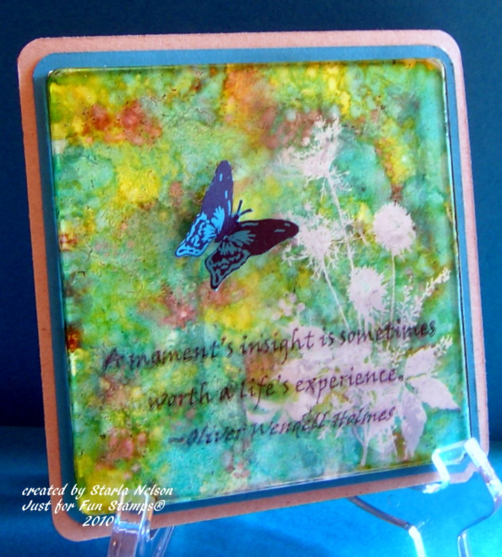
Altering a large fragment with a resist


altering a clear bottle

altering the color of metal for the rose and custom coloring plain aluminum for the leaves


Altering the color of metal again


Alcohol inks are so easy and fun to use, that even Kiddo's love them!!


I hope that you found some inspiration to either get out your alcohol inks again or to give them a try!!  

Sunday, June 26, 2011

The Lazy Days of Summer

Do you remember when summer time meant sleeping in until the bright rays of the sun pulled at you stronger than the comfort of your bed?

When days were spent running around the neighborhood with friends and cousins until dinner time?  Then the evening games of tag, hide and seek, with special effects of "Daddy shot all the bears last night, there won't be any bears tonight", and the screams when the "bear" would jump out and chase you all over the yard while screams of terror/delight filled the air?

The days where you had so much time that you could finish not one, but TWO books in a day?

Those days no longer exist. At least not in this household. 

In the three weeks since school has been out, the Oldest Kiddo has participated in basketball boot camp, volleyball camp, started summer league basketball and will start cross country tomorrow.  The youngest Kiddo, having the fate of being born second, hangs out in the gym all day with his older brother or in The Toad's office while I'm covering vacationing therapists at work.

There has been no lazy days of summer here.  But as a family, we have been enjoying the lazy EVENINGS of summer.

Ice cream bars and fruit soup for dinner. 

Windows open to the cool evening breeze (just a few more weeks of that PLLLEEEASE!!) while as a family we watch movies all night long.

Obviously no creating has been going on. 

Except the creating of memories.  I've decided that the creating of memories outranks the creating of cards or such right now.  Not to say that I won't be doing any creating at all over the next month or so.  I NEED to create for my own sanity.  I'm just giving you all a heads up that the creating might be a bit more sparse than usual over the next month or so.

I want my kids to look back and say "Do you remember when we would sit around eating ice cream bars and watch Myth Buster's all night long?"  Those summer evenings were the best"

The lazy days of summer might be jammed packed.  But the lazy evenings of summer still exist. 

Till then...............enjoy the evenings!

Thursday, June 16, 2011

It's Better with Color, Part 2


Are you ready for another epic ride with the E-Team?!  Along with the amazing projects and helpful hints and tips you'll find on E-Team member blogs,  there are the eclectic offerings and prizes that Daisy is so generous in giving!  Check this out: For leaving a comment on each team member's blog from Thursday, June 16, until Sunday, June 19, you will have the chance to win:

a $25 gift voucher to eclecticPaperie (two random winners will be chosen from the E-Team member's blogs)

Leave a comment on the eP blog for an additional chance to win an assortment of flower stamps and 4 New Copic Color Sketch Markers.

Winners will be posted on eP blog on Monday, June 20.

NOTE:  eP is going to discontinue to carry Copic ORIGINAL & CIAO styles so you will want to check out the clearance price on those items. Sketch Markers are also on sale. There are also some Copic cases that will be slashed to clearance price. There are also an overstock of the PALE Copic Color bundle that Daisy is going to slash at clearance price, too. Finally, there will be some "Flower Stamp" grab bags that will be available for purchase.

E-Team Blogs
Starla (me!)

Ok!  Enough of the business details!  Let's get this hop going, shall we?!

A frequent request of the E-Team follower's blogs has been for more details on how we color with Copics, and more specifically, how we color floral images with Copics.  Today, I would like you to look at your Copics as more than just a way to color a stamped image.  I would like you to consider using your Copics to CREATE your image.

I started by die cutting two of the largest daisy's from Spellbinders Daisy Head from Pure Luxury card stock.  In case this is your first time visiting my blog, let me catch you up to speed on this paper.  It is my FAVORITE paper for coloring with Copics!  I started using it as a base for my cards due to it's 120# weight.  I loved the fact that it was strong enough to hold up on all the layers, embellishments and various ink treatments that I wanted to use, without "buckling".  THEN I discovered the bonus fact that I could color images for single layer cards with no bleed through.  I will admit that I have not tried any of the other popular papers used with coloring with Copics, so I cannot compare.  I am very happy with this paper and haven't felt the need to change (at this time, anyways!)

Lousy picture, but you get the idea! 

I did not emboss the die cut image.  There was a very faint impression of the center of the die that I used as my guide for cutting individual petals.  You could also lightly trace a "center" with a pencil.

After I made my petals, I  went online and found some pictures of daisy's for inspiration. 


I then picked what colors I thought I might like to work with.  I always pull out my Copic Color Chart to help me get started.  I printed this chart out on Pure Luxury card stock and have filled in the "blanks" of the markers that I own.  This gives me a more accurate idea as to what the colors look like on the paper that I am using, versus my previous method of "scribbling" on whatever scratch paper that I had lying on my desk.  Starting with my lightest color (in this particular case, RV21, light pink), I made broad swiping motions from the center of the flower to the tips of the petals.  I did not worry about covering everything evenly or any overlapping of lines.  I wanted the texture this type of stroke makes.


 I then took a slightly darker marker and made more random swipes from the center to the petals, but varied the length of the strokes and did not make as many strokes.


Already, this "image" looks more realistic!  But to add a bit more detail, I then took two darker markers and repeated the above steps, but with shorter, swiping strokes with each color.  I used the last two chosen markers to make the center of my flower.  Instead of "coloring" the center, I just made random dots, first with the lighter of the two markers, then added more "shading" with the darker marker. 


If you look closely at the photo (click on the image to see it larger), you will notice that one of the darker colors has a more "lavender" or "purple" hue to it.  To me, this just adds to the realism.  I do not stick to keeping my chosen colors in the same family of classifications. Don't be afraid to mix your color families!!

At this point, you may chose to leave your daisy image as is, or go back with the first, lightest, marker that you started with and again, make random, swiping motions to "blend" all the colors a bit more. 

NOTE:  I did color the backside of my "image", using the same technique, but in a much sloppier version! LOL!  I wanted some color on the backside as I planned to curl the petal a bit, but wasn't too concerned with "details".

I also wanted to show that this "technique" of coloring will work on other mediums as well!  I used the same markers as above (with R59, Cardinal, added to the mix) on Wendy Vecchi's Clearly for Art Whiteout.
The flower on the top of your screen was done on the Whiteout.


It is difficult to see, but in real life, the lines on the Whiteout are a bit more "streaky".  Helpful hint:  when using Copic markers on Clearly for Art Whiteout, or another "glossier" type surface, let the ink dry just a bit between colors.  The alcohol stays "wet" longer and trying to apply more color or a new color too soon, will actually cause you to remove the previous color.  After you have done your basic coloring, if you'd like to add more color, to increase the intensity, let the ink dry for a several minutes THEN apply more color.  I used my heat gun on the alcohol ink on the Whiteout to shape the flowers with no change in the color intensity. 

DONE!  You've now created an image with your Copic markers! 

And for a project using the daisy's cut from the Pure Luxury.

I am in need of a wedding card for this weekend.  The jury is still out as to whether or not this looks like a wedding card or a fru-fru baby girl card! LOL!

Being in the overloaded, panicked phase of an over booked week, I used the Mojo Monday Sketch 194, as my starting inspiration.  Card base is a 4 1/4" x 5 1/2" Pure Luxury (I told you this is my favorite paper!) with an SU Pink Pirouette, sponged along the edges with Distress Spun Sugar, matted onto basic black card stock.  Scrap Pure Luxury card stock was embossed with a Cuttlebug embossing folder and scalloped along the bottom with SU's scallop punch. All the white panels and the flower were spritzed with Tattered Angel's Glimmer Mist in Pearl to add a lovely shimmer in real life, that for the life of me, I could not get to show in a photo!  The sentiment is from SU's retired Warmest Regards, and was stamped using Archival Jet Black ink. 

And because the jury hung on the Wedding card versus Baby Girl card~~~same song, different verse


I used C1, C3, C5, C7 on the flowers.  Shimmer applied to all the white panels.  Still couldn't get that to show!!

I hope this little tutorial on creating your own image with Copics will inspire you to try creating your own images! 


Saturday, June 11, 2011

Grungy Thanks

How is the weekend starting out for you all?!  A couple of weeks ago I just kept telling myself that I just had to get through till the end of school and things would slow down.

Someone forgot to inform,what is my reality, of that fact.

Now I'm telling myself I just have to get through the month of June. 

19 more days.  But who's counting?!

I have been trying to finish up Thank You cards that the Oldest Kiddo needs to send for birthday and graduation gifts he got over the last couple of weeks.  Seeing as these cards are being sent from a teenage boy, and the fact that he needs at least 13 cards, I kept them CAS, with just the right amount of grunge to keep them edgy.


Card base is Gina K's Pure luxury at 4 1/4" x 5 1/4", folded along the side.  I randomly colored the various circles on Tim Holtz's Gunge Cirque with my SU markers in Old Olive, Not Quite Navy and Chocolate Chip, selectively repeating parts of the image to complete the circle strip to the edges of the card.  The sentiment (from Annette Allen Watkins.....beats me.  Have had it in my collection over 14 years!) was stamped with SU's Old Olive.  Round the corners and call 'er DONE!!

That's all from me today!  I have the daunting task of going shopping for an outfit that I can wear to a family wedding next week.  How long do you figure it will take me to find something that will make me look 15 lbs lighter? 

Yeah.  I figure that it is going to be a looooong day with that goal!

'Till then................


Monday, June 6, 2011

Graduation at the Movies

Well, after a week of my computer working without a hiccup, the dang thing is trying to give me heart failure by not wanting to connect again today!  BUT!! HAHA!  I fooled it!!  I just disconnected the thing and waited (somewhat) patiently for a bit and WAHLA!! it is working again!

But as I am not one to test fate, I am going to try and quickly post the last of the graduation cards that I made.  This one is my favorite.  It is TOTALLY nontraditional.  And, if I say so myself, perfect for the young lady for whom it was made.

J just so happens to be the daughter of my work out buddy (when our crazy schedules allow it, that is!).  For the Junior/Senior banquet, the Juniors hosted a Masquerade Ball on the Queen Mary.  In discussing the banquet, J happened to mention that the theme made her want to watch the Phantom of the Opera movie again.  So one evening, all of us "girls" got together and watched the movie.  And I discovered that the glamour of the old movies is not lost on today's youth.  J LOVES old movies. You know, the GOOD ones....starring Audrey Hepburn, Clark Gable, Lauren Bacall, Humphry Bogart.....

ANYWHOOS!!  I decided to make a card that brought out the glamour of the old movies.


(I seriously LOVE how this turned out!)

No stamping on this.  I used Graphic 45's Curtain Call as the focus for all the elements on this card.   Card base is  5 1/2" square piece of Vanilla Pure Luxury.  Graphic 45 Curtain Call Let's Dance and Leading Ladies was used for my background.  I then used my Classic Circle Nestabilities to cut the main images from Curtain Call and The Cinema from the same Curtain Call line.  The main images were mounted on SU's Real Red.  The year was die cut from Cuttlebug's Olivia from Real Red and adhered with Sakura's Quickie Glue Pen.

Probably my favorite element (besides the wonderful paper that is!) is the Film strip ribbon that was wound around and twisted among the main images.  I used Glossy Accents to hold it in place. 

Of course, I forgot to take a picture of the inside.  I used a strip of the fine polka dot paper along the bottom and then typed the sentiment on more vanilla card stock and mounted on Real Red.

Imagination will often carry us to worlds
that never were.
But without it, we go
No Where
Carl Sagan

Did I mention how much I like this untraditional graduation card?!  It's a style that I wouldn't make for everyone.  But I just knew that J would love it (and she did!!)

I'll be back (computer willing) in a day or so with the Thank You cards that I'm in the process of making for the Oldest Kiddo to send out.

'Till then..................try something untraditional in your creativity this week!!

Sunday, June 5, 2011

Still Marching for Graduation

Hey Peoples!  How is your weekend going?  We are still in the graduation mode here as we have family friends celebrating High School graduations this weekend.  I came up with another CAS (clean and simple) card that I can see being used again and again as the kiddos the Toad coaches graduate. 

This is a very simple card to make in school colors and mass produce!  Base is 6 x 4 1/4" Pure Luxury.  SU's Real Red mat.  The numbers are from PaperArtsy (clocks 7 and clocks 8), that were stamped with VersaMark and embossed with red embossing tinsel.  In real viewing, the embossing tinsel adds a festive sparkle.  Pulled out the retired SU set of Warmest Regards for the sentiment and stamped using Archival Jet Black ink and then drew a line to weight down the main image. 

I made this also in the colors of another local high school for another family friend.  Got a little blip of ink mishap by the zero, but decided that the kiddo (being male) probably wouldn't notice or care.  I just wasn't up to redoing it, when in all likely, it will see the trash can!!


This still uses Pure Luxury for the base but substituted SU's Night of Navy for the mat.  I used Distress Chipped Sapphire ink and clear embossed. Sentiment is the same as above.

That's it for today!!  I'll be back in a day or so and share a very nontraditional graduation card! 

'Till then.......................enjoy the start of a new adventure today!

Friday, June 3, 2011

Graduation, CAS

I am now officially the mother of a High School student. 


Just ignore that anguished wail of a mother who can do nothing to stop her babies from growing up.

Sigh. Ok.  I'm not going to dwell on the fact that my little boy is quickly becoming a young man.  A young man who received an academic award for a GPA above 3.5.  A young man who also was pinned by The Toad for the Junior National Honor Society (Sorry.  Had to brag just a bit!!  What else is a proud mama to do?!!) A young man who is now officially 5 inches taller than me.  Who has a wing span longer than The Toad's.  A young man who borrowed his father's shoes for graduation.  A young man who is is sprouting hair above his upper lip (really?!!)

I REALLY need to stop thinking of all this or I am going to need some serious medication to get through the next four years.  This growing up thing was NOT in the "What to Expect" books that I read. 

Or maybe I just skipped that chapter thinking it wouldn't happen for a VERY long time. 

Reality has a way of smacking you right between the eyes!

******

OK!!  I'm sure that none of you stopped by to listen to me whine about my kids growing up too fast.  So, I'll put that all aside to share the card that I made for the kiddo's classmates.  Since I was making 22 of these, I tried to keep them fairly clean and simple. 


Base:  4 1/4" Pure Luxury.  Mat:  SU's Real Red.  Die cuts of hat and diploma from QuicKutz.  Not quite enough detail to suit me, so I did some shading with Copics and a Inkssentials opaque pen.  Used my Scor Buddy for the embossed edge.  Stamp is from SU (I think it is from All Year Cheer). 

I'm off to make some more graduation cards.  I need 5 more before the weekend is done!  YIKES!

'Till then.................enjoy the moment.  They tend to fly by before you know it!