Showing posts with label Cornish Heritage Farms. Show all posts

Sunday, September 21, 2014

Falling for Inspiration

I think fall is my favorite time of year.  Day time temperatures are warm but not melting.  Evening brings open windows and thoughts of light sweat shirts to ward off the chill in the air.  Colors that are rich, warm and golden.

For the past two weeks, fall has been but a dream. Triple digits temperatures that only fell to the upper 90's at night.  Humidity that is rare for this part of California.  

Basically, weather that zaps all energy, smiles and creativity.  So, once again, I turned to my Pinterest inspiration board when the need arose for a birthday card for the Toad's grandfather (aka "Big Papa").  This card caught my eye due to the fall theme I was craving.  

My version:


Supplies: 
Paper: Gina K's Pure Luxury in Ivory
Stamps:  CHF 6x6 Vintage Text, Tim Holtz: Falling Leaves, SU Warmest Regards
Inks:  Distress inks, Memento Rich Cocoa

As I finish up this post it would seem that possible the first signs of fall are here!! Cooler temperatures and open windows today! 

'Till next time....................enjoy what makes you happy

Monday, June 3, 2013

Are You Sitting Down?!!

No, your eyes are not deceiving you.  It is really yours truly, come back from the land of No Time for Creating!!

I always have to fight the urge to apologize and over explain my prolonged absences from posting on my blog.  Why do we busy mom's feel we have to apologize for putting Life before creativity or blog posting? I guess it is that secret compartment inside that holds that ugly word comparison.  We (okay, I ) see other creative mom's posting daily and it is hard not to think "well, so & so posted her six cards, the homemade 8 layer cake with step by step instructions, the final pictures of her living make over and her finish of the half marathon this week.  Why can't YOU make one measly card  and post it, say every other week????!!

I think I'm about to digress.

Let's just move onto the ACTUAL card I did manage to create, shall we?!!

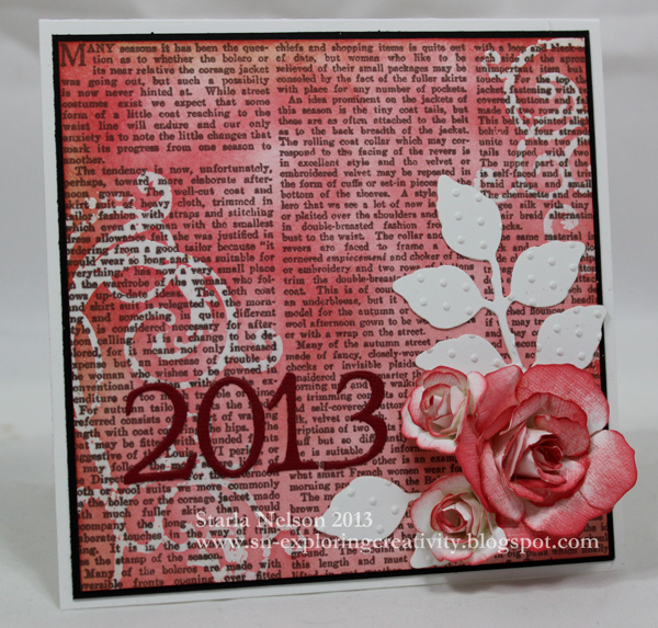
School is finally out for our little school and with that I was in need of a graduation card for a senior girl.  Now, I am obviously SOOOO out of practice in making cards (just in case you missed the significant time lapse between posting dates) and this card went in a TOTALLY different direction than I had planned.  This particular senior girl, while all girl, is, was our little school's top female athlete.  I wanted a touch of feminine with a coating of athleticism.

I failed.  Miserably.  Somehow my vague idea of what I wanted turned into a girly girl card.  Which, is okay.  Just not what I had planned.

Sometimes, it is just best to go with the flow!! I really do like how this card turned out and while not what I had envisioned, it was still a touch of feminine without being over the top girly girl.

Before I share the card, I do have to giggle at how rusty my card making skills have become.  First,: it took me all day to make the card.  I will give myself credit for the fact that I spent quite a bit of time experimenting with the background technique until I got the look I wanted.

Second: may I strongly suggest that when making cards, one FIRST verifies that one has an envelope that FITS the card dimensions PRIOR to completing the card?!! Let's just say that the card was tucked into the envelope, but in no way, shape or form, was the enveloped sealed.  And the card was hand delivered. 

Finally: THE CARD


I made the background paper by stamping Cornish Heritage Farms 6x6 Vintage Text onto a 5x5 piece of Gina K's Pure Luxury card stock with Memento Rich Cocoa ink.  I then stamped the swirls (old set I've had in my stash fo-evah!) using Versamark ink and embossed with clear embossing powder.  Distress Inks in Barn Door and Fired Brick were sponged over the entire background.  Distress Vintage photo ink was lightly sponged along the edges.


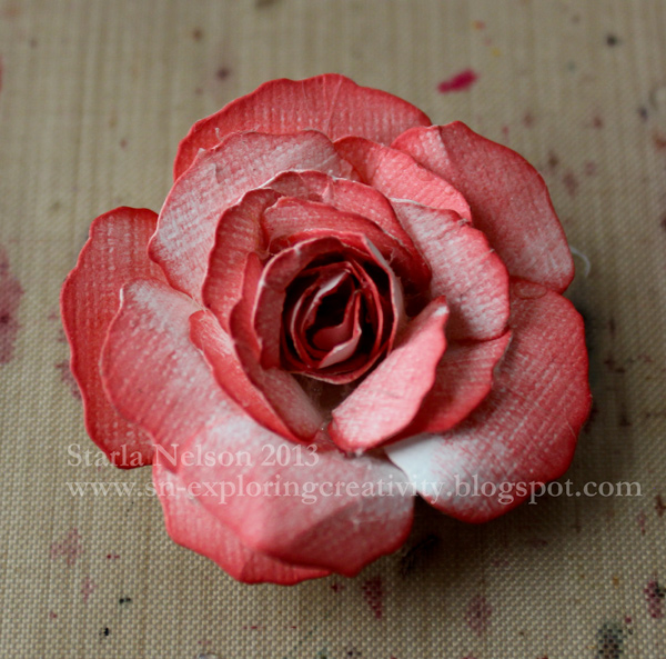
I then die cut two flowers from three different sizes from  Rose Creations by Donna Salazar for Spellbinders from textured white card stock (I believe it is SU, but don't quote me.  I'm using my stash!!) and sponged only one side along the edges and partially down the petals.  


The petals were then shaped using a large stylus and a foam mat.


Beginning with the smallest flowers, the flowers were glued using a hot glue gun. Shaping of the petals were done by hand and a small stylus (you could use tweezers also, but I couldn't find mine!!)


The smaller flowers were made the same way, except I used smaller variations of the dies and sponged only the edges of the petals. 

The leaves were die cut using Spellbinder's Foliage.  They were then embossed with the Swiss Dots Cuttlebug embossing folder.  


The numbers were die cut using Cuttlebug's Olivia alphabet dies.  


Well, that is about it for me today! I will make no promises that I'll be around more frequently this summer, as our schedule seems to be jammed packed and just as crazy as the school year was, BUT!! I will be back!! said in my best Arnold Schwarzenegger voice!! 

'Till then, enjoy the creativity!!


Wednesday, September 1, 2010

First Camaro

Happy Hump Day Peoples!!  I swear I am in some crazy vortex that I just can't escape!! I thought that once the first full week of school was behind us, things would quiet down.  NOPE.  Life is still spinning out of control!! LOL!!

It would seem that in a previous time frame of life, I thought it would be just fine to have BOTH my children on holiday weekends.  Wellllll.  For the most part, it doesn't matter.  Except when one child's birthday happens to come two weeks after school starts.  You know~~~when life is still spinning out of control!!  My youngest is having his birthday this Labor Day weekend (and yes....I've heard all the snarky jokes about that one!!).  Seeing as I also have to make his great grandfather a birthday card before Friday, I sat down and got the kiddo's done today. 

It would seem that this child developed a love for OLD Camaros when the Transformer movies came out.  He is in his glory when he spots some beat up Camaro on the side of the road with a For Sale sign on it (never mind that he won't be old enough to drive for SEVERAL more years!).  He has a Camaro calendar above his desk. You get the idea.  The kid LIKES Camaros. 

When CHF (Cornish Heritage Farms) gave notice that they were closing down their doors, I happened upon a couple of Camaro stamps from their GM line.  They managed to jump into my cart pretty darn quick!!  This is what I came up with today:


Let me tell you~this card was a BUGGER to photograph with all that metal!!  Several weeks ago, I got the wild idea to try something a bit challenging with metal embossing.  I stamped the background stamp License Plates from CHF onto a piece of aluminum metal from TenSecondsStudios.  I then embossed and debossed the various license plates.  I rubbed some black acrylic paint over the finished product to give more depth to the recessed area and wiped off the excess. Now, while I really like how it turned out, I had NO idea as to what I was going to do with it.  Shoved it into the metal drawer and walked away.

Enter the Camaro from CHF.  I stamped this particular image with Archival Jet black ink onto a scrap piece of Gina K's Pure Luxury card stock.  Colored with my copics (is there any other color medium out there?!! LOL!!) and wrote the "vanity" plates with a 08 Micron pen. Got lucky and had a light bulb moment and remembered the previously embossed license plates.  PERFECT.  Now, how to use them together.  Initially, I wanted as much as the background to show as possible.  I think it had something to do with the HOURS spent on it!!  So I cut out the image and thought about having it rest on top of the metal.  But the angle of the image just called for bursting out of the "frame".  After a severe panic attack that I would ruin my many hours of metal work, the Toad suggested that I make a paper template first and see what angles would be needed and if I even wanted to go that route (I'm tellin' ya....that is yet another reason I married the man!!  He is my sounding board when I create stuff and (sigh) isn't afraid to give me honest criticism).  I made my template and used it to cut out my "X" on the back side of the metal.  I then adhered the metal using some Humungo sticky tape just along the edges to a scrap piece of textured black card stock.  I then carefully rolled back the metal and place the front portion of the image on some pretty thick dimensionals and then layered down the height as I got closer to the back of the car.  Tip:  I did color the sides of the dimensionals with my black copic so that they would not be so obvious from the edges.  Here is a side view of the picture trying to show just how much dimension this image has popping out of the metal frame:

 I used more Humungo sticky tape to adhere the image onto a piece of 6"x 5" textured red cardstock that is my base. 

Decided that the metal was embellishment enough and called 'er done!!  I must say I'm pretty dang pleased at how this came out!

Whew!! One item checked off the list!  Now to see if I can crank out some more house cleaning before the family gets home!!  Thanks so much for dropping by again today!!  And remember~~take a deep breath and take your creativity outside the box today! You might be pleasantly surprised!! 

Friday, August 13, 2010

Going Plaid

Happy Friday, Peoples!!  I know it's been quite here this week, but I've been trying to go through my kid's closets and rid them of clothes that don't fit, reorganize, find desk tops and such before school starts next week. Sad thing, there is still lots more cleaning to go!!

On a more fun note, Friday means it's time for another Just For Fun Friday Color Challenge!!  This week we were challenged to use the following colors:


My first reaction was to go with some type of holiday card.  But in all honesty, I just couldn't.  I know that there are those of you who pride yourselves on having all your holiday cards made up by the end of October.  Personally, I think you are really missing out on the seasonal joy of trying to come up with a "WOW" design and mass produce 70+ cards on December 23.  Seriously, you don't know what you are missing!!  A craft area that cannot be walked through with discarded ideas.  The kitchen table hijacked for mass production.  The wonderful holiday "LOOK" that is bestowed upon anyone who dares to ask if there is going to be dinner sometime in the near future.  I highly recommend giving it a try this year!!

So, with that rebellious thought, I started looking through my goodies to see what inspired me.  I came across my stash of "let's see what this would look like" alcohol ink plaid.  And I took the leap from that to this:


I wish I could tell you exactly what alcohol inks were used in the making of this, but this was made last holiday season during T!m Holtz's 12 Tags of Christmas on Day 3.  I made so many different plaid backgrounds that day and never once thought to write on the back of the card stock as to what inks I was using!!  I think it was fate that I had a background that had the colors that were needed for today!!  I stamped the ornamental dress form image from Just For Fun® Stamps onto the background using Archival Jet Black ink.  At the last minute, I decided to emboss the image and lucky for me, the ink was still wet when I poured on the black embossing powder.  I carefully heated  the powder so that I would not melt the coating on the glossy paper. 

I then decided to use the sketch challenge this week on SCS for my layout.  I flipped the layout for giggles. This is a large image so my card base, made from Gina K's vanilla pure luxury paper, is approximately 6"x 4 1/4".  I made the "designer paper" with CHF's (no longer in business) scrapblock Vintage Text.  I stamped the block onto a piece of vanilla cardstock with Scattered Straw Distress ink.  I then laid T!m Holtz's Flourish mask over the top and spritzed with Tattered Angels Glimmer Mist in Old Lace.  The flourish was barely seen so I then lightly sponged more Scattered Straw over the mask and stamping until I had a depth of the flourish that I wanted.  This was then layered on a slightly larger Basic Black and Purely Pomegranate mats.  I use the ticket corner punch on my main image and matted that on a slightly larger Basic Black mat.  My finishing touches was the clear buttons that I added along the side.  I first punched out 3/4" black cardstock circles and cut them in half to highlight the buttons in an alternating pattern along the edge.  The buttons were adhered using glossy accents.  The ribbon is from Target, bought before they revamped their wedding section.  The bow is adhered with glue dots (and I will spare you how long it took me to get the stupid thing to look half way decent!!).  Supplies:  Paper:  Gina K's pure luxury vanilla, very vanilla, purely pomegranate, basic black and glossy cardstock.  Stamps:  Just for Fun Ornamental Dress Form, CHF's Vintage Text scrapblock.  Inks:  Archival Jet Black, Distress Scattered Straw, alcohol inks.  Other:  Black embossing powder, 3/4" circle punch, glossy accents, ribbon.

I'm so thankful you dropped by again today!!  I hope that you will check out the other design team's inspiration pieces and then play along with us on the Just For Fun Blog!!  You could be the lucky winner of a $50 gift certificate (and you don't even have to use Just for Fun Stamps!!) 

Glenda (a maybe as she has fresh garden goodies that need to be tended too!!)

Thanks again for dropping by!! I hope that you take time for some type of CREATIVITY in your weekend!!

Wednesday, May 12, 2010

Life is like a Bicycle

Happy Hump Day, Peoples!!  Today is a busy day as I have to work and my kiddos have their spring music concert this evening.  BUT!! I've got goodies to share first!! 

Last night I got a peek at the sketch challenge on SCS and it got the creative wheels turning using some new stamps from Cornish Heritage Farms that have been waiting to see some ink. It's been forever since I've been able to play in one of the daily challenges!  I was able to get most of the card layed out late last night and finished it up this morning.  Lucky for me, I don't have to be in to work until a bit later, which gives me time to get this posted!!


I "expanded" the sketch to a square 5x5 card with SU's Kraft being the base layer.  I then made a slightly smaller Certainly Celery mat.  The Chocolate Chip layer was scored using my Scor Pal (kind of difficult to see in the photo.....my excuse is that that "photographer" has a very poor set up for late night or early morning photo sessions!). 

The "newspaper" layer was made using the wrinkle free distress technique with Distress inks in Tea Dye, Old Paper and Antique Linen.  This is my hands down favorite technique!! I LOVE the fact that I can make "designer paper" to match any project with just some ink and water!!  The Newspaper Ads scrapblock was stamped with Distress Walnut Stain.  The edges were distressed and sponged with some more Tea Dye.  The bicycle was stamped with Distress Walnut stain and clear embossed (which again, the photograph does not show!!) on a scrap piece of  "design paper".  The edges sponged with Tea Dye.  The sentiment (both  are from Bicycle Life) was also stamped with Walnut stain and again sponged along the edges with Tea Dye. The bicycle was matted on Chocolate Chip and Kraft. The sentiment was matted on Certainly Celery and Chocolate Chip. The striped layer is from My Minds Eye "Bud's Paper" (I've had it in my stash for a couple of years.  That hoarding habit finally paid off!) and was matted on a piece of Chocolate Chip.  Both the bicycle and sentiment are mounted with dimensionals. 

The final touches were to add the idea-ology "gears and "game pieces".  Dimensionals were cut and glue dots rolled to adhere those!! Supplies:  Stamps: Bike Life from Cornish Heritage Farms. Inks:  Distress Inks in Tea Dye, Old Paper, Antique Linen and Walnut Stain.  Papers:  SU's Kraft, Certainly Celery, Chocolate Chip, Very Vanilla.  My Minds Eye.  Accessories:  dimensionals, Tim Holtz's idea-ology, Scor Pal.

I have to say I absolutely LOVE how this turned out!! In real life the colors are rich and the texture from the different embossing techniques adds that extra "pop".  I think that this will be either the Toad's or my FIL's Father's day card!!

I'm headed off to work now.  Thanks for dropping by again today!! Remember to make time to explore some creativity!!