Sunday, November 16, 2014

Route 66

(Tap, tap, tap.  Is this thing still on?  Hello?  Bueller?  Bueller?  Anyone?)

It has been quite a while since I last posted. Really, I have no excuses, unless you would like to consider both kiddos in cross country, the Oldest Kiddo simultaneously in flag football, working everyday and just all around general fatigue that makes taking and editing photos seem more like a chore than a joy to share, haha!!

I'm really not complaining. I'm enjoying every minute that I can of the Oldest Kiddo's last year in high school. I've just put blogging in the freezer for a while!!

A couple of weekends ago was the annual fall fair. This year, the Youngest Kiddo's teacher made a friendly wager with another classroom mom that her class would win the "Best Fall Fair Booth".

Ha!  No pressure to come up with an awesome design. The teacher kept saying it was all in fun and she didn't care what the out come was.

Did I mention that this teacher has also coached for many years and EVERYONE knows she is competitive, lol?!!

I was recruited to help determine the booth's theme. This year's theme was Route 66  The internet and Pinterest gave lots of inspiration.  We decided to base our booths on this old gas station.
We placed both our booths side by side and made a false front with large sheets of cardboard.  Two old window frames were wired onto each side of the "door" (basically, a screen door leaning against the front of the facade).

I painted two large gas tanks to go in front of the gas station. These were about  6x2'.  I snapped a few photos of the creative process:  All these photos were taken with my phone.  I don't know why I never actually grabbed my camera. Too lazy, I suppose!! LOL! So. less than stellar photos ahead.  Bad, bad blogger. I was also too lazy to transport the pictures and do some basic editing.  BAD, BAD, BLOGGER. On the other hand, I did take photos that I am sharing, and figured you'd rather actually have me post sooner than later, lol. YAY me!! One or two points in my favor!


Youngest Kiddo giving the thumbs up for the job finally completed

This picture shows a bit of the "windows" that we used for taking orders.  Anyone for an ice cold root beer, churro, pretzel or shaved ice?!


The facade door can be seen in this shot. The roof tarp and name of the gas station can also be seen in this photo.  After the initial set up on Saturday night, I decided that the pumps need that last final touch of the actual pump handle.  I think these little details really added to the completeness of this booth.  We also swapped out that little gas can for a larger one.  


Notice the Mobilgas horse and the Coco-cola bottle on the front of the booth?  Those were done by one of the girls in the Youngest Kiddo's class.  I informed K that she is going to do help out more with the painting embellishments in the future!! She did an AWESOME job!!


The Toad got into the spirit of things and was willing to don a pair of borrowed overalls, sit on the bench with his oil rag and a bottle of root beer, playing the part of  "Willard " (the namesake of the "gas station" )

And yes, we won the contest. An extra $50 from the Home and School were added to the classroom coffers.

Next up, the Youngest Kiddo outshines both his parents with his photography skills.  Stay tuned!! 


Sunday, September 21, 2014

Falling for Inspiration

I think fall is my favorite time of year.  Day time temperatures are warm but not melting.  Evening brings open windows and thoughts of light sweat shirts to ward off the chill in the air.  Colors that are rich, warm and golden.

For the past two weeks, fall has been but a dream. Triple digits temperatures that only fell to the upper 90's at night.  Humidity that is rare for this part of California.  

Basically, weather that zaps all energy, smiles and creativity.  So, once again, I turned to my Pinterest inspiration board when the need arose for a birthday card for the Toad's grandfather (aka "Big Papa").  This card caught my eye due to the fall theme I was craving.  

My version:


Supplies: 
Paper: Gina K's Pure Luxury in Ivory
Stamps:  CHF 6x6 Vintage Text, Tim Holtz: Falling Leaves, SU Warmest Regards
Inks:  Distress inks, Memento Rich Cocoa

As I finish up this post it would seem that possible the first signs of fall are here!! Cooler temperatures and open windows today! 

'Till next time....................enjoy what makes you happy

Sunday, September 7, 2014

Geometric Gelli Print Card

Hi All!!

Just a quick post tonight.  Our day was spent in HORRIBLY HOT, HUMID weather (with included a downpour) while watching the Oldest Kiddo play flag football.  While I only watched from the sidelines, I am drained!! LOL! How these kids can play 2-3 games in this type of weather is beyond me!!

I realized while looking through the cards I have yet to post (YES!! Believe it or not, I'm actually behind in my postings!! You might want to look out your window to see if pigs are flying!) I realized that all the cards that I have shared lately have been birthday cards.  While one can never have too many birthday cards on hand, I find it a bit sad that my creativity of late has been dictated by need versus free flow creativity.

It is what it is.

Another quick card needed for yet another teen boy.  Pulled out my Possibility File (experiments that might have potential)  and found a few similar Gelli plate prints that I die cut into various square sizes.  A few snips, fussing over the placement and Wah-La!! Card was done.


Can I just say that the money I spent on the two sentiment dies from Cottage Cutz was just about the best investment I have made in a long time?!!! I am going to wear these dies out!!

Sorry for the lack of chatting, I need to get the cattle prod out for two Kiddos (and The Toad) who are busy talking about the games today instead of focusing on homework that needs to be done NOW. 

'Till next time................


Wednesday, August 27, 2014

A 5 Minute Card

Happy Wednesday!!  I've been trying to find the time to post since the weekend, but with the kiddo's now in school full time, time has been spent getting back into the groove of after school sport practices and then directing the focus on homework.

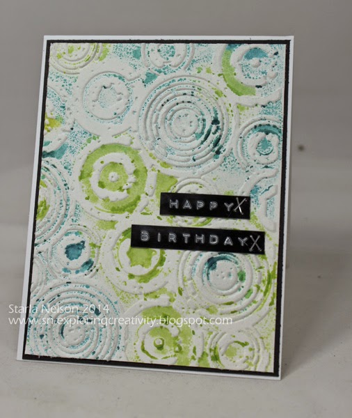
This card was literally a 5 minute card to put together.  Inspiration seemed to have left the building so when another teen boy card was needed at the last minute I went through the pile (quite sadly, that is a literal description) on my desk and came up with this rejected background that was made while I was playing with the stamping with embossing folders technique.   On this particular piece, I believe (ahem.  I am a TERRIBLE detail blogger lately!! I'm guessing here as to what I did!!) I used the Distress Stains again, but this time I actually ran the embossing folder through my Big Shot to emboss the image.  The stains seemed to dissipate, leaving a more blotchy, random look.  I grabbed the piece, trimmed and then using my "old style" label maker, punched out the sentiment and used the mini stapler to add a little extra to the simplicity of the piece.


For the LIFE OF ME, I cannot get a decent photo when I use this label maker!! I don't know if it is the shine of the tape, the shine and combination of the raised lettering, but my camera just can't seem to focus on the whole picture!  Apologies, but hopefully, you get the gist of the idea!!

A splash of color.  Embossed, raised background.  A simple sentiment/embellishment combination. A quick card but for a young teen who was probably more interested in the gift card inside.  Works for me!!  Maybe I should call this reality stamping, LOL!

A 5 minute card and a 5 minute post!!  Laundry and Back to School Night on the agenda now!!

'Till next time...................remember that some times rejections can lead to other opportunities!!


Saturday, August 16, 2014

Embossing with Distress Stains

Hey People!!  Can you believe it is the middle of August already?!!  This past week has been dedicated to trying to get this house under some type of order before the Kiddos start back to school next week.  Needless to say, I didn't get as much accomplished as I had hoped, but a couple of steps in the right direction will make the To Do List a bit easier to manage, I hope!!

I am sharing yet another card that uses the stamping with embossing folders technique  that I have used on the last three cards I have shared. On this particular card, I used Distress Stains instead of paint for my background medium.  I also went for a more masculine look, which, if I do say so myself, turned out quite well!

Due to an unfortunate idea gone horribly wrong, I was left with only a portion of my original stained print. I made the best of what I had left and went for a minimalist look.   Rather than leave the panel whole, I cut it into strips to break up the pattern just a bit.  The dies are from Cottage Cutz.  Clean and simple and perfect for a masculine card!!

I apologize for the slightly blurred picture.  Once again, my last minute photo sessions and not downloading immediately to check out the outcome has become my nemesis. 

That's it for me today. I have two cards that need to be made tonight; one for a teenage boy and a baby shower card.  No time to chit chat as one is needed by tomorrow afternoon and the other Monday afternoon.  One would think that I would quit this procrastination creating, LOL!! 

'Till next time...........................

Saturday, August 9, 2014

LOOK!! More Butterflies!!

Hello there!!  It's been a bit longer than I had planned between posts, despite the fact that I actually have a couple of cards that I have made and need to share.  Ahhhh!! The joys of being busy!! 

After my last card, it would appear that I had a rough time branching out from the butterfly genre.  I needed another teen card for a young lady mere days following the panic creating for the last birthday celebrations. Those creations can be found here and here, for those of you who may wish to refresh your memories or get a gander for the first time.  

I usually try to create cards that are not overly "girly" for the fairer peeps of my boys, as I would rather they not be embarrassed to give the cards.  

Not to mention that if one is going to embarrass their children, one should be able to see them squirm, am I right?!!

Despite my best efforts this card turned out to be a bit more "girly" than I was aiming for. BUT!! I used the last of my scraps from the papers made for the previous two cards and I got the card done fairly quickly, which in itself, is rather a miracle.


I apologize for the poor lighting of this card.  I took the pictures just before leaving to take the youngest kiddo to the party and didn't have time to download to make sure I had something presentable. You will just have to use some of your creativity to "lighten" the card to a brighter shade!!

As I said, the making of this was fairly simple.  I dug through my hoard and found a box of Glimmer Mist Masks and spritzed with a combination of light pink shades of Glimmer Mists. 

Would someone PLEASE let me know why I even own PINK Glimmer Mists?!!! It is driving me crazy as to why I would have purchased these colors!! But, apparently, I'm using them, so maybe I'm more of a "pink" type of gal than I want to acknowledge! 

The butterflies were die cut using a Tim Holtz die and a Martha Steward punch.  A bit of bling for the bodies.  Stamped the sentiment, adhered the butterflies with rolled glue dots down the center of their bodies so that the wings could be bent and popped up for "flight".  The front panel was cut slightly smaller than the card base and popped up with some dimensionals.

Easy peasy.  

I promise that my next couple of cards will NOT have butterflies, LOL!! In fact, I'd say they are at the opposite end of that spectrum!  

'Till next time................................

Monday, July 28, 2014

Winged Birthday Wishes

Hey there!! Today I thought I would share the second card I made using the same background technique I shared in my last post  but in a different way.  If you followed the link to the video of the technique  you will recall that it was recommended to use water color paper for the background. Call me a rebel a curious soul, but I wanted to see how the technique looked on different papers.  I used a heavier paper, (sorry, I think it was from Walmart.  I no longer have the info on it as it was a NEED STURDY PAPER NOW purchase and I was willy nilly in throwing away the information), along with the water color paper to compare the outcomes.

Recommendations are a good thing.  I liked the outcome of the technique better on the water color paper.  Much crisper image, but if you are looking for a more "water colored" or slightly more imperfect image, try it on card stock.  I'd be interested to see how the images compare from heavier weight to lighter weight card stock too.

Anyhoos!! I decided to use the results from the card stock paper with some punches.


I wanted a very light background paper as the butterflies added quite a bit of pattern on their own.  Again, the card size is a bit larger, 5x5.5" (?).  And I have NO IDEA what retired paper pack I used from my stash on this card as I had pulled out just about every pad I own trying to find a subtle background that wouldn't  distract from the butterflies.  Geesh.  I'm really slipping.  Obviously I'm not pushing any specific products, LOL!! I'm quickly becoming the antithesis of a design team member!!  I DO know that the punches are a combination of Tim Holtz, Martha Stewart and retired Spellbinders.  And the sentiment is retired SU.  Inks are the same as the last card: 
Distress Paints in Fired Brick, Spiced Marmalade and Wild Honey.  A mixture of Glimmer Mist Pearl and Luminarte Radiant Rain Pearl Blue. Embossing folder Sizzix Tropical Paisley.

I tried to get a photo of the shimmer on these winged wishes, but I couldn't capture the subtle shimmer. 

More shimmer to come!!

'Till next time.........................I hope you have a fabulous and creative week!!